Nature Photographers Network
This is the preserved archive of the original Nature Photographers Network. The community continues at naturephotographers.network.
A Sea Of Crimson + repost
‹ PreviousLandscape GalleryNext ›

A Sea Of Crimson + repost

by Ed Lowe

Gallery: LandscapePosted October 30, 2014314 views16 comments
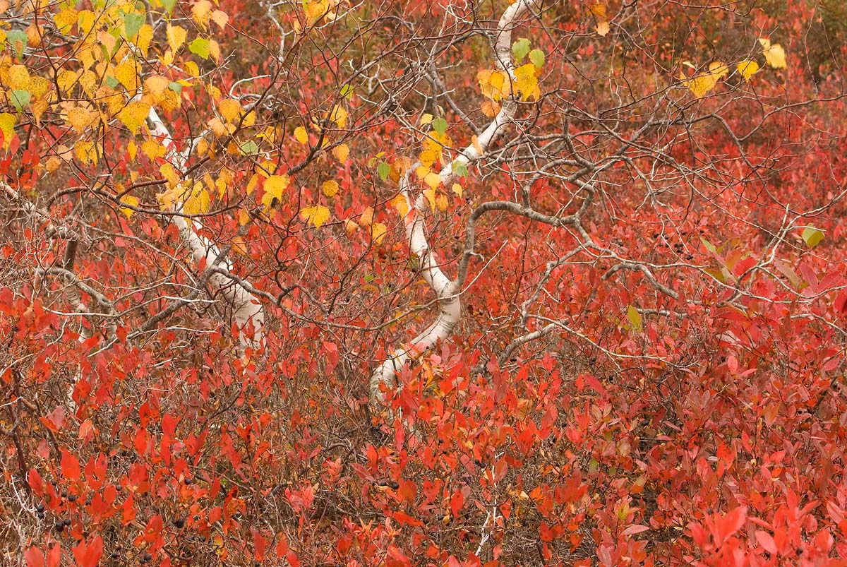
I don't know if this will appeal to many people as they may find it a bit busy, but I have always liked the image. I would really appreciate your thoughts on this one.

What caught my eye originally were the two misshapen white birch nestled in the patch of low bush blueberries adorned in their regal autumn color. This was taken a couple of years ago in Acadia NP, ME near Cadillac Mountain. I didn't post the particulars as I can't find the original raw file.

Thanks for taking a look and leaving a comment or suggestion.

Ed

Comments

16 comments
Comment posted by Pat Sampson on October 30, 2014 at 10:11 AM
I like this a lot as posted Ed. Love those birch trunks. I could also see a crop to 5:4 from the right that tended to center the trunks. Not better necessarily, just an alternative. Excellent detail and a fine comp as posted.

pat
Registered on May 19, 2007, 953 Posts, 15989 Comments
Comment posted by John&Patty Benway on October 30, 2014 at 10:32 AM
Good eye Ed, I like this alot, beautiful color and composition, and I don't find it busy at all. Beautifully done.
John
Registered on May 12, 2006, 626 Posts, 8700 Comments
Comment posted by Jim Greenwood on October 30, 2014 at 10:46 AM
I do think the composition is a bit busy. I like Pat's crop suggestion. In fact, I would go further to suggest possibly a square crop to focus as much attention as possible on the two trees and yellow leaves.
Registered on November 9, 2003, 229 Posts, 1523 Comments
Comment posted by Mark Seaver on October 30, 2014 at 10:51 AM
This is well seen and presented, Ed. The scattering of yellow leaves and those wonderfully twisted white trunks work very well amongst all the red.
Registered on January 23, 2011, 1103 Posts, 17270 Comments
Comment posted by Ronald Murphy on October 30, 2014 at 12:19 PM
Add me to the crop people. Great image, but centering the trunks works better for me.
Registered on March 13, 2012, 279 Posts, 975 Comments
Comment posted by D.A. Edwards on October 30, 2014 at 3:43 PM
I like the image a lot but could see a bit of a crop off of the bottom to focus attention on the birches while eliminating some OOF leaves.
Registered on October 8, 2014, 226 Posts, 1187 Comments
Comment posted by Nick Bristol on October 30, 2014 at 4:55 PM
Ed, I'm quite enjoying this scene and especially in the large version. It has a wonderful look and feel for me. I do see cropping some of the right side working nice as well so like the 5:4 suggestion that Pat mentioned. Very nice.

Nick Bristol
Lone Rock, WI
Registered on February 1, 2004, 752 Posts, 14140 Comments
Comment posted by Paul Breitkreuz on October 30, 2014 at 5:49 PM
This is excellent, Ed. I could go along with the right side crop, seems to be a good idea for centering the view a bit better. Wonderful autumn scene. :cool:
Registered on February 25, 2006, 525 Posts, 8448 Comments
Comment posted by Harley Goldman on October 30, 2014 at 5:50 PM
This is a real nice blast of color, Ed. I would agree with the crop suggestions, as I think it would bring more attention to the white trunks and solidify the comp.
Registered on November 19, 2003, 586 Posts, 11271 Comments
Comment posted by Ed Lowe on October 30, 2014 at 6:32 PM
Thanks for your thoughts on this one everybody. here is a cropped version as several of you have suggested.

Ed
Registered on February 7, 2004, 414 Posts, 7115 Comments
Comment posted by Paul Breitkreuz on October 30, 2014 at 8:55 PM
The repost is the ticket here, Ed.......looks good. :cool:
Registered on February 25, 2006, 525 Posts, 8448 Comments
Comment posted by Ryan Shain on October 30, 2014 at 11:02 PM
I like the repost very much Ed. The eye tends to stay in the image more in the cropped version, and there is lots to explore.
Registered on February 20, 2007, 226 Posts, 4571 Comments
Comment posted by gary phillips on October 31, 2014 at 2:27 AM
The repost is right on for me, Ed. Love the twisted birch and the explosion of color from the blueberries. :toast:
Registered on October 24, 2013, 185 Posts, 4136 Comments
Comment posted by scott lanz on November 1, 2014 at 1:04 PM
I've looked at this one a few times, Ed. I think I prefer the original, of center comp. IMO, more is just better, and the off center comp seems, while less balances, also less static. The two white tree trunks provide a focal point that is well positioned in the original. Both versions are very good, however.
Registered on November 14, 2003, 840 Posts, 12902 Comments
Comment posted by Pat Sampson on November 3, 2014 at 6:21 AM
I like both Ed but for me the repost has more impact and presence.

pat
Registered on May 19, 2007, 953 Posts, 15989 Comments
Comment posted by Bill Reid on November 4, 2014 at 1:57 PM
The repost looks good to me bringing more focus to the white branches Ed. Really nice colors and tones in this and a good eye spotting it.
Registered on January 27, 2013, 65 Posts, 2460 Comments