Gallery: WildlifePosted October 17, 2014287 views13 comments
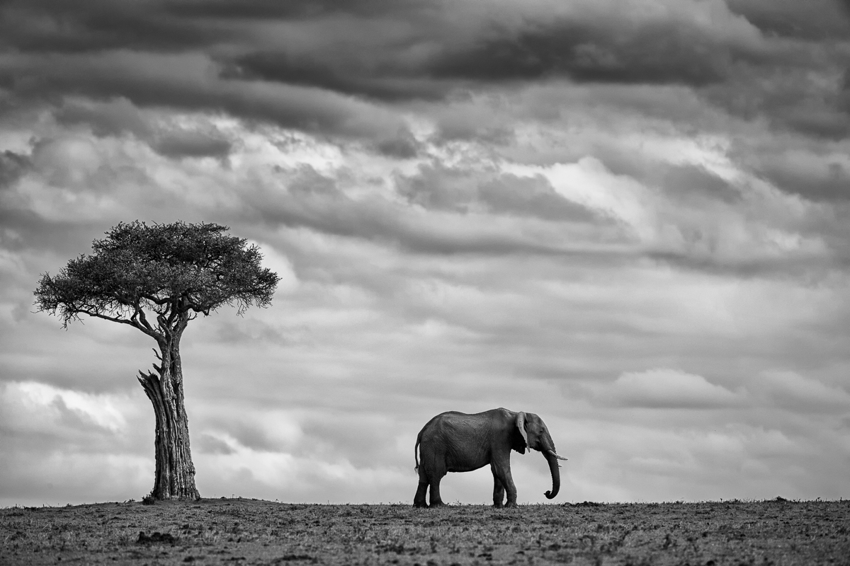
An Elephant on the plains of the Mara North Conservancy set against a moody sky and next to a tree giving us sense of scale.
EOS 1Dx - EF200-400mm f4.0L IS USM - 400mm - 1/2000sec @ f6.3 - ISO 250
Comments
13 comments
Comment posted by Max Waugh on October 17, 2014 at 5:31 PM
Pretty cool shot, Mario. There are some great elements here between the clouds, elephant and tree, and I think your B/W conversion is spot on.
Though the elephant is facing right and one might normally keep more of the foreground ahead of it, I feel that the elephant and tree really serve to balance each other well as equals. So my preferred crop would have the tree and elephant placed in each third of the frame (i.e., cropping some off the right and bringing back more on the left, if possible).
Max
Registered on September 26, 2008, 428 Posts, 2329 Comments
Comment posted by Lon Sharp on October 17, 2014 at 7:38 PM
Really, really nice. I like that all of the elephant is set against the sky and your choice of composition works fine. I do see the merit of Max's suggestion and it might just be there are two great ways to present this scene. B&W looks great.
Registered on December 9, 2007, 258 Posts, 9892 Comments
Comment posted by Ken Watkins on October 18, 2014 at 1:59 AM
Mario,
Great conversion without the usual "over-dramatic" effect, I think more space on the right would be a good idea.
Registered on December 15, 2010, 1537 Posts, 4877 Comments
Comment posted by Paul Breitkreuz on October 18, 2014 at 9:36 AM
Mario......I think it is excellent as presented. An interesting look at this environment as well as the wildlife aspect with the elephant sharing the scene with the neat old tree.
Registered on February 25, 2006, 525 Posts, 8448 Comments
Comment posted by Stephen Kaluski on October 18, 2014 at 9:45 AM
Outstanding simplicity.
TFS
Steve
Registered on March 25, 2007, 189 Posts, 1064 Comments
Comment posted by Thomas Haney on October 18, 2014 at 12:52 PM
What a stunning scene Mario, I love it as presented but I would prefer a bit more space on the left.
Registered on April 7, 2013, 138 Posts, 537 Comments
Comment posted by Richard Sandor on October 18, 2014 at 1:03 PM
Another excellent example of less is more. BW is perfect for this scene. Richard
Registered on January 12, 2014, 453 Posts, 1625 Comments
Comment posted by Butch Lama on October 18, 2014 at 6:39 PM
Beautiful shot... Love the comp!!!
Registered on July 23, 2010, 42 Posts, 316 Comments
Comment posted by Jagdeep Rajput on October 19, 2014 at 3:18 AM
Great setting n appealing picture! The position of elephant in the frame can vary with the taste.
Jagdeep Rajput
Registered on April 29, 2008, 686 Posts, 2857 Comments
Comment posted by Richard Teller on October 19, 2014 at 9:11 PM
Great minimalist composition. The sky adds a lot of drama and it works very well in B&W.
Registered on August 23, 2010, 1162 Posts, 6692 Comments
Comment posted by Ajit Huilgol on October 20, 2014 at 1:53 AM
3 great elements here - dramatic sky, tree, elephant - as mentioned by others. To me, there is one more - the dry parched earth, which adds a lot of drama to an already lovely image. Congrats
Registered on December 19, 2008, 302 Posts, 2055 Comments
Comment posted by Balan Vinod on October 20, 2014 at 7:29 AM
Mario ..thats a wonderful frame ..love the clouds adding the drama too
Balan Vinod
Registered on March 20, 2006, 889 Posts, 2312 Comments
Comment posted by Nate Chappell on October 22, 2014 at 6:45 PM
Lovely in it's simplicity, a great black and white image Mario.
Registered on February 1, 2006, 1158 Posts, 19528 Comments

Comments
13 commentsThough the elephant is facing right and one might normally keep more of the foreground ahead of it, I feel that the elephant and tree really serve to balance each other well as equals. So my preferred crop would have the tree and elephant placed in each third of the frame (i.e., cropping some off the right and bringing back more on the left, if possible).
Max
Great conversion without the usual "over-dramatic" effect, I think more space on the right would be a good idea.
TFS
Steve
Jagdeep Rajput
Balan Vinod