Nature Photographers Network
This is the preserved archive of the original Nature Photographers Network. The community continues at naturephotographers.network.
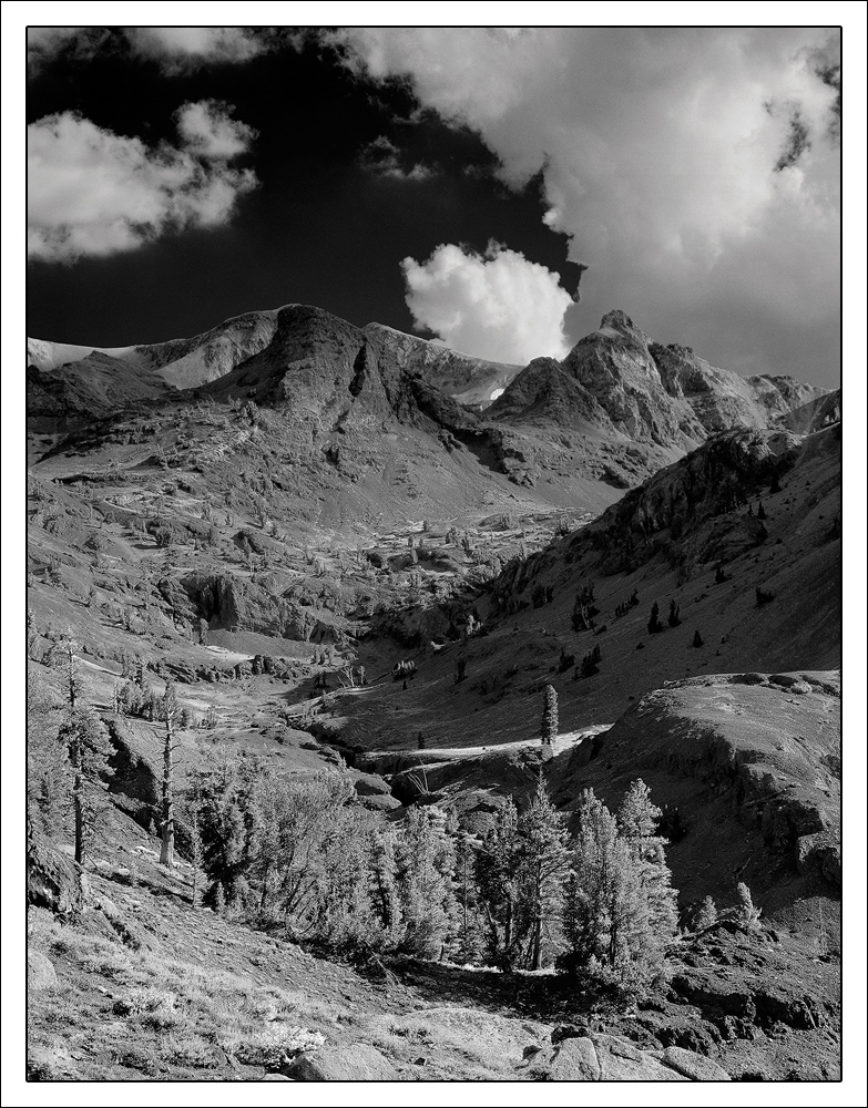
Blue Afternoon BW + rp
‹ PreviousLandscape GalleryNext ›

Blue Afternoon BW + rp

by Preston Birdwell

Gallery: LandscapePosted August 23, 2014195 views14 comments
Harley gave me a great idea: Convert the image to B&W!

I used the Black and White adjustment layer in CS6, along with separate Curves adjustments for the sky and the terrain.

Tachihara 4x5
300mm Nikkor-M
Converted from an Astia 100F color transparency.

Please see the large version. Thanks!

What do you think of the converted image? I would also appreciate your comments as to which you prefer; the color or B&W.:smile:

--P

Comments

14 comments
Comment posted by Ronald Murphy on August 23, 2014 at 2:50 PM
I'm liking the B&W, but I think I want to see the brights of the land/trees brighter.
Registered on March 13, 2012, 279 Posts, 975 Comments
Comment posted by Pat Sampson on August 23, 2014 at 3:55 PM
Preston,

I like this but actually think I prefer the color version. There was just enough yellow in it that I like the complement between the landscape and the sky. Also in the black and white, the sky seems sharp and contrasty while the landscape seems tonally flat to me - not completely of course but somewhat. I do prefer the sky in black and white though.

pat
Registered on May 19, 2007, 953 Posts, 15989 Comments
Comment posted by John&Patty Benway on August 23, 2014 at 4:19 PM
Preston, really liked the color version, and as much as I liked it, I love this. Beautiful tones and light and the white clouds against the dark sky really makes this scene pop. Beautiful. I guess you owe Harley one, don't ya. :wink:
John
Registered on May 12, 2006, 626 Posts, 8700 Comments
Comment posted by Harley Goldman on August 23, 2014 at 4:52 PM
I much prefer the B&W. To me, this one has a lot more pop and the shadow interplay really holds my attention. Very nice, PB.
Registered on November 19, 2003, 586 Posts, 11271 Comments
Comment posted by Dan Kearl on August 23, 2014 at 6:51 PM
Much better for me.
The sky is really well done, the blacks and whites are dramatic.
I might burn the lower LHC a bit or maybe a small crop of the bottom and left side to maintain proportion.
Registered on September 2, 2013, 209 Posts, 1514 Comments
Comment posted by Jean C Cajolet on August 23, 2014 at 10:21 PM
The B&W is nice but to my taste I prefer the color because there is some fine details that can be seen with the colours.
Registered on April 28, 2014, 53 Posts, 532 Comments
Comment posted by Richard Hartmann on August 24, 2014 at 12:13 AM
Another vote for the color version.

The trees seem lost in the black and white. Also the peaks have lost the dappled light effect that seems gives them separation and interest. The dark sky in the B&W feels overbearing.
Registered on January 15, 2009, 13 Posts, 772 Comments
Comment posted by Bill Reid on August 24, 2014 at 8:18 AM
Both are very nice Preston and have very different moods to them. The fore ground in this seems a tinch bright so it looses detail a bit. Darkening the LHC would put more emphasis on that nice curve leading into the scene. Just a thought. Very nice job on both.
Registered on January 27, 2013, 65 Posts, 2460 Comments
Comment posted by Nick Bristol on August 24, 2014 at 2:13 PM
Preston, These are both very nice and I enjoy both versions. I'm kind of leaning towards the b&w but I do think the lower trees do seem to get lost a bit in it. Fun looking back and forth between the two and trying to decide. :smile:

Nick Bristol
Lone Rock, WI
Registered on February 1, 2004, 752 Posts, 14140 Comments
Comment posted by Preston Birdwell on August 24, 2014 at 3:23 PM
Thank you very much for your comments and suggestions!

Here's the tweaked image. What do you think?

--P
Registered on November 1, 2003, 471 Posts, 5188 Comments
Comment posted by Richard Teller on August 24, 2014 at 3:28 PM
I think the second image has a lot more drama to it.
Registered on August 23, 2010, 1162 Posts, 6692 Comments
Comment posted by Paul Breitkreuz on August 24, 2014 at 6:10 PM
Preston, I think the second version is the idea on this one. Overall a wonderful upper sierra scene. I have to say, the color version to me is excellent.....maybe just a slight contrast-sat on that one and I'm liking that one A LOT. :cool:
Registered on February 25, 2006, 525 Posts, 8448 Comments
Comment posted by Pat Sampson on August 24, 2014 at 8:54 PM
Preston,

I still prefer the color but less so. The rework of the black and white has a lot more pop and eye interest for me. It's a real toss up between it and the color version.

pat
Registered on May 19, 2007, 953 Posts, 15989 Comments
Comment posted by Mark Seaver on August 25, 2014 at 10:55 AM
Sure do like the big C of the valley and how it leads to the peaks and that white cloud popping over the ridge, Preston. This looks like a classic LF, B&W from the Sierras, especially with that black sky. I missed the color version, but just took a look. I like them both. They provide two very different feelings, this one tends toward the stark and dramatic while the color version uses "storm light" to create a more gentle and inviting scene.
Registered on January 23, 2011, 1103 Posts, 17270 Comments