Need your help! (REPOST 2)
by Bill Chambers
Computer died - bought a new CPU, kept my old monitor. Old calibration software/hardware wouldn't work with new computer so I bought new calibration software/hardware (xRite Colormunki Display). Calibration is giving me fits. Monitor looks too dim, lacks contrast, and color looks off (Yes, I turned off User Account).
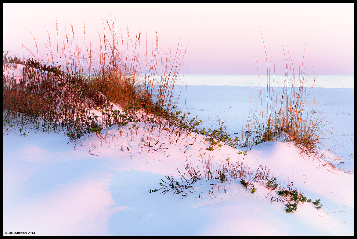
I processed this image to where it looked "right" with the new calibration.
Please give your thoughts and opinions on overall brightness, contrast, color (it should look pretty pink as that what the color was), sharpness, and anything else you can think of. Your help is MUCH APPRECIATED.

Comments
22 commentsThe contrast and sharpness look good to me. With regard to color, My Macbook isn't calibrated and I don't really trust my Dell which supposedly is. In any event, this looks to me like it might have just a touch too much blue saturation but what I'm seeing may be natural. I haven't been to the ocean in years. The whites look good to me also.
pat
That said, I do find that the contrast is too much, which is really hurting the highlights. The plant life is plenty dark & saturated, whereas the highlights in the sand, ocean, and sky appear way too bright - The Gulf sand looks more like fresh snow, the ocean appears to have an overall glare on it, and the upper sky seems to hover near screen white.
John
Not wanting to confuse the issue, but artistically, I actually like the original post just fine. I looks like one of yours. The repost doesn't quite look like one of your photos.
On my uncalibrated MacBook which is actually my current reference (smile):
It basically appears like the light is softer. The grasses are lighter and there's more detail in them. Everything else looks a touch washed out and overly pastel to me. I agree that the grasses were too contrasty in the first image but in this one they look more natural to me (except the ones at the very top of the hill) and the color on everything else seems to soft and flat. If I were trying to create a water color effect, I'd be very happy with this result. Again that's on my 13 inch uncalibrated MacBook.
pat
I think it need just a tiny bit of CCW rotation as a bit of of nitpick.
I like the comp and scene a lot.
Nick Bristol
Lone Rock, WI
Without a doubt the composition has your classic look and signature to it. Wonderful take......
I am in the 'somewhere between the two' camp. I am unsure if you'll be able to much texture out of the sand, given how fine-grained it is. The composition is lovely and has your touch.
Nice talking with you the other day.
--P
Pat
Nick Bristol
Lone Rock, WI
Your last effort looks spot on to me.
Color management, with all its variables, is a thorn in our sides.
Gary: If you're having issues with your monitor, post a topic in the Digital Imaging forum. Perhaps we can help.
--P