Nature Photographers Network
This is the preserved archive of the original Nature Photographers Network. The community continues at naturephotographers.network.
Tremulous Reflection
‹ PreviousLandscape GalleryNext ›

Tremulous Reflection

by Serkan Imisiker

Gallery: LandscapePosted August 12, 2014272 views19 comments
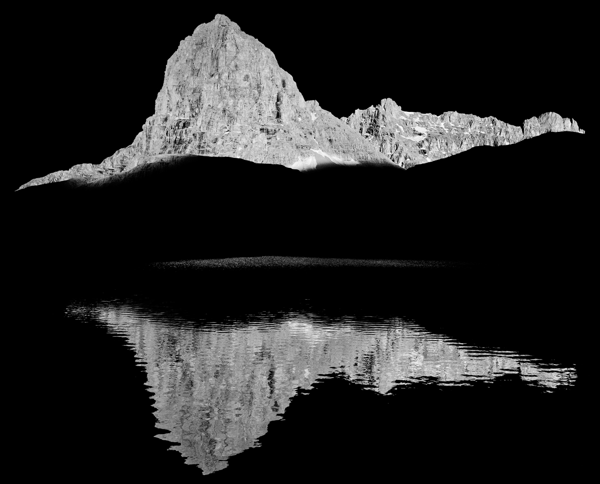
Almost all of the hiking trails at Aladaglar National Park are so steep and it takes about a 4-5 hours hike from our base camp to Yedigoller high plateau. We camped there for two days in June.

There are many lakes in this area and some of them are considered to be seasonal. This one displays the Direktas (Pole Rock),one of the most famous summits of the region at 3500 meters, and its reflection on one of these lakes just before the sunset.

Aladaglar National Park, Nigde, Turkey.

Comments

19 comments
Comment posted by Thomas Haney on August 12, 2014 at 7:30 PM
Really interesting and dramatic image Serkan, I like your minimalist approach and the strip of ground visible in the middle of the scene. The only thing I would suggest trying with an image like this is to zoom out a bit more, as the composition seems a bit tight.
Registered on April 7, 2013, 138 Posts, 537 Comments
Comment posted by John Williams on August 12, 2014 at 9:06 PM
Somewhat surreal in the way the lit areas hang in the black. Nicely artistic.
Registered on September 6, 2007, 221 Posts, 5985 Comments
Comment posted by gary phillips on August 12, 2014 at 9:16 PM
Very artistic, Serkan. Like Thomas, I love the little strip of shoreline. This reminds me of a very dark butterfly. Different in a very cool way. :toast:
Registered on October 24, 2013, 185 Posts, 4136 Comments
Comment posted by Harley Goldman on August 12, 2014 at 10:25 PM
Minimalist and quite beautiful.

I agree a out it being a bit tight. I might consider adding a bit of canvas at the top and bottom and extending the black sky and water to give it a bit more room??
Registered on November 19, 2003, 586 Posts, 11271 Comments
Comment posted by Jeffrey Sipress on August 12, 2014 at 11:33 PM
Fascinating image, Serkan. Thanks for the story, too.
Registered on February 17, 2004, 236 Posts, 1197 Comments
Comment posted by Pat Sampson on August 13, 2014 at 5:39 AM
Beautiful symmetry and presentation Serkan. I actually prefer my images with the subject tight against the frame and this is perfect for my tastes. I like this a lot. No suggestions.

pat
Registered on May 19, 2007, 953 Posts, 15989 Comments
Comment posted by Harry Lichtman on August 13, 2014 at 8:12 AM
Fantastic take on the scene. Bold, and that sliver of light really makes it special for me. :toast:
Registered on September 17, 2010, 304 Posts, 3507 Comments
Comment posted by Nick Bristol on August 13, 2014 at 11:55 AM
This is really a cool looking image. I like it very much and that sliver of light Harry mentioned really adds a wonderful touch to this scene. :smile:

Nick Bristol
Lone Rock, WI
Registered on February 1, 2004, 752 Posts, 14140 Comments
Comment posted by Ronald Murphy on August 13, 2014 at 12:13 PM
Very graphic image. Nice. Maybe a little tight at the top and bottom.
Registered on March 13, 2012, 279 Posts, 975 Comments
Comment posted by Serkan Imisiker on August 13, 2014 at 12:19 PM
Thanks for your comments so far. It seems many of you thought it a little bit tight on top and the bottom. Since the original shot does not have much space on both, I can only add some black canvas to it as suggested by Harley.
Registered on March 15, 2013, 25 Posts, 44 Comments
Comment posted by Richard Hartmann on August 13, 2014 at 1:22 PM
Interesting and powerful. To me it looks like it belongs in Photo Art.
Registered on January 15, 2009, 13 Posts, 772 Comments
Comment posted by Preston Birdwell on August 13, 2014 at 2:17 PM
I like the very graphic nature of this. It has a stark look that really evokes the sense of place.

I do agree with comments about adding more breathing room.

This question is for Richard:

For the sake of discussion, why do think this belongs in the Photo Art gallery?

Personally, I think it's a fine B&W that fits "Landscape" perfectly.

--P
Registered on November 1, 2003, 471 Posts, 5188 Comments
Comment posted by Harley Goldman on August 13, 2014 at 2:24 PM
This has a very similar look to Ansel Adam's famous image, Mt. McKinley - Wonder Lake.

I am also curious to hear why Richard thinks it belongs in Photo Art. Certainly nothing wrong with that opinion, but it might make for an interesting discussion.
Registered on November 19, 2003, 586 Posts, 11271 Comments
Comment posted by Joseph Campisi on August 13, 2014 at 2:27 PM
Very nice graphic image Serkan! Makes quite an impact.
Registered on November 24, 2008, 304 Posts, 3211 Comments
Comment posted by Peter Gordon on August 13, 2014 at 5:09 PM
Beautiful and original great capture..it could work more minimal but works great like this too.
Registered on May 31, 2007, 224 Posts, 1490 Comments
Comment posted by Richard Hartmann on August 13, 2014 at 7:11 PM
This question is for Richard:
For the sake of discussion, why do think this belongs in the Photo Art gallery?
Personally, I think it's a fine B&W that fits "Landscape" perfectly.


Thanks for asking. I hope this does not distract from this fine photo any more than necessary as I feel apprehensive about starting a discussion here.

Of course black and white photos can be posted in the landscape gallery, indeed black and white came before color. Yes, some of these black and white photos have significantly altered luminance values, especially in the skies. The white clouds are a lot whiter and the blue skies made to look really dark. However, one can still see the shape of the components included in the comp. In other words, it’s all still there.

This being said, somehow I am under the impression that photos manipulated so as to significantly change what was seen with the eye, like this photo, that seems to omit much of the scene would be better posted in photo art.

Actually, I thought this was the rule at NPN. I thought that the landscape gallery was supposed to “keep it real” whatever that means. And not really knowing what keep it real means I thought that this photo, far from looking real, belongs in the photo art gallery.

From the photo art gallery. “The Photo Art and Series photo critique gallery is intended for digitally manipulated or multiple exposure photos that are intended as obvious artistic renditions of nature”

To me this photo looks digitally manipulated as an “obvious artistic rendition of nature”

Perhaps I am mistaken and need the rules clearly spelled out for me. I would like to participate, but not in an inappropriate manner.

Peace.
Registered on January 15, 2009, 13 Posts, 772 Comments
Comment posted by Richard Hartmann on August 13, 2014 at 8:05 PM
This has a very similar look to Ansel Adam's famous image, Mt. McKinley - Wonder Lake.


Thanks Harley, yes, there are some similarities to Ansel’s
wonder lake

The photo is nice and the foreground is even dark, but not so dark as to look like solid black. I can still see texture.
Even if this were not the case, even if his photo was black, do we use Ansel as the standard for what is allowable in the landscape gallery?

I am no Ansel expert, but I am under the impression that he was into heavy darkroom manipulation. I think I remember in a documentary where interviewed, Ansel said something along the lines of, “I alter the image in the darkroom to reflect what I want to share, not what I actually saw during exposure.”

I am guessing that Ansel would be heavy into digital manipulation if he were are still shooting today.


Registered on January 15, 2009, 13 Posts, 772 Comments
Comment posted by Jon Daining on August 13, 2014 at 11:13 PM
Serkan, I really enjoy the strong contrast and composition with the simplicity of subject matter. Definitely a fine art B&W photograph.
Registered on February 25, 2012, 25 Posts, 191 Comments
Comment posted by Ed Lowe on August 13, 2014 at 11:27 PM
Very dramatic and graphic, Serkan! I really like what you pulled off here.

Ed
Registered on February 7, 2004, 414 Posts, 7115 Comments