Nature Photographers Network
This is the preserved archive of the original Nature Photographers Network. The community continues at naturephotographers.network.
Bison Animalscape
‹ PreviousWildlife GalleryNext ›

Bison Animalscape

by Jerry Austin

Gallery: WildlifePosted August 5, 2014112 views6 comments
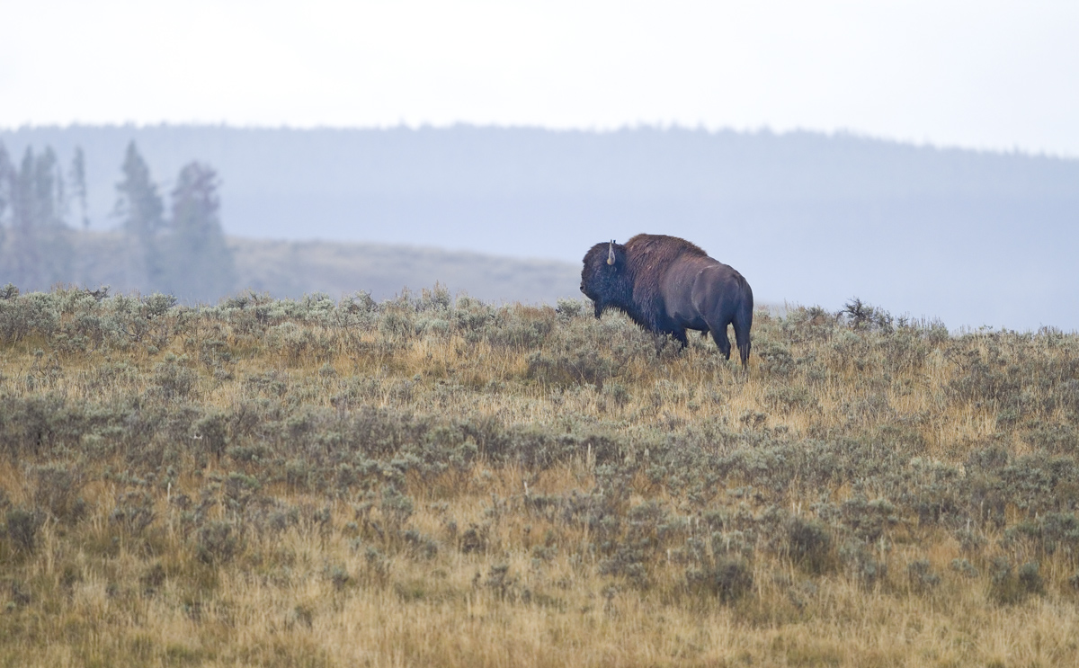
I came across this solitary bull in the Hayden Valley one overcast day last September. I followed him a bit until he gave me this turn with a fairly picturesque background. He just looked majestic standing there. He was a big bull in his prime.

Processed using Photoshop CS3, NeatImage and LightZone. Comments and critiques welcome.

Canon 7D
Canon 500mm f4 L IS II
f4.0
1/800s
ISO 500

Comments

6 comments
Comment posted by Ken Watkins on August 6, 2014 at 2:48 AM
Jerry,
I like the overall concept of this one, but on my monitor the colours seem a little off. I think a little less blue and magenta would help plus perhaps a little more contrast. :toast: :toast:
Registered on December 15, 2010, 1537 Posts, 4877 Comments
Comment posted by Nate Chappell on August 6, 2014 at 3:08 PM
A nice, moody image and good comp here Jerry, a bit more contrast for the bull in particular would help I think. :toast:
Registered on February 1, 2006, 1158 Posts, 19528 Comments
Comment posted by William Bickle on August 8, 2014 at 9:14 AM
Hello Jerry

Well done to capture this guy , overlooking the scene.

as other mentioned , maybe revisit with colours and contrast in mind

Bill
Registered on June 13, 2011, 183 Posts, 1702 Comments
Comment posted by John Launstein on August 8, 2014 at 5:07 PM
Jerry - I REALLY like this bison-scape. The textures and tones of the foreground hillside are wonderful, the bison is impressive and his pose and stare intriguing, the layers and comp are excellent. I do agree the bison itself appears to need some additional tweaks in processing...he has a bit of a "hazy" look that would be greatly improved with more mid-tone or middle-darks contrast (the darkest shadows are already looking pretty blocked so I would not try a general contrast adjustment on him without masking those areas out...I'm sure you have your own approach to such, so I'm just suggesting the image is worth revisiting in that area).

You know I have a clear preference of panos whenever I can find an excuse for that format, and I do have to say this image looks pretty amazing (and markedly different) by cropping the brighter sky section off the top. I wouldn't say that would necessarily be a definite improvement as much as suggesting you try it and see which you like better.

I'm still sticking with my opening statement: I really like this bison-scape!
Registered on April 5, 2011, 223 Posts, 1193 Comments
Comment posted by Jerry Austin on August 9, 2014 at 10:05 AM
Made some contrast and color adjustments to the bull. Improvement?
Registered on January 6, 2012, 651 Posts, 3448 Comments
Comment posted by Lon Sharp on August 9, 2014 at 11:02 PM
Regarding color and contrast....I much prefer the original as posted! I feel it has a moodiness and sense of atmosphere that is not untrue.

My eye was drawn to the bulls posture, with all four feet leaning backward, making me think he might fall on his face! :wink: Actually, I think you can make a pretty strong clockwise rotation, judging on the point of his shoulder and the stationary front feet. You could also use the trees on the background left, which are all leaning similarly. My only real nit is the brightness of the sky. Hopefully it is not totally blown so you could lower brightness and bring as much color out as possible.
Registered on December 9, 2007, 258 Posts, 9892 Comments