Comment posted by Ken Smith on June 18, 2014 at 10:47 PM
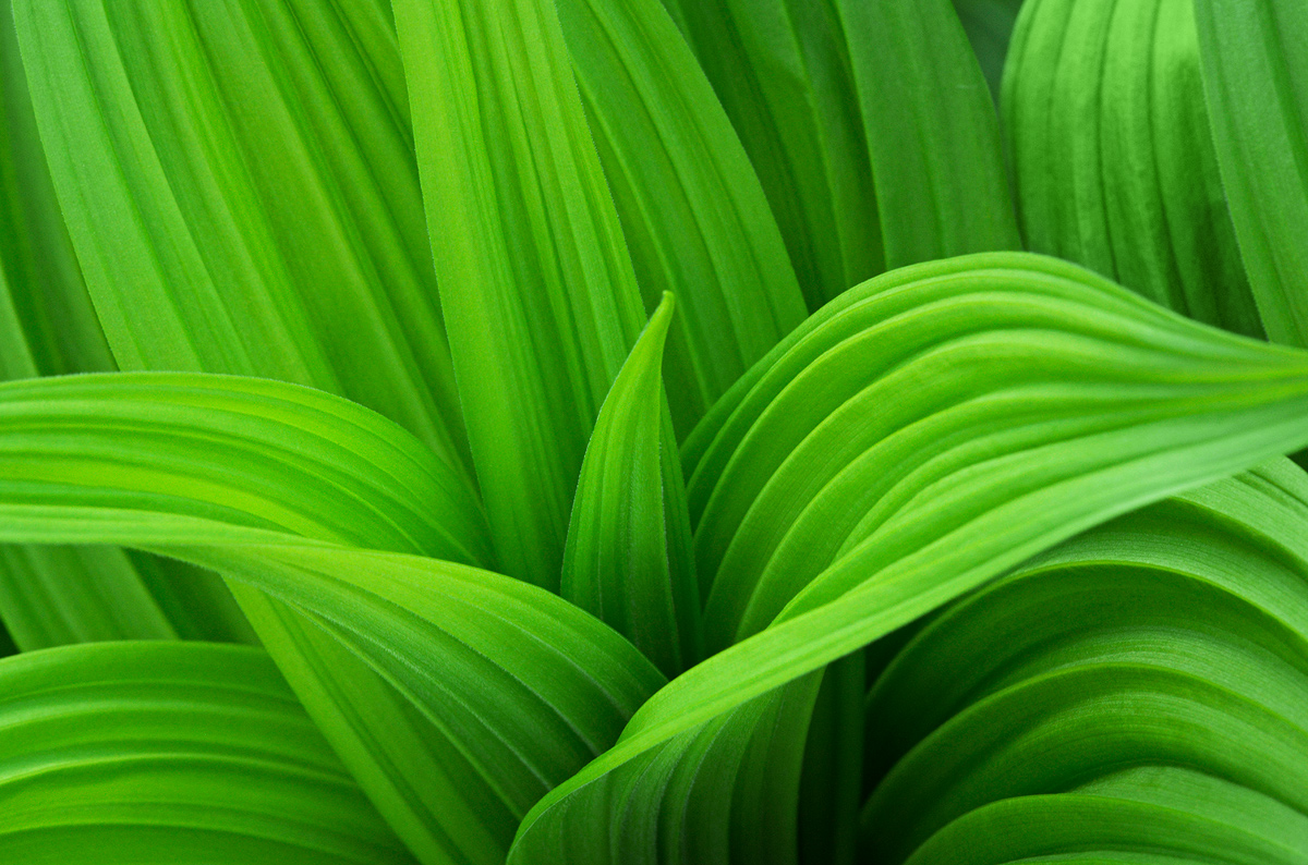
This is a creamy smooth veratrum image. Like the soft light and textures. These are tough to crop…when to say when. You did a good job!
Registered on September 5, 2008, 449 Posts, 2444 Comments
Comment posted by scott lanz on June 19, 2014 at 9:19 AM
Another super fine Veratrum, Albert. One of your best, I think, but hard to say because you posted some super nice ones before. Beautiful color, lines, and form.
Registered on November 14, 2003, 840 Posts, 12902 Comments
Comment posted by Carol Hyman on June 19, 2014 at 10:57 AM
Albert, I think this must be one of your favorite subjects. Beautiful lighting and nice depth of field add to the composition.
Good job.
Carol
Registered on January 18, 2007, 597 Posts, 8062 Comments
Comment posted by Nathan Buck on June 19, 2014 at 7:03 PM
Very nice lines and strong colors Albert. I think I would clone some color into the dark 'v' on the left side of the image.
Nathan
Registered on November 1, 2003, 1101 Posts, 13589 Comments
Comment posted by Ramamohan Pai on June 19, 2014 at 7:40 PM
Albert - Very beautiful layers and leading line as in all your Veratrum Shots
Registered on November 1, 2003, 550 Posts, 9037 Comments
Comment posted by Yun Gao on June 20, 2014 at 1:06 AM
Albert, Beautiful green and flowing lines. I like your composition.
Registered on September 11, 2012, 267 Posts, 1621 Comments
Comment posted by Ian Wolfenden on June 20, 2014 at 6:39 AM
Lovely, gentle feel to this image, Albert - the soft lighting is delicious. Up there with your best of this series I feel - really well done !!!!
Registered on May 18, 2007, 1108 Posts, 7647 Comments
Comment posted by Bob/Charly Nelson on June 20, 2014 at 7:18 AM
Probably my favorite composition Albert. I like how the vortex is lower center and the lines bring my eyes right to it.
Bob&Charly
Registered on January 29, 2014, 35 Posts, 398 Comments
Comment posted by Howard Cheek on June 20, 2014 at 8:42 AM
I like this one best of your series Albert.
The lighter range of green colors/shades seems more attractive to me.
Love the ridged leaf design in the veratrum, really works nicely with the graceful curves of the leaves as a whole
Registered on July 24, 2008, 1201 Posts, 10758 Comments
Comment posted by Pat Sampson on June 20, 2014 at 1:34 PM
Wonderful comp Albert. As a personal preference I might take the image a little darker but this is really beautiful as posted.
pat
Registered on May 19, 2007, 953 Posts, 15989 Comments
Comment posted by Jim Hackley on June 20, 2014 at 3:23 PM
For some reason I like this one the best. It may be due to seeing more flowing lines through out the image, way to go.
Registered on September 17, 2009, 302 Posts, 5535 Comments
Comment posted by Bill Fach on June 22, 2014 at 10:59 PM
Albert: The best of the bunch by far IMO. Love the lines and overall flow of the image. 2 thumbs up! >=))>
Registered on November 1, 2003, 1805 Posts, 26981 Comments
Comment posted by Ken Henke on June 25, 2014 at 7:10 PM
Beautiful. Not sure there is anything that can really improve this image!
Registered on February 20, 2012, 117 Posts, 285 Comments
Comment posted by Bruce King on June 26, 2014 at 3:54 PM
simply superb
Registered on January 14, 2010, 276 Posts, 2212 Comments

Comments
14 commentsGood job.
Carol
Nathan
Bob&Charly
The lighter range of green colors/shades seems more attractive to me.
Love the ridged leaf design in the veratrum, really works nicely with the graceful curves of the leaves as a whole
pat