Nature Photographers Network
This is the preserved archive of the original Nature Photographers Network. The community continues at naturephotographers.network.
Bark Patterns + RP
‹ PreviousLandscape GalleryNext ›

Bark Patterns + RP

by Preston Birdwell

Gallery: LandscapePosted June 18, 2014208 views17 comments
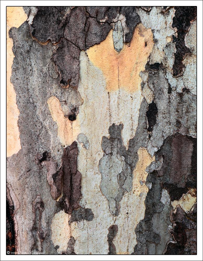
Here's another Sycamore bark detail from the same tree as this image, only this time large format.

I'm up for a better title. Any Ideas?

Chamonix 4x5
Schneider Symmar-S 210mm
Astia 100F
TK's Masks
Late December 2013

Please see the large version. Thanks.

Your comments or critiques a re always appreciated. :smile:

--P

Comments

17 comments
Comment posted by Pat Sampson on June 18, 2014 at 3:37 PM
I like the subtle colors, the fine textures and the sense of depth created from the layered bark. Strong balanced comp as well for my tastes. A really fine abstract and I think I prefer it to the earlier one. The colors and larger shapes make this one feel warmer to me. I like it a lot.

pat
Registered on May 19, 2007, 953 Posts, 15989 Comments
Comment posted by Mark Seaver on June 18, 2014 at 5:01 PM
Another fine tree bark abstract, Preston. The pattern is great and there's a fine light/dark and color balance. Seems like the trees have been barking at you a lot recently, :biggrin: and you're a great listener.
Registered on January 23, 2011, 1103 Posts, 17270 Comments
Comment posted by Chet Dowell on June 18, 2014 at 5:20 PM
Very nice image, Preston . I like the variety of color and pattern and I agree with Pat and prefer this image as well. The only minor nit I have is the light area in the upper left tends to pull my eye out of the image. I'm sure you have already considered that. Nice work. Chet
Registered on December 3, 2012, 237 Posts, 1171 Comments
Comment posted by Harley Goldman on June 18, 2014 at 6:25 PM
Nice colors and patterns, but I have the same reaction as Chet on the left bright area. It tends to pull me out of the image. Cropping the left side works for me.
Registered on November 19, 2003, 586 Posts, 11271 Comments
Comment posted by Dan Kearl on June 18, 2014 at 9:25 PM
I don't know about a different name, but I like the photo.
A lot of interesting shapes and a nice color palette.
Registered on September 2, 2013, 209 Posts, 1514 Comments
Comment posted by gary phillips on June 18, 2014 at 11:39 PM
Looks pretty much like nature's camo pattern. I think they call it Real Tree. Don't know where they came up with that. :confused: BTW, nice abstract.
Registered on October 24, 2013, 185 Posts, 4136 Comments
Comment posted by John&Patty Benway on June 19, 2014 at 4:51 AM
Very nice composition of natural color and patterns, beautiful light and detail, definitely like it. Good eye Preston, as always.
John
Registered on May 12, 2006, 626 Posts, 8700 Comments
Comment posted by Harry Lichtman on June 19, 2014 at 11:04 AM
Cool textures and patterns. No great ideas for a title :frown: You could always go with Sycamore Bark #_. May give a viewer some clue as to something about the image, as it is pretty abstract.
Registered on September 17, 2010, 304 Posts, 3507 Comments
Comment posted by Preston Birdwell on June 19, 2014 at 7:42 PM
I did a little tweaking on this one. Rather than crop the left side, I selected the light area on the left and adjusted a curves layer.

Does this tweak work better, or do think a crop is still in order?

Thanks for all your comments!

-P
Registered on November 1, 2003, 471 Posts, 5188 Comments
Comment posted by John&Patty Benway on June 20, 2014 at 8:30 AM
To be honest Preston, I still like the original as presented, just me, your still have the last word.
John
Registered on May 12, 2006, 626 Posts, 8700 Comments
Comment posted by Nick Bristol on June 20, 2014 at 10:10 AM
Wow! This is fantastic, Preston. The shapes, colors and textures just look great to me. The repost works very well and I personally would not do a crop on this. :smile:

Nick Bristol
Lone Rock, WI
Registered on February 1, 2004, 752 Posts, 14140 Comments
Comment posted by Harley Goldman on June 20, 2014 at 10:15 AM
The re-post works nicely.
Registered on November 19, 2003, 586 Posts, 11271 Comments
Comment posted by Eva McDermott on June 20, 2014 at 6:51 PM
Wonderful textures Preston. Astonishing detail in the large view. I like your repost best.
Registered on January 4, 2009, 1015 Posts, 13229 Comments
Comment posted by Pat Sampson on June 20, 2014 at 8:44 PM
Preston,

I prefer the repost because it better matches the other shapes that have the same color.

If I look at this as layers, I don't see a need for the crop. I don't see the need for the crop regardless but if I think of this as more of a water color with no depth, I'm inclined to want the dark bark on the top to touch the edge of the frame.


Registered on May 19, 2007, 953 Posts, 15989 Comments
Comment posted by Mark Seaver on June 22, 2014 at 10:46 AM
Preston, the repost does have a better "balance". I'm with Pat in thinking that a cropped version would be quite a different result.
Registered on January 23, 2011, 1103 Posts, 17270 Comments
Comment posted by Paul Breitkreuz on June 22, 2014 at 1:20 PM
No crop needed IMO Preston, the curve down worked and made this very nice. I like this version as well as the previous digital take, but maybe this warmer Astia version a bit better. Can't go wrong when they all work out....... :cool:
Registered on February 25, 2006, 525 Posts, 8448 Comments
Comment posted by Peter Richter on June 25, 2014 at 1:16 PM
Wonderful abstract for me, most interesting interplay of colors and shapes.

Peter
Registered on November 10, 2010, 218 Posts, 2723 Comments