Nature Photographers Network
This is the preserved archive of the original Nature Photographers Network. The community continues at naturephotographers.network.
Pieces + RP
‹ PreviousLandscape GalleryNext ›

Pieces + RP

by Preston Birdwell

Gallery: LandscapePosted June 12, 2014236 views18 comments
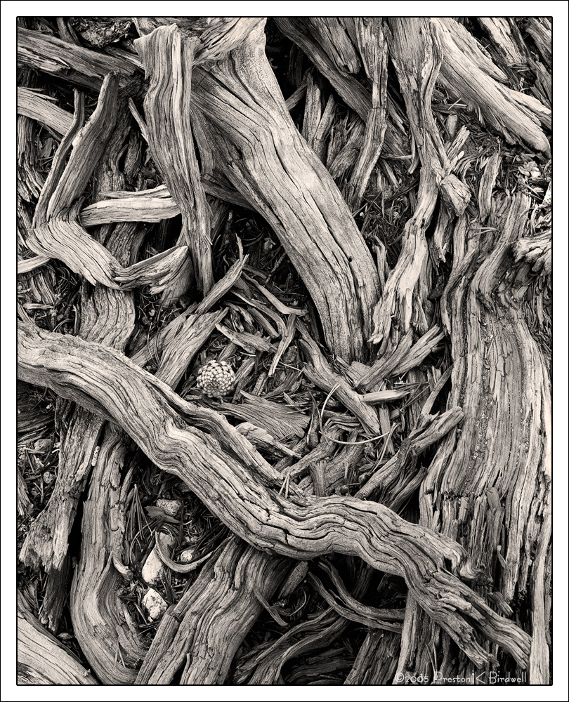
I found this somewhat chaotic gathering of weathered pieces of an old Lodgepole Pine near Sonora Pass in the Sierra, and wanted to see if I could extract order from the chaos.

There was very little color remaining in the wood, so I thought this would look nice in B&W.

Tachihara 4x5
Fujinon 180mm
Astia 100F Converted to B&W
TK's Masks
June 2005, Reworked in 2013.

Please see the large version. Thanks.

Your comments and critiques are always appreciated. :smile:

--P

Comments

18 comments
Comment posted by Mark Seaver on June 12, 2014 at 11:03 AM
This looks like a b/w, large format classic, Preston, where the lack of color and extended tonality lets the details dominate. That pine cone is the key to holding this together. Very well seen!
Registered on January 23, 2011, 1103 Posts, 17270 Comments
Comment posted by Richard Teller on June 12, 2014 at 11:11 AM
This works really well in B&W. I agree that the pine cone brings order out of chaos and holds the image together.
Registered on August 23, 2010, 1162 Posts, 6692 Comments
Comment posted by Roel Wijtmans on June 12, 2014 at 11:13 AM
Very nice Preston! I like the pine cone among the chaotic wood. Well seen!
Registered on September 30, 2012, 116 Posts, 2257 Comments
Comment posted by Pat Sampson on June 12, 2014 at 11:28 AM
As fine as Adams or Howard Bond's bristlecone images IMHO. I hope you can tell that I like this a lot.

pat
Registered on May 19, 2007, 953 Posts, 15989 Comments
Comment posted by Jeffrey Sipress on June 12, 2014 at 12:38 PM
Nice imaging, Preston. And a good conversion from a color tranny. I wonder what this would have looked like if you had a sheet of BW neg film in the holder.
Registered on February 17, 2004, 236 Posts, 1197 Comments
Comment posted by Bill Reid on June 12, 2014 at 2:08 PM
Love the tones and texture in this Preston and how your comp curls around into the center and pine cone. Real ly nice job on this. :toast:
Registered on January 27, 2013, 65 Posts, 2460 Comments
Comment posted by Harley Goldman on June 12, 2014 at 6:19 PM
Excellent, Preston. I really like your composition. I am not sure the toning is working for me, as I like it better as a straight B&W. But that is strictly a personal preference. Very fine image, my friend.
Registered on November 19, 2003, 586 Posts, 11271 Comments
Comment posted by Preston Birdwell on June 12, 2014 at 7:12 PM
Thanks for your comments, everyone!

Based upon Harley's comment regarding the toning, I eliminated that layer. So, here's the un-toned version.

Which do you prefer?

Thanks,

--P

Registered on November 1, 2003, 471 Posts, 5188 Comments
Comment posted by Eva McDermott on June 12, 2014 at 7:17 PM
Great use of diagonals. I prefer the non-toned version but as Harley mentioned, it is a personal preference.
Registered on January 4, 2009, 1015 Posts, 13229 Comments
Comment posted by Pat Sampson on June 12, 2014 at 10:39 PM
Hard call but I'd vote for the untoned version also.

pat
Registered on May 19, 2007, 953 Posts, 15989 Comments
Comment posted by Stuart Williams on June 13, 2014 at 4:15 AM
preston - lovely image - just when I am exploring driftwood as a subject ... the key is, of course, in the composition and yours is interesting and visually stimulating. the cone acts as a good focal point, too. i like the textures and tones. portrait photographers (and painters) might have a thing or two to say about your placement of the cone (they might, for example, say that it'd be better placed in the intersection of two of the 'third' lines ... !!?).

re the blush of colour that you've added, i see that it roughly approximates to the toning that LensWork uses. the difference is, as far as i can see, that they use an algorithm that ensures that in the very dark areas there's little tonal shift (i.e., the RGB channels are approximately the same) and in the very lights to white the same is true. it is only at the mid-tones that there is a bigger separation (e.g., R 113, G 106, B 99) - thus up a difference of up to 20 on the 255 scale between R and B with G somewhere in between. Your brights (which is where it might be making the difference) still retain a pinky/warm hue - in contrast to the repost which has some nice brights which accentuates the contrast. I reckon that if you could achieve less tonal/hue separation in the darks and brights while retaining the warm tone in the mid-tones, folks would prefer the toned version. that's a lot of words for 2c!!
Registered on December 7, 2007, 247 Posts, 4792 Comments
Comment posted by John&Patty Benway on June 13, 2014 at 6:58 AM
Preston, definitely like the non toned version, it's a little more on the stark side, to my eye, it stands out a little better, yup, I like this, and your comp works beautifully. Excellent work.
John
Registered on May 12, 2006, 626 Posts, 8700 Comments
Comment posted by Harley Goldman on June 13, 2014 at 9:17 AM
The straight B&W works for me!! I really love this image. Wonderful tones, detail and patterns. Very sweet, PB.
Registered on November 19, 2003, 586 Posts, 11271 Comments
Comment posted by Paul Breitkreuz on June 13, 2014 at 2:24 PM
+1 for the non toned version, Preston. The weathered pieces have enough randomness to make for an interesting scene too. Another nice find here.... :cool:
Registered on February 25, 2006, 525 Posts, 8448 Comments
Comment posted by Vance Gese on June 13, 2014 at 2:49 PM
This is absolutely stunning, Preston. Your extraction of order from the chaos of all these weathered branches is perfect in my opinion and the cone adds the perfect subtle anchor. While I like the toned image alot, the untoned image just seems to work better for me, maybe because I enjoy John Sexton's work so much and this is right up there with his. Exquisite.
Registered on November 13, 2008, 298 Posts, 6629 Comments
Comment posted by Scott Smorra on June 13, 2014 at 10:05 PM
Excellent image Preston. You did a great job finding order in the chaos here. I'm really enjoying the details in the larger version. I prefer the untoned version.
Registered on November 2, 2009, 161 Posts, 2143 Comments
Comment posted by Tony Kuyper on June 13, 2014 at 10:51 PM
I prefer the toned image. Makes the textures and decay feel more vintage. Nice job finding such a comp in this chaos.
Registered on November 1, 2003, 364 Posts, 22328 Comments
Comment posted by Bill Chambers on June 16, 2014 at 12:59 PM
This is a wonderful collection of elements Preston. Beautiful composition and the pine cone is a great extra. I do like the repost best.
Registered on April 10, 2005, 753 Posts, 21216 Comments