Nature Photographers Network
This is the preserved archive of the original Nature Photographers Network. The community continues at naturephotographers.network.
Not Arches
‹ PreviousLandscape GalleryNext ›

Not Arches

by Pat Sampson

Gallery: LandscapePosted June 11, 20141,739 views13 comments
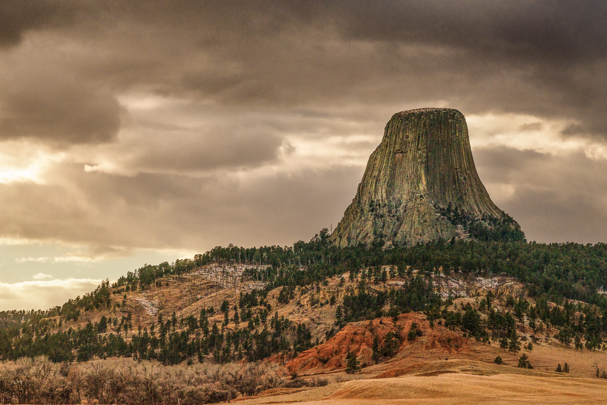
This is from Thanksgiving two years ago. I've been trying to process it off and on since then. Wanted to try it with luminosity masks and TK's actions.

Nikon D800
Zeiss 50mm macro
LR, CC, TK's actions

Comments and suggestions welcome.

pat

Comments

13 comments
Comment posted by Ken Smith on June 11, 2014 at 11:03 PM
Hi Pat, that is a hecka-big petrified tree stump. Must be from Paul Bunyon era… kidding aside, the tones in the monolith and clouds interact wonderfully. There is an overall gold tint touching everything which is a matter of taste… it appears to work as it retains the tonal quality with sepia look. Certainly a must-see in the larger version…and would want to enjoy seeing this on my 27 inch monitor at 2600 pixel width. Nicely done.
Registered on September 5, 2008, 449 Posts, 2444 Comments
Comment posted by Patrick O'Healy on June 11, 2014 at 11:20 PM
Patrick,
Like the image a lot. It looks like a Redwood tree stump. Ken was spot on from my perspective. :toast:
Registered on March 13, 2011, 326 Posts, 1679 Comments
Comment posted by Preston Birdwell on June 11, 2014 at 11:52 PM
Pat,

Nothing like basalt standing on end. I like this, and I think you did a good job with TK's masks. It may be a tad warm for my taste, but I think it works as-is.

If you want to cool it off a little, create a Photo Filter adjustment in CC at the top of the layer stack. In the properties window, choose one of the cooling filters (80 series). The default is 25%, but you can adjust the value to taste.

One quick note on TK's luminosity masks (not the Triple Play): Sometimes if you make radical adjustments to the Curve (or Levels) color may be affected. If all you want is to control tonality, set the layer blending mode to 'Luminosity' rather than 'Normal'. When you do this, and make adjustments, color will not be affected.

Devil's Tower is fascinating-The power to create such a formation must've been enormous.

--P
Registered on November 1, 2003, 471 Posts, 5188 Comments
Comment posted by Pat Sampson on June 12, 2014 at 12:07 AM
Thanks for the comments you all.

Preston,

Thanks for the tutelage on the luminosity masks. I appreciate it. I'm still watching Sean's videos and plan to go through them again as well.

pat
Registered on May 19, 2007, 953 Posts, 15989 Comments
Comment posted by John&Patty Benway on June 12, 2014 at 7:35 AM
What a difference the large view makes Pat, pretty scene for sure, very nice comp and fine detail, does seem a tad warm, but as Preston mentioned, matter of taste. Beautiful work.
John
Registered on May 12, 2006, 626 Posts, 8700 Comments
Comment posted by Bill Reid on June 12, 2014 at 10:09 AM
The large version looks very nice Pat and a nice comp. I agree it looks a tad warm but great as is.
Registered on January 27, 2013, 65 Posts, 2460 Comments
Comment posted by Mark Seaver on June 12, 2014 at 10:34 AM
I think I see a UFO in the distant sky... :biggrin: Fine look at Devil's Tower. I like how the overall warm tone contrasts with the starkness of the tower and the surrounding landscape. Are the touches of white on the ground snow?
Registered on January 23, 2011, 1103 Posts, 17270 Comments
Comment posted by Richard Teller on June 12, 2014 at 11:16 AM
Great image of Devils Tower. I really like the drama in the sky and the colors. I need to get back there and shot some more images.
Registered on August 23, 2010, 1162 Posts, 6692 Comments
Comment posted by Pat Sampson on June 12, 2014 at 11:25 AM
Thanks for the comments. I appreciate them.

Mark,

The white on the ground is snow. There's a little bit on the top of the tower as well. It had snowed on the Wed before Thanksgiving and before we arrived. I'll go back at some point and photograph with more snow during winter.

pat
Registered on May 19, 2007, 953 Posts, 15989 Comments
Comment posted by Chet Dowell on June 12, 2014 at 1:28 PM
Very dramatic image of the tower, Pat. Your comp from down below the hill gives the tower a proper placement. The colors seem fine to me. well done. Chet
Registered on December 3, 2012, 237 Posts, 1171 Comments
Comment posted by Nick Bristol on June 13, 2014 at 9:47 AM
Pat, This is really a nice shot of Devil's Tower. I like this view and the clouds you got to go with it worked out nice. It does seem just a tad warm for my taste as well, but it still works fine. It has been many years since I was last there. I think I had a Canon F1 at the time loaded with Kodachrome 64. :smile:
Registered on February 1, 2004, 752 Posts, 14140 Comments
Comment posted by William Bickle on June 13, 2014 at 5:22 PM
Hello Pat

Wonderful to see so clear and crisp. Well balanced lighting with excellent tone...

thanks for sharing

Bill
Registered on June 13, 2011, 183 Posts, 1702 Comments
Comment posted by Bill Fach on June 14, 2014 at 11:53 AM
Pat: The sky makes the shot IMO and its a good one. Looks like the processing worked really well to my eye. >=))>
Registered on November 1, 2003, 1805 Posts, 26981 Comments