Gallery: FloraPosted June 4, 2014137 views13 comments
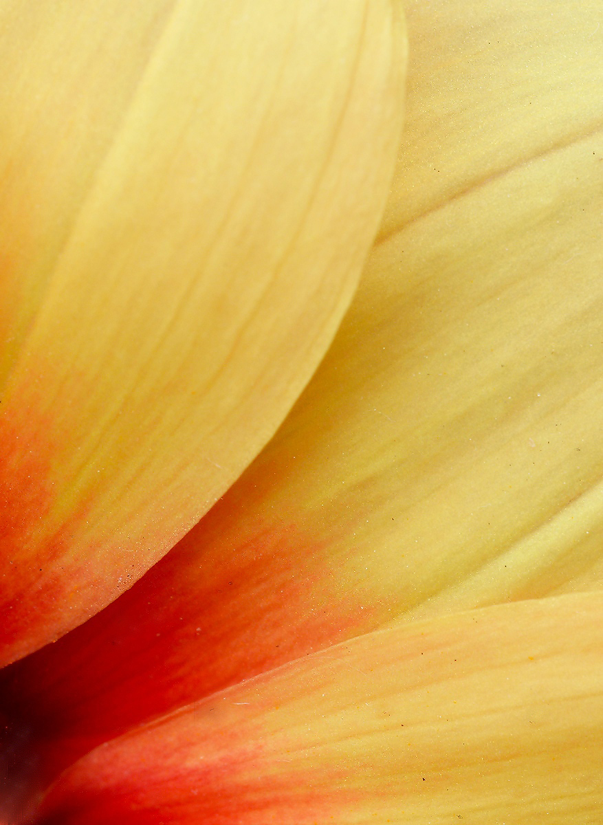
A potted dahlia taken outside yesterday. my garden is just starting to bloom. comments appreciated..
D600.. 150 mm.macro f/16. 1/100sec..iso 400
Comments
13 comments
Comment posted by Nathan Buck on June 5, 2014 at 1:17 AM
A nice extract from a larger bloom Albert. I like the color gradient. Have you applied any sharpening? It seems just a tad soft to me.
Nathan
Registered on November 1, 2003, 1101 Posts, 13589 Comments
Comment posted by Howard Cheek on June 5, 2014 at 8:24 AM
Nice 'flow' and comp and I like the 'cornered' red that fades to yellow.
Very attractive Albert!
Well done
Registered on July 24, 2008, 1201 Posts, 10758 Comments
Comment posted by Michael Cothran on June 5, 2014 at 9:31 AM
I find the composition and color scheme to be quite attractive. However, I believe the texture, or "feel" of the image is not attractive at all. It, IMO, lessens what could otherwise be another very nice abstract. Not sure what can be done about it.
Registered on December 5, 2012, 31 Posts, 730 Comments
Comment posted by Michael Cothran on June 5, 2014 at 9:43 AM
After further viewing, I think I can see what my issues are -
All the following, of course, is strictly my opinion -
It looks somewhat dirty, with all the detail. I think an abstract like this needs a much larger aperture. F16 simply shows too much. With f2.8 - f5.6, you could have focused on one of the petal lines, allowing the rest to be less detailed. Furthermore, I believe it is also quite flat in contrast. I would do a bit of line sharpening to get the edges sharper, but mask off the rest of the image. PS>Filters>Stylize>Find Edges, then invert, add 1-2 pixels of Gaussian blur will do this for you. I'd add some diffusion, or better, some glow, then increase the contrast. May not be at all what you're after, but that's how I see it.
Registered on December 5, 2012, 31 Posts, 730 Comments
Comment posted by Ian Wolfenden on June 5, 2014 at 9:47 AM
Beautifully composed, Albert, with that one sharp edge leading the eye so well through the image. Maybe a little more texture would have been nice but I do like this as is.
Registered on May 18, 2007, 1108 Posts, 7647 Comments
Comment posted by Jim Hackley on June 5, 2014 at 12:10 PM
I like the flowing lines and color transition to this composition. It would be interesting to see this at f5.6.
Registered on September 17, 2009, 302 Posts, 5535 Comments
Comment posted by Ramamohan Pai on June 5, 2014 at 7:31 PM
Albert - Very good try. Love the leading lines and the colors here. If possible I'd remove all those tiny dust spots.
Registered on November 1, 2003, 550 Posts, 9037 Comments
Comment posted by Richard Teller on June 5, 2014 at 8:08 PM
I like the comp and colors. I also agree that it looks a bit soft.
Registered on August 23, 2010, 1162 Posts, 6692 Comments
Comment posted by scott lanz on June 5, 2014 at 8:17 PM
Interesting reading the comments on this one, Albert. I am in the camp that would prefer more detail, especially in the top half, where you lose focus/sharpness. Other commenters wish for less dof. Maybe you have it just right after all!
Registered on November 14, 2003, 840 Posts, 12902 Comments
Comment posted by Albert Darmo on June 5, 2014 at 10:57 PM
Hi Ram .. thanks for the comment.. My camera has no more spots on the senser. nikon cleaned it up. there were many black spots on the flower.. pollen? i tried to clean them all up, guess i missed the really small ones, because of weak eyesight.
Regards Albert Darmo
Registered on November 25, 2008, 1386 Posts, 11978 Comments
Comment posted by Jim Zablotny on June 6, 2014 at 1:35 PM
Hi Albert--Wonderful color change in your composition. The small dust specks are a minor nit and can be taken care of in post processing. A tad more sharpness may help bring out some of the texture. For your next attempt, you may want to try a small amount of flash coming in from the upper left to help reveal some of the texture in the veins and folds of the petals. .................................Jim
Registered on January 17, 2004, 705 Posts, 3594 Comments
Comment posted by Bill Fach on June 6, 2014 at 9:11 PM
Albert: Nice job getting in close. I like the comp and the color palette. 2 thumbs up! >=))>
Registered on November 1, 2003, 1805 Posts, 26981 Comments
Comment posted by Jeffrey Sipress on June 9, 2014 at 2:18 PM
This is sweet. One of my fav flowers. A bit of speck cleanup would enhance this image.
Registered on February 17, 2004, 236 Posts, 1197 Comments

Comments
13 commentsNathan
Very attractive Albert!
Well done
All the following, of course, is strictly my opinion -
It looks somewhat dirty, with all the detail. I think an abstract like this needs a much larger aperture. F16 simply shows too much. With f2.8 - f5.6, you could have focused on one of the petal lines, allowing the rest to be less detailed. Furthermore, I believe it is also quite flat in contrast. I would do a bit of line sharpening to get the edges sharper, but mask off the rest of the image. PS>Filters>Stylize>Find Edges, then invert, add 1-2 pixels of Gaussian blur will do this for you. I'd add some diffusion, or better, some glow, then increase the contrast. May not be at all what you're after, but that's how I see it.
Regards Albert Darmo