Gallery: LandscapePosted May 30, 2014227 views15 comments
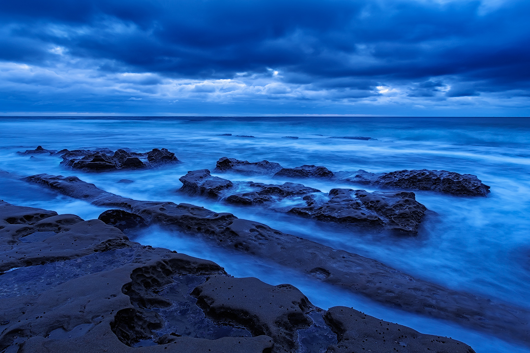
I managed to catch an incoming storm by the California coast some time back. Did a long exposure to catch the foamy waters during a high tide evening.
Single exposure processed twice.
Your comments and critiques are much appreciated
Comments
15 comments
Comment posted by Bill Reid on May 31, 2014 at 10:24 AM
Very nice blue hour shot Sairam. Nice comp and just enough shadow detail in the large version. Also like the exposure for the water.
Could be just me but the colors in the top of the clouds are maybe too saturated looking. See what others say. But I really like this as is.
Registered on January 27, 2013, 65 Posts, 2460 Comments
Comment posted by Brian Schrayer on May 31, 2014 at 12:25 PM
Very nice composition, Sairam. I like the repeating diagonal lines in the foreground. I like the blue color cast but I do think it's a tad bit strong. I would recommend backing off of that a little and you will have a great image.
Registered on May 28, 2004, 114 Posts, 2890 Comments
Comment posted by Nancy Lea Sandy on May 31, 2014 at 12:37 PM
a bit too blue for my tastes but a lovely image none-the-less. I like the repetition of the rock shelves.
Registered on January 24, 2011, 576 Posts, 6942 Comments
Comment posted by Sairam Sundaresan on May 31, 2014 at 1:18 PM
Here's a repost with the blues toned down Better?
Registered on March 14, 2013, 100 Posts, 643 Comments
Comment posted by Nick Bristol on May 31, 2014 at 3:04 PM
Sairam, You really did capture that blue hour mood in this shot, and your repost works much better for my taste. I think your comp works well here too. A very cool looking place!
Nick Bristol
Lone Rock, WI
Registered on February 1, 2004, 752 Posts, 14140 Comments
Comment posted by Brian Schrayer on May 31, 2014 at 3:05 PM
The repost is definitely better, Sairam.
Registered on May 28, 2004, 114 Posts, 2890 Comments
Comment posted by Balakumar Kaushik on May 31, 2014 at 4:25 PM
Simple and neat composition, Sairam. Loved the overall blue tones in the image. For my taste buds too, the repost looks better with blues toned down a tad.
Registered on January 4, 2008, 98 Posts, 1403 Comments
Comment posted by Pat Sampson on May 31, 2014 at 4:51 PM
Love the comp and the mood you created/captured. I also prefer the repost. Beautiful work.
pat
Registered on May 19, 2007, 953 Posts, 15989 Comments
Comment posted by Preston Birdwell on May 31, 2014 at 6:33 PM
The repost looks much better to my eye, even though the overall blue isn't really to my taste. The comp works well, Sairam.
Registered on November 1, 2003, 471 Posts, 5188 Comments
Comment posted by gary phillips on May 31, 2014 at 8:05 PM
The repost is much better in terms of the degree of blue. The overall comp works very well, Sairam. The foreground rocks and foam really compliment that sweet sky.
Registered on October 24, 2013, 185 Posts, 4136 Comments
Comment posted by Sairam Sundaresan on May 31, 2014 at 8:15 PM
Thanks everyone! Glad that the repost is better
Registered on March 14, 2013, 100 Posts, 643 Comments
Comment posted by Navin Sarma on May 31, 2014 at 11:49 PM
Nice comp and mood, Sairam! I really like the clouds in the distance. On my calibrated system, though, I don't see much difference between the two versions in terms of blue. Seems like I'm in the minority though
Registered on July 17, 2011, 233 Posts, 1373 Comments
Comment posted by Sairam Sundaresan on June 2, 2014 at 12:18 AM
thanks Navin. On my monitor, the two versions look pretty different
Registered on March 14, 2013, 100 Posts, 643 Comments
Comment posted by Youssef Ismail on June 2, 2014 at 1:30 PM
Sairam,
I have been struggling with a similar image from the coast in dealing with the blues. Its just the color we have to deal with on a cloudy day at the coast. I do not mind the blue tones, but maybe desaturate them some rather then shifting them towards the cyan. Nice composition.
Registered on November 1, 2003, 474 Posts, 5555 Comments
Comment posted by Sairam Sundaresan on June 2, 2014 at 2:12 PM
thanks Youssef, i agree that blue and green are the hardest to control. It's very easy to push them over the edge. Thanks for the feedback. So it looks like both you and Navin feel that even the repost is too blue.
Registered on March 14, 2013, 100 Posts, 643 Comments


Comments
15 commentsCould be just me but the colors in the top of the clouds are maybe too saturated looking. See what others say. But I really like this as is.
Nick Bristol
Lone Rock, WI
pat
I have been struggling with a similar image from the coast in dealing with the blues. Its just the color we have to deal with on a cloudy day at the coast. I do not mind the blue tones, but maybe desaturate them some rather then shifting them towards the cyan. Nice composition.