Nature Photographers Network
This is the preserved archive of the original Nature Photographers Network. The community continues at naturephotographers.network.
Shadowlands
‹ PreviousLandscape GalleryNext ›

Shadowlands

by Brian Schrayer

Gallery: LandscapePosted May 15, 2014340 views7 comments
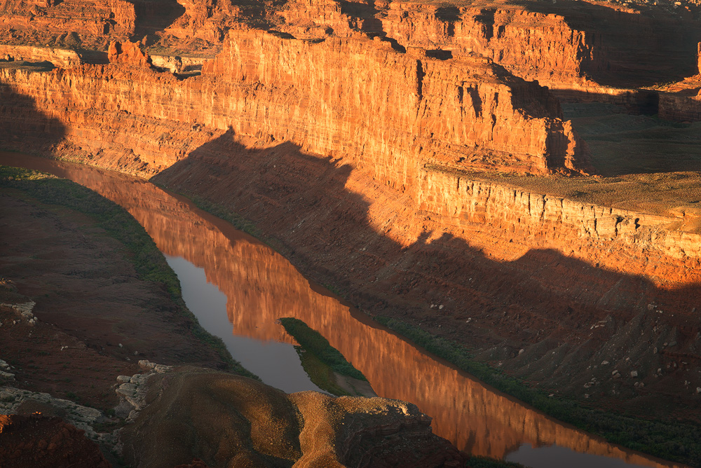
I was drawn to the reflection in the Colorado River as well as the interplay of light and shadow in this scene at Utah's Dead Horse Point State Park last fall.

All honest comments and critiques are welcome. :wavey:

Specs:
100mm
f5.6 @ 1/125 sec.
ISO 100

Processing Info:
1. Basic curves layer to adjust global contrast with adjustments on mask painted in.
2. Luminosity painting layer to bring up the highlights in the reflection and to add contrast in the rocks by darkening with a dark channel selection.
3. TK's Vibrance mask.
4. Vignette Layer
5. TK's web sharpening action.

Comments

7 comments
Comment posted by Kathy Barnhart on May 15, 2014 at 4:22 AM
Fascinating image. At first I couldn't quite figure out what I was looking at because of the shadows. Very nice composition going diagonally. And thanks for putting in so much processing info. I'm not crazy about the lower left corner, but I'm not sure how to handle it differently.
Registered on November 11, 2011, 404 Posts, 1639 Comments
Comment posted by gary phillips on May 15, 2014 at 4:41 PM
I like this a lot, Brian. The diagonal reflection is very cool. I was also a bit lost at first, and it agree with Kathy that the left foreground shadow is dominate at first. The reflection cutting thru the shadow is unique to this image.
Registered on October 24, 2013, 185 Posts, 4136 Comments
Comment posted by Zhoen on May 15, 2014 at 5:39 PM
There is something about the image i really like, I think its the diagonal lines and light on the red rocks. I would personally crop out the shadow on the top left, so its a transition from shadow to light in the river channel. I might also consider dodging the foreground rock where there is already light; where it looks like a small path into the image.
Registered on May 16, 2013, 25 Posts, 188 Comments
Comment posted by Mark Seaver on May 16, 2014 at 4:06 AM
Fine collection of colors, shapes, and shadows. Cutting off the sky makes it a bit disorienting, but adds a lot to the joy of viewing. The reflection is another nice addition. I do agree that the lower left grabs too much attention and think that cropping to remove the bright spots llc helps.
Registered on January 23, 2011, 1103 Posts, 17270 Comments
Comment posted by Dan Kearl on May 16, 2014 at 4:30 AM
This is nice Brian, but I agree about cropping a bit off the left side.
Registered on September 2, 2013, 209 Posts, 1514 Comments
Comment posted by John Williams on May 22, 2014 at 10:33 PM
Your comment about the interplay of light echoed my thoughts. The reflection/shadow/golden wall stack up nicely. I like the crop idea too.
Registered on September 6, 2007, 221 Posts, 5985 Comments
Comment posted by Catherine Reilly on June 1, 2014 at 5:20 AM
Brian, I really did a double-take on seeing your image. I was at the exact place in 2009 with a very similar vision as yours! In fact I went back in my files to look up my images of this incredible place. I see that I did both a closer view and a wider view than this one of yours. Pretty radical to leave out the sky, huh! Obviously, I like what you've done here; and look at the comments received! Thanks for good memories.
Registered on August 16, 2006, 603 Posts, 9192 Comments