Nature Photographers Network
This is the preserved archive of the original Nature Photographers Network. The community continues at naturephotographers.network.
Devil's Garden Redux [x3]
‹ PreviousLandscape GalleryNext ›

Devil's Garden Redux [x3]

by John Williams

Gallery: LandscapePosted May 9, 20143,750 views28 comments
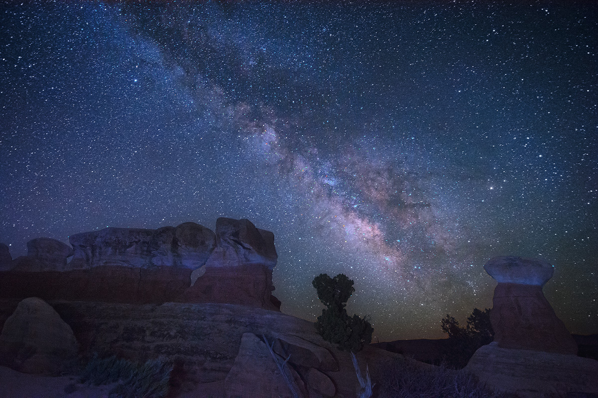
I'm not sure if I've posted the same image twice before, but this night photography stuff was a little more tricky than I first thought. I've spun around npn and the web a bit trying to learn from others, and would love some feedback on this white balance setting for those who are willing to weigh in yet another time. (I really value the feedback here, and promise to not post it again :smile: ) Here's the original.

Also, I think a large part of the odd glow on the horizon in the lower right was from man-made lighting (maybe from a distant Las Vegas?); I tried to minimize it in this version.

Comments

28 comments
Comment posted by Brian Schrayer on May 9, 2014 at 4:19 AM
This version is much improved in terms of the processing. The color balance is much better. I still like the subtle blue cast on the landscape as it makes it feel like a night image.
Registered on May 28, 2004, 114 Posts, 2890 Comments
Comment posted by Dan Kearl on May 9, 2014 at 4:21 AM
You are a quick study......
This is excellent, a very nice balance of sky and land.
The WB looks good for me, it is a bit subjective.
What did you use?
I sometimes shoot at auto & change it if I want or I shoot at fluorescent which works most of the time.
This looks like fluorescent to me.
I do think the land could be warmer, you have nice light on it, maybe a bit more red on the rock.
Registered on September 2, 2013, 209 Posts, 1514 Comments
Comment posted by Jared Warren on May 9, 2014 at 4:26 AM
I think you pretty much nailed it this time, John. Head and shoulders above the original. FWIW, when light painting I like to use a Brinkman Dual Xenon flashlight that gives a very nice natural warm light (I'm sure it was someone else here on NPN that recommended it). Nothing wrong with the cooler tones you have here, but it's something to play with if you're interested. :toast:
Registered on May 11, 2012, 84 Posts, 931 Comments
Comment posted by John Williams on May 9, 2014 at 4:26 AM
Thanks!! I ended up going with a temperature of 3700 and a tint of +32 in camera raw. That ends up being much closer to fluorescent than some of the other options I tried. For some reason I thought the magenta/green axis would be neutral; I had now idea it should be so magenta.

Great tip Jared; I'll look for that. (I have no idea what temp my old headlamp is!)
Registered on September 6, 2007, 221 Posts, 5985 Comments
Comment posted by Roger Clark on May 9, 2014 at 4:47 AM
Hello John,
Please see my comments on Keith Bauer's Bosque nightscape. Your image captures the prevailing view of digital photographers of the "night is blue crowd," and is much better than your original. But it is still far from natural. For example, the star Antaries (Alpha Scorpio) is a very red-orange star surrounded by dust that also shows the same color as the star. This star appears red-orange visually. You show it as white. You have some nice brownish tints to the Milky Way dust, but it is too magenta. You have many blue stars but there really are no blue stars. Emission nebulae, like the Lagoon nebula, appear white but are really quite red. Overall, the color balance is still too blue, at least if you want to represent real nature.

I liken this blue trend in the digital photography community as if they decided sunsets should be blue with a blue setting sun and no red is allowed.

The night sky is really warm and wondrous with many beautiful colors. But I'm probably speaking alone in the dark of the night.

Roger
Registered on May 8, 2014, 2 Posts, 23 Comments
Comment posted by John Williams on May 9, 2014 at 5:53 AM
Thanks for the information Roger! Wow, there's a lot I don't know. Time for more research!
Registered on September 6, 2007, 221 Posts, 5985 Comments
Comment posted by Bill Reid on May 9, 2014 at 1:37 PM
What a difference and a great improvement over the original John. Colors and tones in this look great to me. I don't have any experience at night photos but I like this scene. Well done. :toast:
Registered on January 27, 2013, 65 Posts, 2460 Comments
Comment posted by Sairam Sundaresan on May 9, 2014 at 2:22 PM
Looks excellent John. Like others have said below, I would try to make the land a bit warmer and leave the sky as is. Stellar image :wink:
Registered on March 14, 2013, 100 Posts, 643 Comments
Comment posted by Roel Wijtmans on May 9, 2014 at 3:27 PM
That's a really big improvement over the previous version! My only nit is that it is a bit too blue for me.
Registered on September 30, 2012, 116 Posts, 2257 Comments
Comment posted by John Williams on May 9, 2014 at 3:53 PM
Roger, after reading more on your website I decided to go back and develop a "what the heck, why not" Daylight white balance setting. (I added a touch of blue back into the foreground; it looked too yellow without that.)

It's fascinating to me how different the WB settings make the sky appear, especially because the camera sees so much that is just dark to my eye when I'm actually taking the photo. (My night vision is decidedly average.) Below, I'll post a version that is 35% the bluer version from above, and 65% this version processed at Daylight. Comparing these three the final version is probably my favorite, with the bluer version posted at the beginning of the thread second.
Registered on September 6, 2007, 221 Posts, 5985 Comments
Comment posted by John Williams on May 9, 2014 at 3:54 PM
The 35/65 blend.
Registered on September 6, 2007, 221 Posts, 5985 Comments
Comment posted by gary phillips on May 9, 2014 at 4:59 PM
Hi John. I have no idea about the nuances of night photography. It is something I'd like to learn , but I'm overwhelmed with all the things I need to improve in the daytime. FWIW I like the last version best. I'm not sure what is the most natural presentation but I know what I like. Very nice work.
Registered on October 24, 2013, 185 Posts, 4136 Comments
Comment posted by Scott Smorra on May 9, 2014 at 6:49 PM
This is a big improvement over the original IMO. I like the sky in #1 and the rocks in #3. Perhaps a blend of the 2 images would be the sweet spot. You are right about how small changes in the white balance have a huge effect on the sky. I usually start with my white balance at a temp of 3500 and tint of +35 and adjust from there in Photoshop.
Registered on November 2, 2009, 161 Posts, 2143 Comments
Comment posted by Sairam Sundaresan on May 9, 2014 at 6:52 PM
I like the last repost John. Looks good to me!
Registered on March 14, 2013, 100 Posts, 643 Comments
Comment posted by Phil Pogledich on May 9, 2014 at 7:30 PM
I slightly prefer your third version over the first version but I might like it with a bit more of the original blue, at least in the sky. It's just my opinion, but I think you have a lot of artistic license with this type of image because it's simply not natural to see the Milky Way with such clarity. So, you can do what feels right rather than what may be strictly "natural"...at least to a degree.
Registered on August 24, 2009, 123 Posts, 3099 Comments
Comment posted by Roger Clark on May 9, 2014 at 8:52 PM
Hi John,

I like your 35/65 blend. The star colors show great range in color and are generally in the right end of the spectrum (e.g. Antares is orange, as is the dust around Antares). The brown in the Milky Way looks good too. The daylight version looks good too though seems a little too yellow--but sometimes the night sky is like that.

Roger
Registered on May 8, 2014, 2 Posts, 23 Comments
Comment posted by Roel Wijtmans on May 10, 2014 at 6:19 AM
Third version looks great John!
Registered on September 30, 2012, 116 Posts, 2257 Comments
Comment posted by John&Patty Benway on May 10, 2014 at 10:57 AM
Pretty amazing shots John, as for picking one, I wouldn't even try, they all have there own attributes, and I find them all appealing in there own way. Beautiful work as always. OK, if you twist my arm, # 3
John
Registered on May 12, 2006, 626 Posts, 8700 Comments
Comment posted by Howard Cheek on May 10, 2014 at 11:58 AM
I read through the comments, sounds like a lot of give & take here :smile:
The end result is some beautiful night photography, sure to please :toast:
Registered on July 24, 2008, 1201 Posts, 10758 Comments
Comment posted by Brian Schrayer on May 10, 2014 at 2:58 PM
It's been interesting to see the impact of the change in white balance on the overall look on the image. Subjectively, I still prefer the version with the blue toned sky. The 35/65 version would be my next pick and probably looks the most natural.
Registered on May 28, 2004, 114 Posts, 2890 Comments
Comment posted by Navin Sarma on May 10, 2014 at 3:57 PM
I like the last version but will say that WB is quite subjective; it really depends on the mood you're trying to portray. I like the first version very much as well.
Registered on July 17, 2011, 233 Posts, 1373 Comments
Comment posted by Ken Smith on May 10, 2014 at 5:21 PM
Well done, John! The challenge and learning for night shots is just one more reason that photography is such a blast! The ohhs and ahhs of this comp - that sky is well deserved and your attn to processing is showing a keen eye and solid application of technique. If anything were a nit…(minor), I think the white bands of the rocks are a bit too bright. (Hey…if you can make it to Palouse Falls on Fri night…May 30th…come join! …. there will be at least 3 of us …we’re passing on a Columbia Gorge waterfalls; instead, to do P-Falls and Palouse fields on 31st and Jun 1) Ken S
Registered on September 5, 2008, 449 Posts, 2444 Comments
Comment posted by Joseph Campisi on May 10, 2014 at 10:49 PM
Last version works best for me overall John. Nice work! :toast:
Registered on November 24, 2008, 304 Posts, 3211 Comments
Comment posted by Kah Kit Yoong on May 11, 2014 at 4:06 AM
I think the posted shot is spot on.
Registered on September 27, 2006, 636 Posts, 10682 Comments
Comment posted by Jon Daining on May 11, 2014 at 6:09 AM
White balance looks good from here (uncalibrated monitor). Lovely shot, John.
Registered on February 25, 2012, 25 Posts, 191 Comments
Comment posted by Stuart Williams on May 11, 2014 at 7:45 PM
john, i haven't read any of the comments and i am pretty sure that people have offered some good but probably opposing advice. however, my 2c is that it's up to you and what you think looks best to you. our eyes cannot see colour so we can make it as subdued or psychedelic and in any hue we wish! wind it one way, wind it back and see what fits best. or even convert the sky to near b&w leaving the rocks warm. i'd say it is time for experimentation! given that i'm only using b&w film and in these circumstances i end up with 9 hour exposures, what do i know - so take whatever i say with a large pinch of salt!!!
Registered on December 7, 2007, 247 Posts, 4792 Comments
Comment posted by Mark Metternich on May 13, 2014 at 1:08 AM
Trippy place. Great shot John! :toast:
Registered on June 19, 2009, 276 Posts, 6240 Comments
Comment posted by Bill Chambers on May 13, 2014 at 8:36 PM
This is beautiful. Looks much more realistic than so many night sky images.
Registered on April 10, 2005, 753 Posts, 21216 Comments