Nature Photographers Network
This is the preserved archive of the original Nature Photographers Network. The community continues at naturephotographers.network.
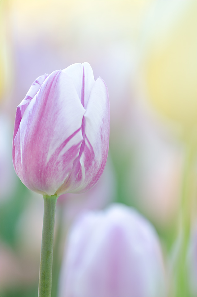
Tulips 7 (two versions)
‹ PreviousFlora GalleryNext ›

Tulips 7 (two versions)

by Nathan Buck

Gallery: FloraPosted May 7, 2014141 views8 comments
I have a few (3) more tulip photos that I would like some honest opinions on.

I will post them over the next few days. Probably three different shots.

Any and all thoughts appreciated. Please be honest!

Thanks in advance.

Nathan

Nikon D7000, Sigma 180 macro, tripod, ISO 200, f4ish

Comments

8 comments
Comment posted by Nathan Buck on May 7, 2014 at 9:16 PM
And a horizontal comp...

Nathan

Nikon D7000, Sigma 180 macro, tripod, ISO 200, f4ish
Registered on November 1, 2003, 1101 Posts, 13589 Comments
Comment posted by Albert Darmo on May 8, 2014 at 1:49 AM
Hi Nathan :wavey: To me, the vertical wins by a mile.. your subject is beautifully captured, with sublime soft detail and color :toast:


Albert Darmo
Canada
Registered on November 25, 2008, 1386 Posts, 11978 Comments
Comment posted by Jim Hackley on May 8, 2014 at 6:32 PM
I also like the vertical much better. Not sure why but I happen to like the image Tulips 6 better. Maybe because you can make out full tulips in the background and sometimes an OOF white color tends to draw the eye away versus other colors. I really like the wonderful low perspective you are getting on all your tulip images.
Registered on September 17, 2009, 302 Posts, 5535 Comments
Comment posted by Ian Wolfenden on May 8, 2014 at 8:03 PM
I like both, Nathan, with a slight preference for the vertical. They are very different images : the prominence of the oof yellow bloom in the horizontal version nicely counterpoints the main flower. But then I always feel stems are so important, and the greater space at the top of the vertical image sets the tulip off the best for me. Nice high key treatment.
Registered on May 18, 2007, 1108 Posts, 7647 Comments
Comment posted by Philip Hodgkins on May 8, 2014 at 8:08 PM
I would have to go with the vertical, both for the thirds position of the bulb and length of the stem, but also it gives a much more commanding presence to what should be the subject—the one tulip, supported by lesser submissive OOFs. :smile:
Registered on July 24, 2006, 2741 Posts, 12349 Comments
Comment posted by Howard Cheek on May 9, 2014 at 12:56 PM
In this case, I prefer the horizontal. More space around your subject (the vertical's a bit close, left side), & the BG colors are 'livelier' Nathan.
In the horizontal the BG forms & colors are still soft enough that they add more than they compete IMHO
I may be the oddball here, but it really is a matter of personal taste after all:smile:
Registered on July 24, 2008, 1201 Posts, 10758 Comments
Comment posted by Bob/Charly Nelson on May 9, 2014 at 2:11 PM
hands down the vertical is my choice Nathan. Just a wonderful piece of art.
Bob :wavey:
Registered on January 29, 2014, 35 Posts, 398 Comments
Comment posted by Larry Lynch on May 20, 2014 at 9:30 PM
I too like the vertical. Looks like a work of art!! Beautiful job Nathan.
Registered on September 16, 2006, 773 Posts, 9940 Comments