Nature Photographers Network
This is the preserved archive of the original Nature Photographers Network. The community continues at naturephotographers.network.
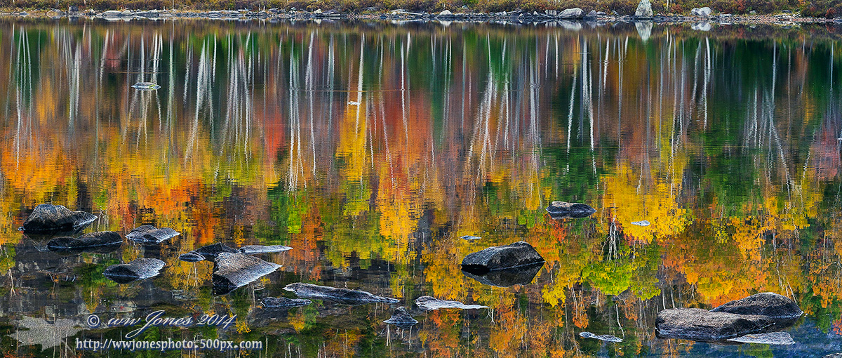
Quiet Water/Bright Color
‹ PreviousWeekly Challenge GalleryNext ›

Quiet Water/Bright Color

by Wayne Jones

Gallery: Weekly ChallengePosted May 2, 2014470 views17 comments
Round Pond is my favorite Adirondack Pond for fall colors, largely because the beaver have not eaten all the paper birch yet. Catching it when the winds are calm can be a challenge. I posted some other shots from this place in the Landscape Gallery, but not this one.

Canon 5D3
Canon 24-105mm.; Circ. Pol.
1/15 sec. @ f/11; ISO 320
This is a crop from a long panorama of 11 vertical frames.

Comments

17 comments
Comment posted by Mike Ramy on May 2, 2014 at 3:10 AM
Very impressive colors and reflection in this composition Wayne, I can see why it is one of your favorite spots in the fall.
This image looks like a painting if not for the reality of the shore line at the top.
Great post for this WC . . . :toast:
Registered on June 16, 2012, 567 Posts, 2809 Comments
Comment posted by Mark Seaver on May 2, 2014 at 2:11 PM
That's one glorious reflection, Wayne! The colors are fabulous and the touch of reality provided by the foreground rocks and distant shoreline feel like perfect additions.
Registered on January 23, 2011, 1103 Posts, 17270 Comments
Comment posted by Peter Cross on May 2, 2014 at 5:21 PM
I remember the series you posted earlier. Spectacular place. I'll bet it's even pretty at other times of the year. A nice comp and the exposure is right on. Looks like you're shadow and the trees are in sunlight. Certainly makes them pop! Nice work.
Registered on April 3, 2010, 271 Posts, 1342 Comments
Comment posted by Rick Diffley on May 2, 2014 at 5:31 PM
Lovely image. Great capture!
Registered on April 8, 2012, 52 Posts, 279 Comments
Comment posted by Jim Lockhart on May 2, 2014 at 6:50 PM
Beautiful colors reflected in the quiet waters Wayne. Always like the inclusion of a foreground too, and the far shore balances everything nicely. I must put this pond on my list when visiting the area; have paddled Long Lake and Lake Harris in the area.
Registered on February 19, 2013, 91 Posts, 500 Comments
Comment posted by Paul Breitkreuz on May 2, 2014 at 7:58 PM
I really like the pano look here, Wayne. Seems to really fit the very colorful horizontal view of this autumn scene so nicely. I'm glad to see you included the slice of shoreline on the other side. I'm not sure it would have presented as well without that small added boundary or line of demarcation. Excellent execution all the way around...... :cool:
Registered on February 25, 2006, 525 Posts, 8448 Comments
Comment posted by Gary Minish on May 2, 2014 at 10:28 PM
Very nice reflection shot, Wayne! Great colors and details plus I like the layered appearance. I think the inclusion of a little more above the water line at the top would have balanced the layers a bit more but that's just a guess.
Registered on February 4, 2006, 625 Posts, 3583 Comments
Comment posted by gary phillips on May 3, 2014 at 2:51 AM
This is really sweet, Wayne. I think you could make a great living just off the shots you've presented on NPN from this location. Fabulous. :toast: :toast: :wavey:
Registered on October 24, 2013, 185 Posts, 4136 Comments
Comment posted by Scott Fricke on May 3, 2014 at 3:20 AM
Gorgeous image Wayne, great colors and the foreground rocks work perfectly in the pano format. Just a personal preference, but I would crop out the top to get rid of the shoreline and the rock reflections, to my eye it just seems too tight to the top of the image. I think I always tend to want to simplify an image and the crop tome focuses the eyes on the colorful trees and rocks which are the real meat of the image. :toast:
Registered on January 19, 2007, 133 Posts, 1448 Comments
Comment posted by Carolyn Derstine on May 6, 2014 at 3:04 PM
Another fantastic entry from you for this theme, Wayne! :smile: I really like how the vividly-colored leaf reflections are sandwiched between the grayish colors of the foreground rocks and the tree trunks. While the inclusion of the bank works well to give a sense of the real setting, for a more abstract take, you could also eliminate that far bank altogether. Pano comp works great for this scene. Fine shot! :smile:
Registered on February 16, 2011, 610 Posts, 3684 Comments
Comment posted by Keith Bauer on May 8, 2014 at 3:38 PM
Sweet frame. Glad this image was selected for a WP as I missed it in the Weekly Challenge gallery. Love the pano crop. Great execution for an 11 image stitch.
Registered on November 20, 2003, 458 Posts, 4836 Comments
Comment posted by Sharon Hallowell on May 8, 2014 at 10:12 PM
Beautiful image; lovely colors. Fills me with a sense of longing to be there! Really nice, Wayne! Sharon
Registered on November 1, 2003, 392 Posts, 4810 Comments
Comment posted by John Tobias on May 8, 2014 at 11:58 PM
Congratulations Wayne, well deserved.
Registered on September 12, 2009, 2120 Posts, 6455 Comments
Comment posted by SandyRichardsBrown on May 9, 2014 at 4:39 PM
just stunning - another real beauty!
Congrats on an excellent WP!
Sandy
Registered on November 24, 2003, 3937 Posts, 12909 Comments
Comment posted by Patrick O'Healy on May 10, 2014 at 7:36 PM
Lovely image. Simply stunning. :toast:
Registered on March 13, 2011, 326 Posts, 1679 Comments
Comment posted by Bill Fach on May 10, 2014 at 9:39 PM
Wayne: What a wonderful scene superbly captured. Congrats on the WP! >=))>
Registered on November 1, 2003, 1805 Posts, 26981 Comments
Comment posted by Daniel & Loana on May 13, 2014 at 9:09 PM
Great colours Wayne. Strong composition.
Congrats on the WP!

D&L
Registered on October 7, 2008, 166 Posts, 3044 Comments