Nature Photographers Network
This is the preserved archive of the original Nature Photographers Network. The community continues at naturephotographers.network.
Spellbound (with re-post)
‹ PreviousLandscape GalleryNext ›

Spellbound (with re-post)

by Carey Closs

Gallery: LandscapePosted April 25, 2014448 views12 comments
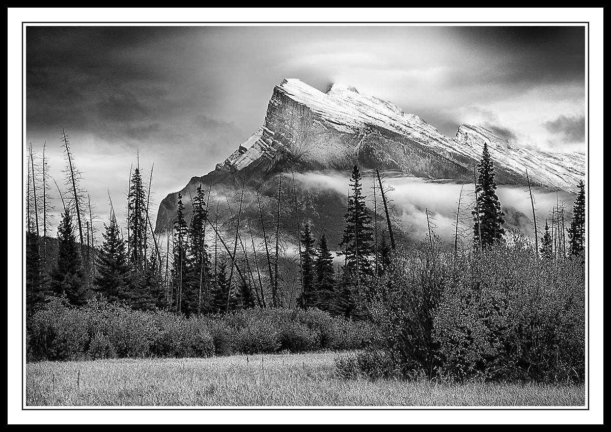
This was one of the first images I posted here when I joined NPN in 2012. There was a lot of feedback and suggestions on how to improve the image but given my abilities at the time, I wasn't able to make it much better. Since then though, I have acquired some new software and course more experience and managed to fix it somewhat so I thought I would repost it today, on the 2 year anniversary.

The original is in my gallery for comparison
http://www.naturephotographers.net/imagecritique/ic.cgi?a=vp&pr=190681&CGISESSID=5fdc2f8b9cab99472a9b6d56faf0824e&u=4212

Thanks for looking and please let me know if you think it is an improvement. :toast:

Comments

12 comments
Comment posted by Alan LaFaver on April 25, 2014 at 8:00 PM
First thing, before I critique....DADGUM!!! That is an awesome scene and great composition. I love landscape photos and B&W. I'm no expert on either but I'll throw my hat in the ring....

I would love to see the original image to see what you started with.
As for the processing, overall, I think there is too much sharpening on the entire image, but especially on the bottom half. I like what you did on the top half of the new version. To me, it's almost perfect, maybe just the tiniest bit too sharp. For the bottom half, I like the tones, brightness, contrast better on the previous version. The bottom half of the new version is WAY too sharp for my taste. Uniformly too bright also.
If it was my shot, I would try to make the mountain and sky the main focus, so I'd try not to lighten the foreground too much. Also wouldn't sharpen the FG at all, I think.

Regardless, great shot. I would be extremely proud if this was in my portfolio.
:toast:
Registered on February 28, 2014, 18 Posts, 147 Comments
Comment posted by Jeffrey Sipress on April 25, 2014 at 9:54 PM
Fine imaging, Carey. Really sets a mood. When I see something like this I always wish I were about 40 feet higher for the perfect vantage point.
Registered on February 17, 2004, 236 Posts, 1197 Comments
Comment posted by John Williams on April 25, 2014 at 11:38 PM
My thoughts were just about exactly what Alan said (especially the DADGUM part).
Registered on September 6, 2007, 221 Posts, 5985 Comments
Comment posted by Stuart Williams on April 26, 2014 at 12:44 AM
nicely done ...i love the top two-thirds of the image but would happily go to your original post for the bottom two-thirds (although the comments about the over-sharpening ring true and it's difficult to say whether the bottom third is an artefact of the sharpening business or the tones). still a moody and great atmospheric image.
Registered on December 7, 2007, 247 Posts, 4792 Comments
Comment posted by Carey Closs on April 26, 2014 at 1:24 AM
In regards to the sharpening, I was attempting to address some of the issues that were pointed out in the original post but it does appear that I overcompensated with he structure in Silver FX2. Same goes or the brightness in the lower half. Here's a repost and thanks for the feedback :toast:
Registered on April 15, 2012, 107 Posts, 326 Comments
Comment posted by Roel Wijtmans on April 26, 2014 at 2:10 AM
Nice image indeed! I too think it got a bit too much sharpening, but the repost looks great to me! The darkened foreground really adds a lot.
Registered on September 30, 2012, 116 Posts, 2257 Comments
Comment posted by David Chauvin on April 26, 2014 at 9:02 AM
Beautiful composition and moody atmosphere. I think the third round is best. :cool:
Registered on August 5, 2004, 1007 Posts, 5595 Comments
Comment posted by Eva McDermott on April 26, 2014 at 7:48 PM
Striking B&W Carey. Aside from the sharpening, I like this a lot and your repost is best.
Registered on January 4, 2009, 1015 Posts, 13229 Comments
Comment posted by Mark Metternich on April 26, 2014 at 10:54 PM
Nice classic yet punchy B+W. :toast:
Registered on June 19, 2009, 276 Posts, 6240 Comments
Comment posted by Mark Seaver on April 27, 2014 at 3:06 PM
The difference in processing amazing, Carey. The two versions convey completely different feelings. I must say that I prefer this version although it looks like you've over sharpened this one, with all of the foliage looking distinctly crunchy. The repost, below, is nicely improved, although still a touch crunchy in the shrubbery. This looks very much like a classic mountain b&w, well worth getting right.
Registered on January 23, 2011, 1103 Posts, 17270 Comments
Comment posted by Ed Lowe on April 27, 2014 at 10:57 PM
I think you nailed it with the repost, Carey. The darkened FG puts more attention on all that mood and atmosphere going on in the BG. Great image.

Ed
Registered on February 7, 2004, 414 Posts, 7115 Comments
Comment posted by Matthew Goldsmith on April 28, 2014 at 2:50 PM
I like everything about this.
Registered on June 29, 2010, 37 Posts, 286 Comments