Nature Photographers Network
This is the preserved archive of the original Nature Photographers Network. The community continues at naturephotographers.network.
Tulips 1
‹ PreviousFlora GalleryNext ›

Tulips 1

by Nathan Buck

Gallery: FloraPosted April 22, 2014194 views14 comments
Echoes

Hi all.

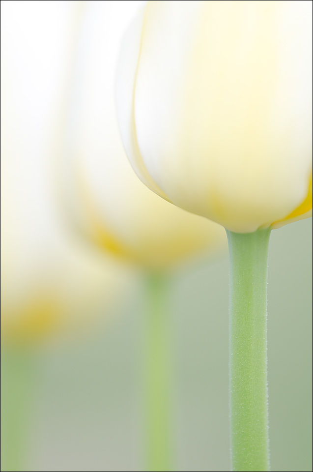
I have been able to shoot some tulip photos recently. I liked the simplicity of the white on white tulips. Do I need to tone down the color in the shot and make it all black and white?

Thanks for any and all suggestions!

Nathan

Nikon D7000, Sigma 180 macro, tripod, ISO 200, f4ish

Comments

14 comments
Comment posted by Ken Smith on April 22, 2014 at 7:13 PM
I like the creamy colors and symmetry ... dof too! Unique image ...almost an architectural 'feel'. Well done.
Registered on September 5, 2008, 449 Posts, 2444 Comments
Comment posted by Barb Pflaum on April 22, 2014 at 8:09 PM
Wonderful comp and symmetry, Nathan! I would not tone down the color to make it black and white as you suggested. I think the pastel colors are beautiful and add a lot to this image.
Registered on January 14, 2009, 316 Posts, 2724 Comments
Comment posted by Kathy Barnhart on April 22, 2014 at 8:26 PM
This is perfect as it is and the soft colors are wonderful. The flowers look like goblets lined up, and I like the long stems.
Wonderfully soft and spring-like.
Registered on November 11, 2011, 404 Posts, 1639 Comments
Comment posted by Philip Hodgkins on April 22, 2014 at 8:33 PM
No. Good as is! :toast:
Registered on July 24, 2006, 2741 Posts, 12349 Comments
Comment posted by Ronald Murphy on April 23, 2014 at 9:01 AM
No! This is great as is.
Registered on March 13, 2012, 279 Posts, 975 Comments
Comment posted by Ed Lowe on April 23, 2014 at 9:14 AM
I love this as posted, Nathan. The symmetry and the softness you captured with the tulips is exquisite. I wouldn't change a thing.

Ed
Registered on February 7, 2004, 414 Posts, 7115 Comments
Comment posted by Bob/Charly Nelson on April 23, 2014 at 2:44 PM
I also wouldn't touch this. Just beautiful.
Bob :wavey:
Registered on January 29, 2014, 35 Posts, 398 Comments
Comment posted by Jim Hackley on April 23, 2014 at 3:32 PM
Very creative approach and I would not change a thing. Interesting presentation and point of view. Excellent shot, well seen and well done.
Registered on September 17, 2009, 302 Posts, 5535 Comments
Comment posted by Ian Wolfenden on April 23, 2014 at 5:05 PM
I go with the colour I think, Nathan - though it would be interesting to see a b & w version. Beautifully composed and executed - love the blooms fading into the distance !
Registered on May 18, 2007, 1108 Posts, 7647 Comments
Comment posted by gary phillips on April 24, 2014 at 1:24 AM
For me it doesn't matter if it's b/w or color. A good comp and execution says it all regardless.
Registered on October 24, 2013, 185 Posts, 4136 Comments
Comment posted by Mark Seaver on April 25, 2014 at 11:28 AM
This is lovely as presented, with a fine sense of warm glow. The softly repeated shapes and the diagonal flow of the oof flowers works great. I much prefer this version to the horizontal version as it emphasizes the erect nature of the tulips.
Registered on January 23, 2011, 1103 Posts, 17270 Comments
Comment posted by Albert Darmo on April 25, 2014 at 11:45 AM
Hi Nathan :wavey: To me this is perfectly composed , leave it as is.......:cool: Love the lines and colors. :toast:


Albert Darmo
Canada
Registered on November 25, 2008, 1386 Posts, 11978 Comments
Comment posted by Daniel & Loana on April 26, 2014 at 12:13 PM
Wonderful shot, Nathan. Perfect composition and colours.

D&L
Registered on October 7, 2008, 166 Posts, 3044 Comments
Comment posted by Lorna Taylor on April 26, 2014 at 11:09 PM
Stunning comp. love the creamy colours !
Registered on November 12, 2010, 254 Posts, 3083 Comments