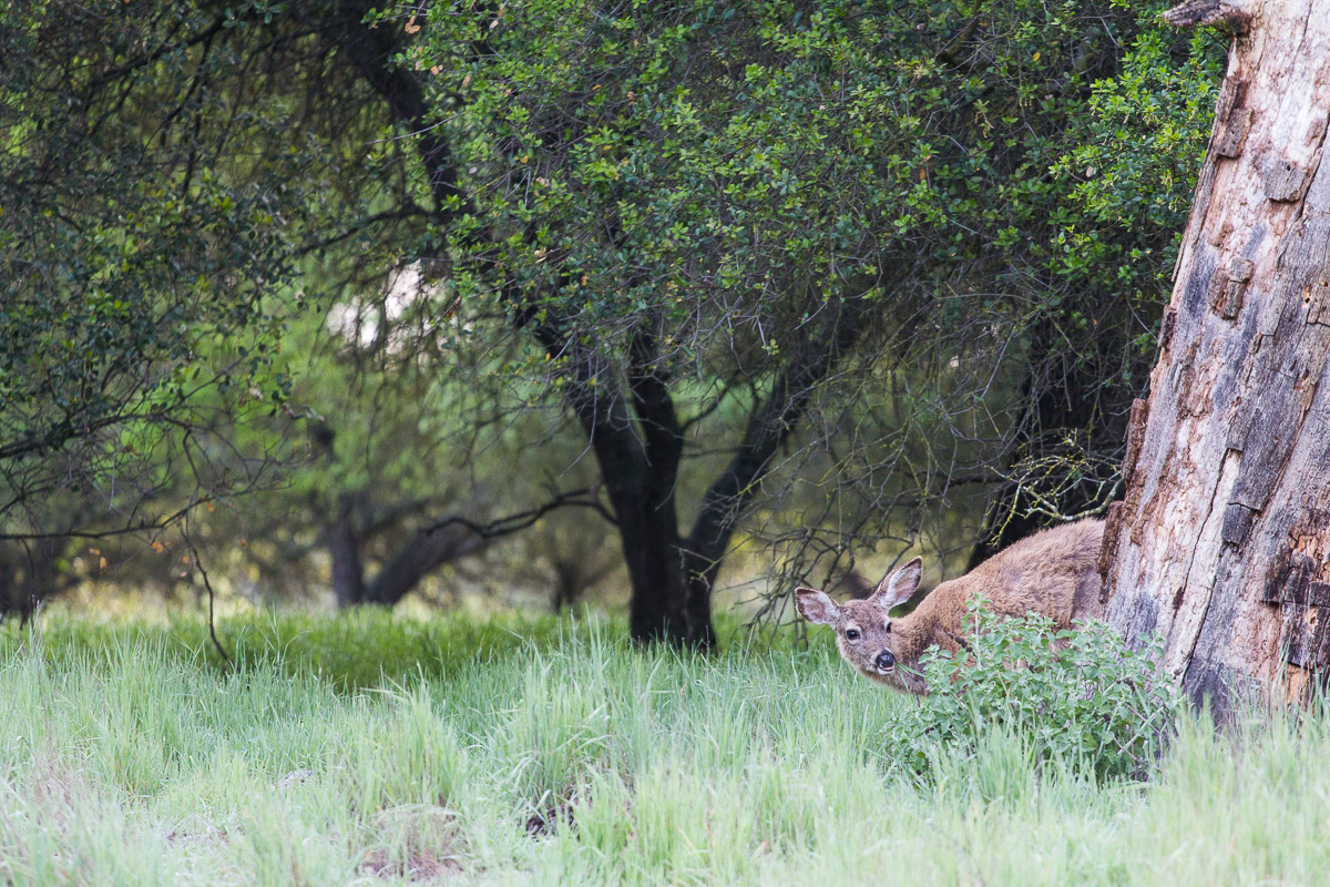
Peek-a-boo
by Peter Cross
This just reminded me of the game babies and little kids play with older folks. My wife thought it was cute, so it gets the nod for posting. Been out due to weather; both physically and literally. Glad to finally make it up to the nature area this morning. I did very little to this as the exposure looks on, saturation is good. I just did some contrast and sharpening to help the deer stand out better and small adjustments to clarity and vibrance. I didn't crop this at all and wonder if cropping in some way might have made it better. I decided not but what do you think? Comments and critiques are welcomed.
Tech Info
Canon EOS 60D with EF 70-200mm f/4L at 200mm
1/200th at f/4.0 and ISO 1250
tripod
Lightroom 5

Comments
6 commentsIt is a nice shot with many good elements. DOF, focus, colors, all look good.
1. General Impression - I like how you have placed the deer in her environment. The habitat is varied and interesting in itself and
invites my eye to explore the frame. The photo immediately struck me as being different in several ways from the usual wildlife
photo and encourages me to spend some time to understand what is happening in the scene. 7/10
2. Subject of Photo - The deer is immediately evident as the subject, even though she is partially hidden. Nice ear carriage and
both eyes are visible and expressive. Very cool how she is peeking around that shrub, makes you wonder what has caught her attention. . Deer are common
wildlife in many part of the world, but it is what you do with the subject photographically that counts, well done! 7/10
3. Composition and Perspective - I love the low point of view Peter, helps to engage the viewer with the subject. I like how you
have balanced the heavy tree on the right edge of the frame with ample space to the left, nicely done! The exaggerated off-
centre placement of the subject works very well here. Nice framing of the subject by the lovely leafy canopy. 9/10
4. Use of Camera, exposure and speed - I like your choice of lens to include subject and habitat in nice proportions. !/200 shutter
speed is perfect for this situation imho. The iso was pushed a little, but was reasonable under the circumstances. 8/10
5. Depth Of Field - Shooting wide open optimized your shutter speed while providing pleasing dof for subject and the background. 7/10
6. Color and Lighting - Very nice greens up in the canopy, however the foreground grass is somewhat bright. The
dark tree trunk in the middle of the frame is rather dark, perhaps lightening it up selectively would make it less prominent so as to not compete with the deer.
The light is crisp and clean as befits a spring day. I'm a fan of the warm light at the edges of day, can't help but wonder how this might have
looked had this been captured during that special time. 5/10
7. Focus - Excellent, nice sharp focus where it matters most Peter. 8/10
Total - 51/70
How to Improve - I really like this effort Peter! I think the composition is outstanding and is what really makes this photo work. I think that a bit more work could be done in post to tone down the foreground exposure somewhat. The lighting, although adequate lacks the oomph to makes this an award winner. Perhaps you might experiment a little with some warming and colour balance to compensate what nature didn't provide.
Had a few minutes to try out this idea, hope it helps you Peter. At very least hope the number ranking doesn't offend. I have no idea whether or not I'll stick to this format, just a trial run I hope might generate some feedback in itself. My typing skills are modest at best, might be the biggest deterrent to this approach as it is a bit time consuming.
I won't try to one-up Gary on his detailed critique, but will say that I'm tending to agree with Mark on this one. More specifically, I think you have a good idea here but that perhaps there's just a little too much negative space on the left side of the frame. In my view if approximately 1/3 of the frame was removed from the left, and then that image was re-presented at 720 pixels (or 1200 pixels in the larger image) - thus slightly increasing the size of the subject along the way - I think the idea would work even better.
Note to Gary: I don't think it's appropriate for me to comment too much on your experiment right here on Peter's post, but I've seen many attempts to tease apart the "contributors" to a good image (i.e., the interacting variables) and provide a numerical "score" for an image. Personally I'm not a fan of them - to me what makes an image successful is - in a sense - much more organic than this and, more importantly to the methodology, the weight of the various contributing variables to image "success" is inherently dynamic (and I have yet to see a scale yet that recognizes that technical concerns can make or break one image but be totally irrelevant in the success of another). But this is probably better discussed within the forum (rather than the gallery).
Cheers...
Brad
Techs look good with with nice details and use of F/4