Nature Photographers Network
This is the preserved archive of the original Nature Photographers Network. The community continues at naturephotographers.network.
Resurrected?/ W Edit
‹ PreviousLandscape GalleryNext ›

Resurrected?/ W Edit

by Chris Chamberlain

Gallery: LandscapePosted March 25, 20141,203 views13 comments
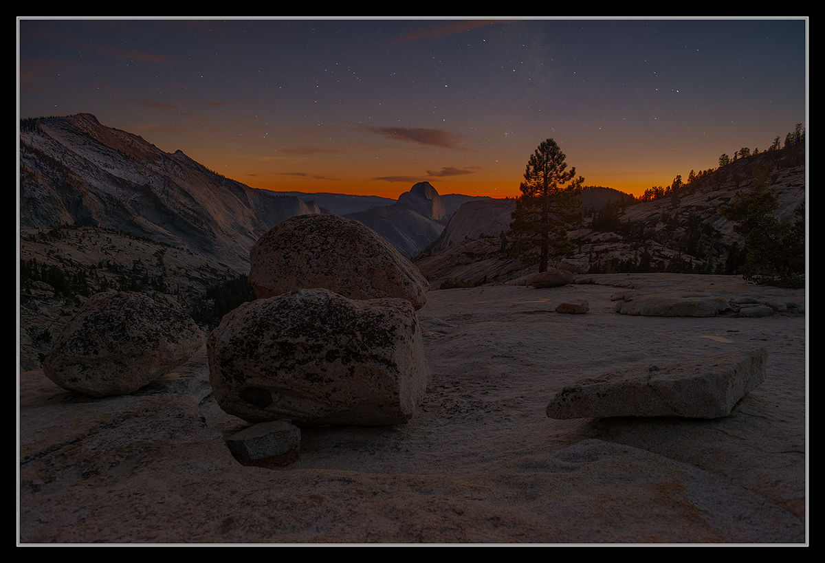
another round of editing on this two exposure blend. My first attempt at blending. The first time around, I didn't know how to get a smooth blend on the horizon with the "Blend If" sliders in Photoshop. I did some research and figured out how to refine the technique a bit. I think I have achieved a good seem this time around. Some additional color adjustments to reign things in a bit too. I was wondering if this couldn't tolerate more saturation though?

Looking at this here after posting, the small version looks a little dark. The large view looks about right to me. Thanks for looking.

Thanks for your thoughts.

D800,
24-70 2.8,
sky exposure, 20sec, F/2.8, iso 800,
foreground exposure, 1/2sec, F/5.6, iso 800,

Thanks,
Chris

Comments

13 comments
Comment posted by Bob Miller on March 25, 2014 at 10:55 PM
Still too dark Chris.
Registered on January 24, 2005, 152 Posts, 405 Comments
Comment posted by Peter Cross on March 25, 2014 at 11:33 PM
I like this Chris. Not sure about the darkness of it. I thought about it some and if I were standing there what would be the level of light. I think it's probably about right as the human eye might see it but seeing how its a 20 sec exposure you get the stars and I would guess the landscape would be a little brighter too. Regardless, its a beauty.
Registered on April 3, 2010, 271 Posts, 1342 Comments
Comment posted by Chris Chamberlain on March 25, 2014 at 11:48 PM
I went back to make a brightness adjustment, and once into photoshop, it looked much brighter there than it does here. Not sure why that is. But, here's an adjustment. And again, it just isn't as bright and vibrant here as it is in photoshop. But, I hope this still helps.

Thanks
Chris
Registered on March 13, 2007, 500 Posts, 8365 Comments
Comment posted by Dan Kearl on March 26, 2014 at 12:11 AM
The repost is better, with the D800, you should be able to bring it up as much as you want.
I think the 1/2 sec exposure was too short however, I would have done several (maybe you did?), and
Had a longer one.
If you are going to do two night exposures, I might have used ISO 200 or so for a long FG exposure.
You could get brightness without noise.
It is all just a guessing game at night, nothing on the back of camera really tells you anything, you just have to do it
A lot I guess.
Anyway, I like it, the sky is perfect.
Registered on September 2, 2013, 209 Posts, 1514 Comments
Comment posted by Roel Wijtmans on March 26, 2014 at 3:55 AM
To be honest I like the original more.... The repost is a bit too bright for me. But dark pictures don't look good on the white background of this site, which is why the large version looks a lot better. Neat photo for sure!
Registered on September 30, 2012, 116 Posts, 2257 Comments
Comment posted by Nick Bristol on March 26, 2014 at 9:07 AM
Chris, This is very nice! I like the night look and feel this has. The sky looks great and the whole scene is especially nice in your larger version. I think your repost looks good and I'm just wishing I could see it larger too. Would be really nice seeing these on a dark background! :smile:

Nick Bristol
Lone Rock, WI
Registered on February 1, 2004, 752 Posts, 14140 Comments
Comment posted by Jose Fernandez on March 26, 2014 at 12:15 PM
I think as Roel, in my monitor the darkness of the first version is very nice. Great image
Registered on July 25, 2011, 77 Posts, 172 Comments
Comment posted by gary phillips on March 26, 2014 at 12:22 PM
I have very little experience with night shots, Chris. To me the repost is better, but things still look a little dark on my monitor. As has been said, the sky is perfect.
Registered on October 24, 2013, 185 Posts, 4136 Comments
Comment posted by Nathan Apodaca on March 26, 2014 at 4:25 PM
Really like the scene. So my general thoughts may be that the sky is too burnt-orange, and doesn't seem to quite match up to the coolness of the bottom, or at least the distant hills on the horizon. They both seem disconnected, at least to me. I'm not very experienced with these shots either, so take my comments with a grain of salt! :smile:
Registered on November 16, 2011, 67 Posts, 1127 Comments
Comment posted by Harley Goldman on March 27, 2014 at 6:20 PM
I like the large version. Darker works fine for me. The repost also looks good, but I still prefer the darker large version. This turned out real well, Chris.
Registered on November 19, 2003, 586 Posts, 11271 Comments
Comment posted by Kah Kit Yoong on March 28, 2014 at 6:13 PM
A Really well balanced composition. I like the lighter version myself.
Registered on September 27, 2006, 636 Posts, 10682 Comments
Comment posted by Jared Warren on March 29, 2014 at 11:07 AM
I might have used a longer exposure for the foreground with lower ISO, but the difference is probably imperceptible. It's hard to appreciate with the light background, but it's a great image!
Registered on May 11, 2012, 84 Posts, 931 Comments
Comment posted by John Williams on March 31, 2014 at 9:31 PM
Love it Chris. The lighter version looks better on this white, but this type of image really needs black.
Registered on September 6, 2007, 221 Posts, 5985 Comments