Nature Photographers Network
This is the preserved archive of the original Nature Photographers Network. The community continues at naturephotographers.network.
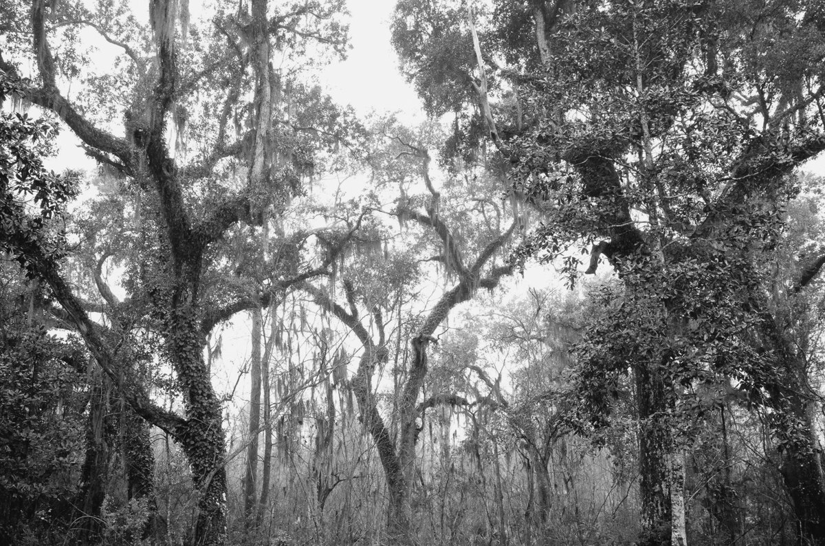
swamp oaks
‹ PreviousLandscape GalleryNext ›

swamp oaks

by Alan LaFaver

Gallery: LandscapePosted March 18, 2014156 views9 comments
Feedback, both technical and artistic, requested.

D7000, Tokina 12-24mm f/4 @ 24mm
f/11
1/60s
1600 ISO
Tripod

Since I was using a tripod, I should have dropped ISO to 100, used a much slower shutter speed, and mirror up.

Thanks,
Al

Comments

9 comments
Comment posted by Philip Hodgkins on March 18, 2014 at 11:32 AM
Your self critique is noted. Artistically, the picture has merit. The weakest part of the picture is the lack of tonality, particularly black. If mood is important here, and I think it is, the lack of richer blacks weakens the mood. :smile:
Registered on July 24, 2006, 2741 Posts, 12349 Comments
Comment posted by gary phillips on March 18, 2014 at 12:24 PM
I agree with your self assessment . I like the comp, Alan. Lots of possibilities here but some are lost to middle grayness. I would encourage you to jump in and comment on the work of others. It is tremendous tool to help with your own photography and your insights can and will help others.
Registered on October 24, 2013, 185 Posts, 4136 Comments
Comment posted by Stan Rose on March 18, 2014 at 1:58 PM
I agree with the others--tonality is an issue. Its an extremely busy/chaotic shot--the question is it cohesive? Im not sure, maybe playing with the tonality/contrast might work. Its a cool subject for sure. :wavey:
Registered on September 15, 2005, 836 Posts, 17099 Comments
Comment posted by Daniel Finchum on March 18, 2014 at 11:24 PM
Your thumbnail comp caught my eye so that is appealing but when viewed larger the others comments already made about mid-tone contrasts is spot on. Fix that and I think you got a very nice pic.
Registered on September 8, 2013, 43 Posts, 222 Comments
Comment posted by Stuart Williams on March 19, 2014 at 6:50 AM
al - broadly, i like it. with this sort of image (in which i dabble myself a fair bit), getting the tones good is challenging as well as the cohesiveness (as stan rightly pointed out). the brighter tones in the sky could be tamed a little and the tones in the trees a little more interesting. challenging it is!
Registered on December 7, 2007, 247 Posts, 4792 Comments
Comment posted by Alan LaFaver on March 19, 2014 at 1:08 PM
well......i'm learning. Frustrated also. I put this up to get some feedback as I was unsure about it. I made some adjustments, but I just don't like it. sky/light wasn't good to start with. I cropped, increased contrast, white and black points, and sharpened the center. Looks like fido's ass to me.

I'm going to go back and read up more on black and white. Ansel Adams maybe? On one hand, I see what people are saying in their feedback. Black and white, I guess, like anything, has general rules, and one should follow them to some extent. Now, I've just got to go find those rules and learn them.
Registered on February 28, 2014, 18 Posts, 147 Comments
Comment posted by Chris Chamberlain on March 20, 2014 at 11:54 PM
I like the scene, and the comp. The bright "detailess" sky kind of hurts it a little. I agree with it needing some more contrast/tonal separation too. So my suggestion in this kind of situation would be to find a comp or subject that can use less or no sky.

I see the repost, it is better imo. The best suggestions I could make would be to echo those that you stated yourself under your post. While modern cameras can do very well with increased iso. I would never raise it if not necessary. Noise becomes an issue when trying to do too much recovery with exposure issues. Noise can also be increased or introduced with too much processing. So yes, low iso, tripod, mirror lock-up, any time your subject is static. Unless, you to eliminate unwanted motion blur or something like that.

Chris
Registered on March 13, 2007, 500 Posts, 8365 Comments
Comment posted by Thomas Miller on March 26, 2014 at 10:36 AM
I agree with the others about the tones. The whites are definitely blown out, and I might have cropped it differently. But it looks like a good spot to try out other ideas.
Registered on March 10, 2011, 56 Posts, 56 Comments
Comment posted by John Williams on March 31, 2014 at 9:16 PM
While I agree with much of the above, I think the original is pretty good. My thought would be to open the midtones a bit, especially the range involving the background tree leaves, and to slightly warm the image.
Registered on September 6, 2007, 221 Posts, 5985 Comments