Nature Photographers Network
This is the preserved archive of the original Nature Photographers Network. The community continues at naturephotographers.network.
Bedwell River Valley
‹ PreviousLandscape GalleryNext ›

Bedwell River Valley

by Bill Reid

Gallery: LandscapePosted March 10, 2014224 views15 comments
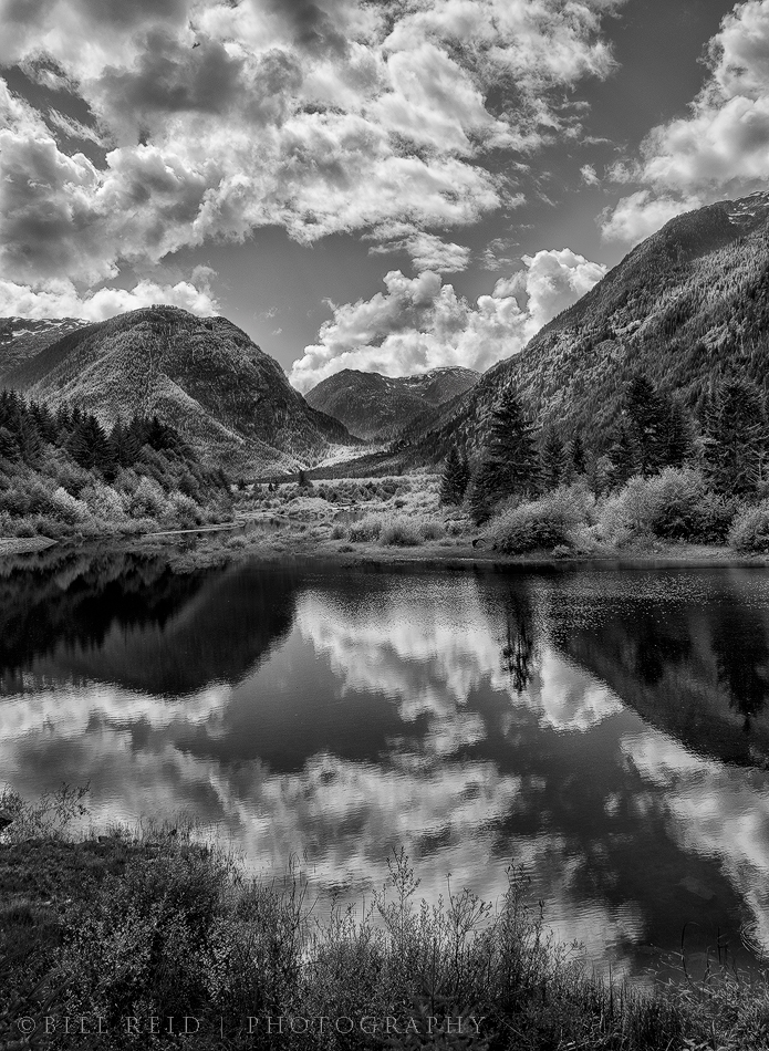
I don't do much B&W so I thought I would take a crack at it. This is from one of my favorite places on the island, Strathcona Park in the central island area. Processed a bit contrasty and left sharpening in the clouds as it seemed to add a bit of drama. Haze down the valley from a fire in the area. Interested in your opinions on the processing.


Nikon D7000
18-105 @24mm
ISO 100
1/4 sec. @ f16
CPL and Grad ND soft
Silver FX pro

Comments

15 comments
Comment posted by Jared Warren on March 10, 2014 at 11:03 AM
Bill, I think this is gorgeous. The comp is great, with a nice foreground, great reflection, and awesome cloud action. My personal preference would be for slightly less contrast overall, but that's probably just an issue of personal taste. Makes a great b&w but I imagine it's also great in color. :toast:
Registered on May 11, 2012, 84 Posts, 931 Comments
Comment posted by Ronald Murphy on March 10, 2014 at 11:06 AM
To my eye, a very nice range of tones. The sky is particularly eye-catching. I've so far been afraid to try B&W.
Registered on March 13, 2012, 279 Posts, 975 Comments
Comment posted by Nancy Lea Sandy on March 10, 2014 at 12:01 PM
Excellent job. I love all the textures and the high contrast. Nice
Registered on January 24, 2011, 576 Posts, 6942 Comments
Comment posted by Mark Seaver on March 10, 2014 at 12:24 PM
This is a wonderful scene in b&w, Bill. I think the sky looks particularly good. In the larger version, the bright areas of the shrubs and mountain sides look quite "crunchy" which could be over sharpened or the high contrast.
Registered on January 23, 2011, 1103 Posts, 17270 Comments
Comment posted by gary phillips on March 10, 2014 at 1:17 PM
Looks great, Bill. Beautiful comp and I wouldn't change thing. One thing to watch for, and I've been burned by several times, is haloing along ridge lines, particularly where dark meets light clouds or highlights. I think that is perhaps my biggest concern with silver effects. The slightest tweeks can make a big difference. I've adopted,as part of my work flow in raw processing, to always do a chromatic aberration fix before conversion. Great job and I hope to see more b/w from you. :toast:
Registered on October 24, 2013, 185 Posts, 4136 Comments
Comment posted by Eva McDermott on March 10, 2014 at 1:35 PM
The sky especially came out fantastic Bill. I like the mix of tones in the mid ground as well.
Registered on January 4, 2009, 1015 Posts, 13229 Comments
Comment posted by Louis Pattis on March 10, 2014 at 1:43 PM
I would love to hike up this valley, looks so inviting, the cool tonal range for your choice of the B&W conversion is to my liking and outstanding. The level of contrast looks fine on my monitor.
Registered on March 30, 2012, 0 Posts, 164 Comments
Comment posted by Doug Roane on March 10, 2014 at 2:31 PM
I think the BW conversion is excellent, Bill! The image comp itself is fair, but not great, as it is hard to pick out a main subject for the eye to settle on - the hills and trees are nice, but not a strong focal point. It leaves me feeling like it's missing something and I want to see more of the scene. If you wanted to emphasize the sky, then I would get rid of the foreground grass so the eye starts with the reflection. In fact, cropping off the bottom grass and cropping in from the right looks pretty good to me, and places that prominent tree in a more dominant position. That's my 2 cents!
Registered on December 12, 2008, 213 Posts, 2226 Comments
Comment posted by Nick Bristol on March 10, 2014 at 5:33 PM
Hi Bill, I like this image a lot. Hope I can make it there one of these days. Your b&w processing really appeals to me and I quite enjoy the tones you have here. I really like those clouds. :toast: Cheers

Nick Bristol
Lone Rock, WI
Registered on February 1, 2004, 752 Posts, 14140 Comments
Comment posted by Harley Goldman on March 10, 2014 at 6:04 PM
This turned out real well, Bill. You should do B&W more often!
Registered on November 19, 2003, 586 Posts, 11271 Comments
Comment posted by Dan Kearl on March 11, 2014 at 10:04 PM
The processing is really good here. A lot of contrast, blacks and whites.
I only wish the water was more glassy but still very well done.
Registered on September 2, 2013, 209 Posts, 1514 Comments
Comment posted by Kane Engelbert on March 11, 2014 at 10:45 PM
Hi Bill, nice dive into B&W. However to my eye this one seems a bit chaotic. I appreciate the B&W application with this nice contrasty scene. I do agree with a few of the earlier comments. There's a lot going on here with just black and white showcasing your comp. Leaving out the foreground bushes and cropping the sky by about 20% would help alleviate most of the chaos. i like the idea of sharpening the clouds and sky, what about a slight smoothing of the foreground and water with adding a bit of Gaussian Blurr just to the water areas?
Registered on June 14, 2009, 63 Posts, 291 Comments
Comment posted by David Chauvin on March 13, 2014 at 7:19 AM
The comp and processing look fine to me, Bill. I like the suggestion of less sharpening in the water. :cool:
Registered on August 5, 2004, 1007 Posts, 5595 Comments
Comment posted by Vance Gese on March 13, 2014 at 7:55 PM
Love your composition, Bill, and the nice luminous quality to the clouds. Excellent b/w work.
Registered on November 13, 2008, 298 Posts, 6629 Comments
Comment posted by Bill Reid on March 15, 2014 at 12:10 PM
Thanks everybody for the kind comments. Doug and Kane thanks for the input and I'll try playing with your ideas and see what happens. Thanks for the input.
Registered on January 27, 2013, 65 Posts, 2460 Comments