Gallery: AvianPosted March 2, 2014126 views7 comments
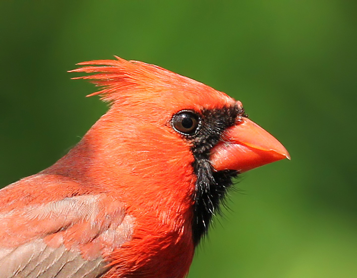
This is from my backyard near my feeders last May. This is a very large crop.
Canon 60D, 100-400 IS lens@400mm, f7.1, 1/640 sec., ISO 640.
Comments
7 comments
Comment posted by Peter Cross on March 2, 2014 at 7:57 PM
Handsome devil, Barb. Nice comp with really good detail of his feathers, considering the large crop . Excellent BG, too. I'd experiment with a reduction of exposure as most of the image looks over exposed and probably would look better if a little subdued. My personal preference but certainly up to you. Nice no matter what.
Registered on April 3, 2010, 271 Posts, 1342 Comments
Comment posted by Barb Pflaum on March 2, 2014 at 8:21 PM
Thank you for your comments, Peter. Is this what you had in mind when you suggested a reduction in exposure?
Registered on January 14, 2009, 316 Posts, 2724 Comments
Comment posted by Peter Cross on March 2, 2014 at 11:00 PM
Yeah, that looks pretty good to me. Still a good lookin' dude. I miss then from my times in the east.
Registered on April 3, 2010, 271 Posts, 1342 Comments
Comment posted by Rick Cloran on March 3, 2014 at 3:17 PM
It holds up nicely for a large crop. The repost does look better. A very handsome fella.
Registered on April 6, 2004, 119 Posts, 1989 Comments
Comment posted by Dennis Plank on March 3, 2014 at 4:59 PM
Nice portrait, Barb. The repost does look a bit better. it looked to me as if the reds were oversaturated in the original. You could try just desaturating the reds until they don't show blocked on the histogram.
Registered on January 28, 2008, 1767 Posts, 23192 Comments
Comment posted by David Haynes on March 5, 2014 at 12:10 AM
Hi Barb,
Very colorful Dude for sure and a nice portrait. The head angle is just perfect with a very slight look towards you. It's fairly sharp given the extreme crop you suggest and yes, I much prefer the repost which is just slightly less harsh with the highlights. I would take more off the top to make it a little more balanced. It just seems like there is too much negative space. Maybe crop out about 40-50% of the space above the crest. Otherwise you have a really nice image here. Would have loved to have seen a larger version posted.
Registered on February 20, 2010, 110 Posts, 1511 Comments
Comment posted by Howard Cheek on May 2, 2014 at 9:34 PM
Even with the large crop it's a cool profile view, I love cardinals of course
The re-post's a good improvement comp wise, I prefer it Barb.
Have a great weekend!
Registered on July 24, 2008, 1201 Posts, 10758 Comments

Comments
7 commentsVery colorful Dude for sure and a nice portrait. The head angle is just perfect with a very slight look towards you. It's fairly sharp given the extreme crop you suggest and yes, I much prefer the repost which is just slightly less harsh with the highlights. I would take more off the top to make it a little more balanced. It just seems like there is too much negative space. Maybe crop out about 40-50% of the space above the crest. Otherwise you have a really nice image here. Would have loved to have seen a larger version posted.
The re-post's a good improvement comp wise, I prefer it Barb.
Have a great weekend!