Nature Photographers Network
This is the preserved archive of the original Nature Photographers Network. The community continues at naturephotographers.network.
Looking out to Sea +
‹ PreviousLandscape GalleryNext ›

Looking out to Sea +

by Nick Bristol

Gallery: LandscapePosted March 2, 2014423 views28 comments
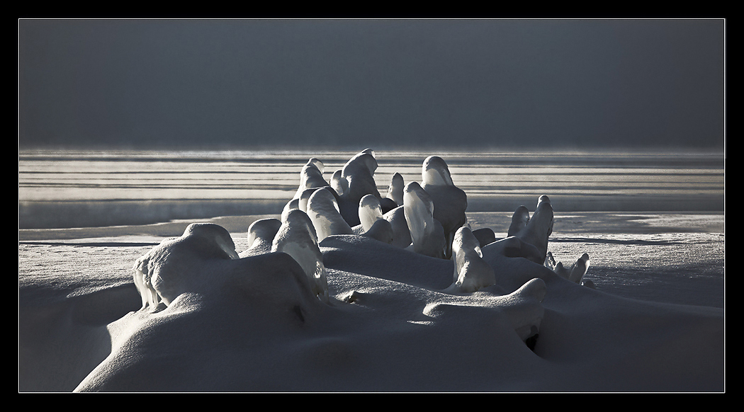
This is an image I made a couple of weeks back from my Lake Superior trip. I took this on a cold early morning while out on Madeline Island in Big Bay State Park. I posted a different comp of this not long ago and had comments about the shapes kind of looking like seals. They are small trees frozen in the ice and snow but do remind me of seals looking out to sea. I though it captured the cold feel and look of Lake Superior in this very cold winter. Larger version included.
5D3, 70-300L @180mm, iso 200, f/16 at 1/320 sec.

Comments

28 comments
Comment posted by Paul Breitkreuz on March 2, 2014 at 1:05 PM
:smile: Excellent. I really like this one, Nick. It gave me a flashback to areas I worked in years ago now. The uprights or foreground formations set this one up very nicely. The unending backdrop works perfectly too.
Registered on February 25, 2006, 525 Posts, 8448 Comments
Comment posted by John Williams on March 2, 2014 at 1:11 PM
Excellent play of light and form Nick; really good. Personal preference is a tighter crop, moving the leading line of light closer to the left and reducing the empty space on the top.
Registered on September 6, 2007, 221 Posts, 5985 Comments
Comment posted by gary phillips on March 2, 2014 at 1:15 PM
I like this even more than the other similar image,Nick. Beautiful light and comp. Those seals are awesome :cool:
Registered on October 24, 2013, 185 Posts, 4136 Comments
Comment posted by Mark Seaver on March 2, 2014 at 2:07 PM
The lighting and textures are great, Nick. For me this feels like some kind of alien medieval landscape with the random towers in the foreground and the neat streaks of light in the distance. Very well seen!
Registered on January 23, 2011, 1103 Posts, 17270 Comments
Comment posted by Joseph Campisi on March 2, 2014 at 2:11 PM
Those formations almost look like petrified penguins Nick! Great contrast of light and shadow. And I like John's suggestion.
Registered on November 24, 2008, 304 Posts, 3211 Comments
Comment posted by Nick Bristol on March 2, 2014 at 2:22 PM
Thank you guys! Appreciate your thoughts and suggestions.
John, I'll work up a version like that and see how it looks.
Joe, Yes, I see the penguins too...thanks. :smile: Nick
Registered on February 1, 2004, 752 Posts, 14140 Comments
Comment posted by Eva McDermott on March 2, 2014 at 4:09 PM
Another wonderful image Nick but my preference is your original version with the tighter crop around the ice forms and the B&W treatment. None-the-less this also has some great quality light.
Registered on January 4, 2009, 1015 Posts, 13229 Comments
Comment posted by Andrew Waddington on March 2, 2014 at 4:37 PM
Sitting in the Caribbean right now just the sight of this makes me feel cold. They certainly do look like frozen seals, I love the shadows and the simplicity of the image.
Registered on February 11, 2014, 44 Posts, 183 Comments
Comment posted by Brian Schrayer on March 2, 2014 at 6:06 PM
This is another excellent composition, Nick. I think I prefer the B&W image that you posted previously - for some reason the B&W just seems to convey the mood a little better. But, this still stands nicely on its own merit too.
Registered on May 28, 2004, 114 Posts, 2890 Comments
Comment posted by Nick Bristol on March 2, 2014 at 7:22 PM
Thanks Eva, Andrew and Brian! Sure appreciate your comments. Working on a b&w version and with a crop John thought might work. I will try and add that in this thread tomorrow. Leaving the studio and heading to the house for the night where we have a nice warm fire going.
p.s. Andrew, The Caribbean sounds pretty good at this point in a very cold winter! :smile:
Registered on February 1, 2004, 752 Posts, 14140 Comments
Comment posted by Vance Gese on March 2, 2014 at 7:52 PM
This is an incredible image, Nick. The sculptural qualities of these forms combined with that beautiful light, really makes this one unique and amazing image. Love the tones you achieved in this color version. Looking at the b/w version you referred to, I will have to say that I very much prefer this color version; maybe the feel of cold comes through more so in this one. You could probably even bring out more of the blues in those grays to play on the cold feel, but to be honest with you, this looks fantastic as is. Looks like the deep freeze you guys are experiencing hasn't kept you indoors.
Registered on November 13, 2008, 298 Posts, 6629 Comments
Comment posted by Louis Pattis on March 3, 2014 at 4:29 PM
This screams Antarctica, I see penguins instead of seals, just a great capture overall, a little increase in the blues may convey the cold even more. Give as more ice and caves.
Registered on March 30, 2012, 0 Posts, 164 Comments
Comment posted by Chris Chamberlain on March 3, 2014 at 9:59 PM
Awesome! Looks like it could Antarctica.

Chris
Registered on March 13, 2007, 500 Posts, 8365 Comments
Comment posted by Kane Engelbert on March 4, 2014 at 12:49 AM
Nick, I'm going with Eva's idea to crop this one closer. There's something to be said here about shooting a closer focal length to accentuate the ice and snow formations..... which are beautiful and should be the center piece...to my eye of course! I like the dark band up top but there is possibly too much of it (negative space) that takes away from the ice and snow designs that deserve the attention.
Registered on June 14, 2009, 63 Posts, 291 Comments
Comment posted by Bill Reid on March 4, 2014 at 10:54 AM
This is just great Nick and I really like the colors and shapes in this. Wonderful light on the animal shapes giving a very 3D appearance. Great job. :toast:
Registered on January 27, 2013, 65 Posts, 2460 Comments
Comment posted by Nick Bristol on March 4, 2014 at 12:55 PM
I sure appreciate all of your comments and thoughts on this one. I like the original pretty well but I also did a tighter crop and b&w version all in one here. :smile: Thanks for the help! Nick
Registered on February 1, 2004, 752 Posts, 14140 Comments
Comment posted by Matt Anderson on March 4, 2014 at 1:47 PM
Wonderful capture, I like the first one.
Registered on September 6, 2007, 346 Posts, 2696 Comments
Comment posted by Harley Goldman on March 4, 2014 at 5:56 PM
This is very cool! Great shapes and they do look like seals. I would be tempted to bring in the black point quite a bit and go fairly high contrast. My take, anyway.
Registered on November 19, 2003, 586 Posts, 11271 Comments
Comment posted by Dan Kearl on March 4, 2014 at 5:57 PM
This is one of the best photo's you have posted in my short time here.
Excellently seen and thought out.
The light and shadows are superb.
Registered on September 2, 2013, 209 Posts, 1514 Comments
Comment posted by Jared Warren on March 4, 2014 at 9:55 PM
Wonderful image, Nick! I like the tighter crop, but I like the color image. Very unique and interesting. And props for getting out there in the cold! :smile:
Registered on May 11, 2012, 84 Posts, 931 Comments
Comment posted by Nick Bristol on March 5, 2014 at 7:59 AM
Matt, Harley, Dan and Jared,Thank you guys for the comments and your thoughts on this. Cheers, Nick
Registered on February 1, 2004, 752 Posts, 14140 Comments
Comment posted by Jeff Hackett on March 5, 2014 at 10:51 AM
Definitely captured the cold feel. Great work, I love the backlighting!
:toast:
Registered on March 13, 2006, 65 Posts, 1119 Comments
Comment posted by Scott Fricke on March 7, 2014 at 10:57 PM
Superb image Nick, the comp, exposure, light, all comes together beautifully. Excellent work! :toast:
Registered on January 19, 2007, 133 Posts, 1448 Comments
Comment posted by Scott Fricke on March 7, 2014 at 10:57 PM
Superb image Nick, the comp, exposure, light, all comes together beautifully. Excellent work! :toast:
Registered on January 19, 2007, 133 Posts, 1448 Comments
Comment posted by Scott Fricke on March 7, 2014 at 10:57 PM
Superb image Nick, the comp, exposure, light, all comes together beautifully. Excellent work! :toast:

Edit: I like the original version better, both the color and the wider view, which gives a better sense of the place.
Registered on January 19, 2007, 133 Posts, 1448 Comments
Comment posted by Nick Bristol on March 8, 2014 at 9:02 AM
Thanks Jeff and Scott! I like the original better as well Scott. Nick
Registered on February 1, 2004, 752 Posts, 14140 Comments
Comment posted by Mark Metternich on March 9, 2014 at 5:10 PM
Very original, and unusual. Nice and graphic too. Sweet! :toast:
Registered on June 19, 2009, 276 Posts, 6240 Comments
Comment posted by Nick Bristol on March 10, 2014 at 7:13 AM
Hey Mark, Thanks!! One of my favorites of the trip. :smile: Nick
Registered on February 1, 2004, 752 Posts, 14140 Comments