Nature Photographers Network
This is the preserved archive of the original Nature Photographers Network. The community continues at naturephotographers.network.
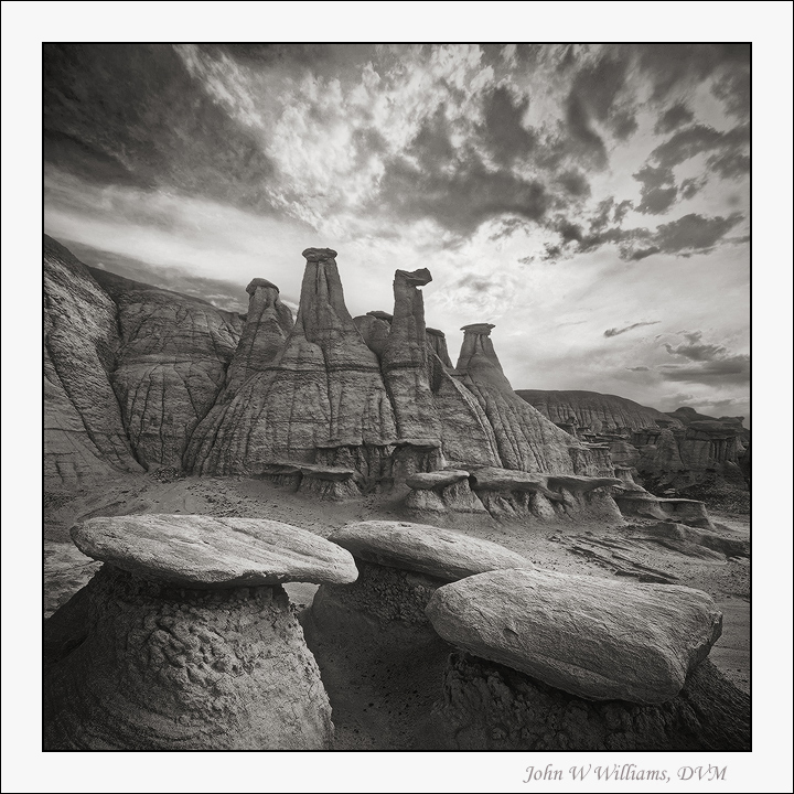
Awful Throne
‹ PreviousLandscape GalleryNext ›

Awful Throne

by John Williams

Gallery: LandscapePosted February 2, 20143,537 views22 comments
In 2010 I posted a color version of this image. Since I've been fiddling with B&W conversions in some of my contemporary images, I thought I'd play with some of my older ones too.

For the prior conversions, I've cooled them slightly. Stuart mentioned in a prior thread that he usually warmed his conversions, and for this one I thought I'd experiment with that.

I'd love feedback and suggestions.

Shooting infos posted in the color version.

Comments

22 comments
Comment posted by Ken Smith on February 2, 2014 at 5:43 PM
I like this b/w photo. It has the requisite blacks to bright white and everything between. That leaves me looking and admiring the composition, esp the use of b/w to convey the moonscape surface and the depth by shading and bright (the front top surfaces seem to float). This has balance to boot! If I had one minor nit … it is the sky tones seems clipped with little mid-range …mostly darker and brighter. Boy, really well done, on the whole…!
Registered on September 5, 2008, 449 Posts, 2444 Comments
Comment posted by gary phillips on February 2, 2014 at 6:14 PM
John, I really like the conversion. This spot is definately on my list. Awesome comp with the smaller toadstools in the foreground. I just finished Guy Tal's e-book on b/w processing, which I found to be excellent and I would highly recommend. I've been going thru older shots, experimenting with different temps and tints prior to conversion. I'm excited about the possibilities . Very nice work.
Registered on October 24, 2013, 185 Posts, 4136 Comments
Comment posted by Dan Kearl on February 2, 2014 at 9:06 PM
I think you did a nice conversion.
It has a lot of depth and the light sky gives you a nice contrast.
Comp is excellent.
Registered on September 2, 2013, 209 Posts, 1514 Comments
Comment posted by Brian Schrayer on February 2, 2014 at 10:09 PM
Another fine B&W, John. I think the B&W presentation has more impact for this photo. Very nicely done!!
Registered on May 28, 2004, 114 Posts, 2890 Comments
Comment posted by Brian Schrayer on February 2, 2014 at 10:10 PM
Another fine B&W, John. I think the B&W presentation has more impact for this photo. Very nicely done!!
Registered on May 28, 2004, 114 Posts, 2890 Comments
Comment posted by Morris McClung on February 2, 2014 at 11:29 PM
I've always felt the warmer tones translate into an organic b&w, and the cooler tones more into abstract, lines, and tones. This works great with these formations, John. Everything about it screams fine art. :toast:
Registered on May 7, 2007, 670 Posts, 19650 Comments
Comment posted by Daniel Rappaport on February 3, 2014 at 1:00 PM
B&W works well here. Really emphasizes the nice compositional interplay between the foreground and background formations.
Registered on September 9, 2009, 294 Posts, 2006 Comments
Comment posted by Chet Dowell on February 3, 2014 at 3:46 PM
This does work well in BW version. I think I like it better than the color one though both are nice. Wonderful comp ! Chet
Registered on December 3, 2012, 237 Posts, 1171 Comments
Comment posted by Richard Castillo on February 4, 2014 at 2:21 AM
I really like the rich, and deep tonal variation within the midrange tones. Beautiful!
Registered on October 20, 2013, 9 Posts, 37 Comments
Comment posted by Kah Kit Yoong on February 4, 2014 at 7:49 AM
Works a treat. Personally I've been going cool but I think you made the right call here. Terrific composition.
Registered on September 27, 2006, 636 Posts, 10682 Comments
Comment posted by Patricia Brundage on February 4, 2014 at 8:18 AM
John, guess I'm the odd man out on the tone you chose. Usually the b&w image wins my vote, but in this case the subtle colors in your color version give so much more detail and interest. A little more contrast to give a stronger tonal range might change my mind.
Registered on March 23, 2006, 1111 Posts, 6531 Comments
Comment posted by R.Bill Moser on February 4, 2014 at 10:47 AM
Great comp and I like the conversion - good job :toast:
Registered on January 29, 2010, 285 Posts, 4281 Comments
Comment posted by Lorna Taylor on February 4, 2014 at 7:30 PM
Beautiful work , the conversion really adds an extra sparkle. Love the warm tones to the mono !
Registered on November 12, 2010, 254 Posts, 3083 Comments
Comment posted by Kane Engelbert on February 4, 2014 at 9:00 PM
This is stunning work. Comp and B&W processing is about perfect to my eye.
Registered on June 14, 2009, 63 Posts, 291 Comments
Comment posted by Wayne Jones on February 4, 2014 at 10:42 PM
Great conversion, John. The warm tone here seems to fit the scene, and the conversion adds just the right amount of contrast to put the large rock formations into the spotlight. The lack of color puts the foreground formations into their proper supporting role in this composition. I like the brightness or parts of the sky, but I think I liked that part better in the color version, where the bright spot was more confined by the comparatively darker area around it. All in all, however, this version is more powerful IMHO.
Registered on April 18, 2007, 953 Posts, 6435 Comments
Comment posted by David Edwards on February 5, 2014 at 5:21 AM
An interesting shot John. Such harshness in the sky, yet such softness in the rock. I love the light/shadow play of the fg rocks.
Registered on December 6, 2008, 142 Posts, 2623 Comments
Comment posted by Bill Reid on February 5, 2014 at 12:50 PM
Really like your processing on this John. Wonderful composition and tones are very nice throughout. The sky adds some drama to the scene also. Very striking B&W.
Registered on January 27, 2013, 65 Posts, 2460 Comments
Comment posted by David Chauvin on February 5, 2014 at 6:15 PM
Beautiful! I much prefer the b&w version over the color. It simplifies the scene and lets the wonderful forms take center stage. :cool: :cool: :cool:
Registered on August 5, 2004, 1007 Posts, 5595 Comments
Comment posted by Stan Rose on February 5, 2014 at 10:09 PM
I agree with the others! :toast:
Registered on September 15, 2005, 836 Posts, 17099 Comments
Comment posted by Ed Lowe on February 5, 2014 at 11:30 PM
Sweet B&W, John. Your processing looks spot on to me as far as the contrast and the range of tones in the scene. All topped off with that drama in the sky. Excellent work.

Ed
Registered on February 7, 2004, 414 Posts, 7115 Comments
Comment posted by Mark Metternich on February 7, 2014 at 8:53 AM
Nice classic on the SW. Makes me miss it down there. Cant wait to get back this summer. :toast:
Registered on June 19, 2009, 276 Posts, 6240 Comments
Comment posted by Nancy Lea Sandy on February 9, 2014 at 9:52 AM
Seems a lot of b&w photos are showing up here lately but this is the one that caught my eye. Great job on a wonderfully engaging image.
Registered on January 24, 2011, 576 Posts, 6942 Comments