Nature Photographers Network
This is the preserved archive of the original Nature Photographers Network. The community continues at naturephotographers.network.
chillin'
‹ PreviousLandscape GalleryNext ›

chillin'

by Ronald Murphy

Gallery: LandscapePosted January 29, 2014219 views8 comments
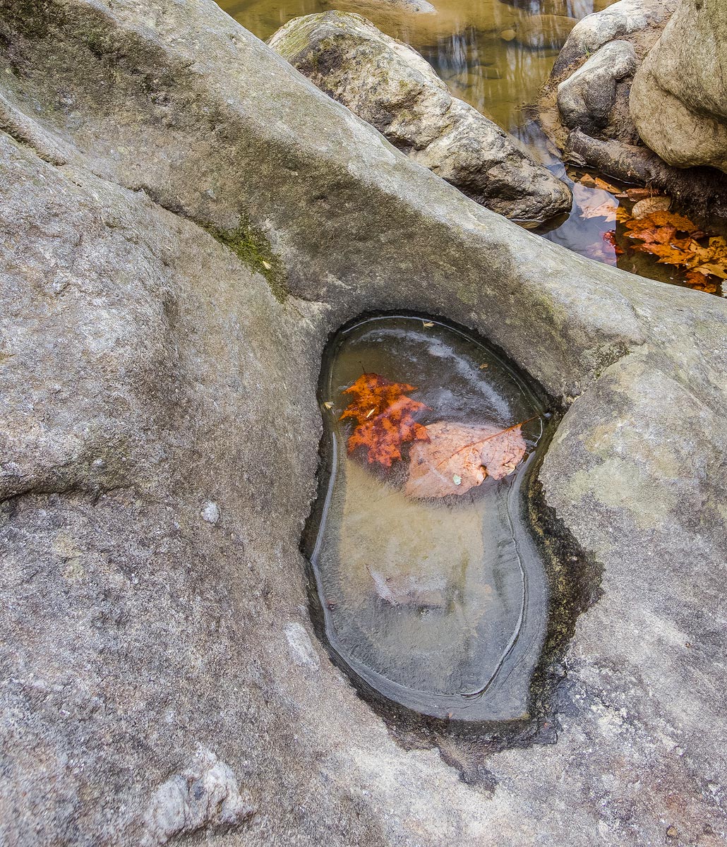
Near the fall line on the Northwest Branch of the Anacostia River

Two Raw exposures for DOF, hand blended in PS6, processed in LR5, with TK resize/sharpening for web.
Canon T2i, 1.6 s, f/8, ISO 100, EFS 10-22 mm @ 15 mm, CPL

Please view the large image!

Seeking any and all advice and comments. Thanks in advance.

Comments

8 comments
Comment posted by gary phillips on January 29, 2014 at 1:48 PM
Hi Ronald. To me this image is one that almost looks better as a thumbnail than when viewed full. In the small view the oranges seem more vibrant, which I think makes the image stronger. I think I would punch up the color and crop some off the top and left side to isolate this abstract of the pocket which holds the leaves.
Registered on October 24, 2013, 185 Posts, 4136 Comments
Comment posted by R.Bill Moser on January 29, 2014 at 2:05 PM
The top right is a bit of a distraction to me. I would crop some off the top and I would also love to see the colors of the leaves a bit more vibrant.
Registered on January 29, 2010, 285 Posts, 4281 Comments
Comment posted by Ronald Murphy on January 29, 2014 at 2:19 PM
Thank you for your comments! If you should return, I've cropped more and increased sat. and brightness of the red/oranges. Not much I can do to totally eliminate that UR corner. I would like your further comments.
Registered on March 13, 2012, 279 Posts, 975 Comments
Comment posted by gary phillips on January 29, 2014 at 3:28 PM
Ronald, I think the repost is improved greatly. I still might burn the front of the rocks to further concentrate the focal point.
Registered on October 24, 2013, 185 Posts, 4136 Comments
Comment posted by Ed Lowe on January 29, 2014 at 10:26 PM
I think your repost is the way to go with this one, Ronald. The comp is simplified and the boost in color gave the scene a bit more pop. Great eye to spot this.

Ed
Registered on February 7, 2004, 414 Posts, 7115 Comments
Comment posted by Nancy Lea Sandy on January 30, 2014 at 8:43 AM
Neat subject. A different comp that featured just the rock and the pot hole would, IMO, be stronger but this is engaging as is.
Registered on January 24, 2011, 576 Posts, 6942 Comments
Comment posted by Bill Reid on January 30, 2014 at 9:53 AM
Your repost looks much improved Ronald. It focuses more attention on the ice and leaves. Well done.
Registered on January 27, 2013, 65 Posts, 2460 Comments
Comment posted by Mark Seaver on January 30, 2014 at 5:32 PM
The leaves in the water pocket look great. Your repost is a big improvement.
Registered on January 23, 2011, 1103 Posts, 17270 Comments