Nature Photographers Network
This is the preserved archive of the original Nature Photographers Network. The community continues at naturephotographers.network.
Winter Sunset at Second
‹ PreviousLandscape GalleryNext ›

Winter Sunset at Second

by Zhoen

Gallery: LandscapePosted January 21, 2014243 views13 comments
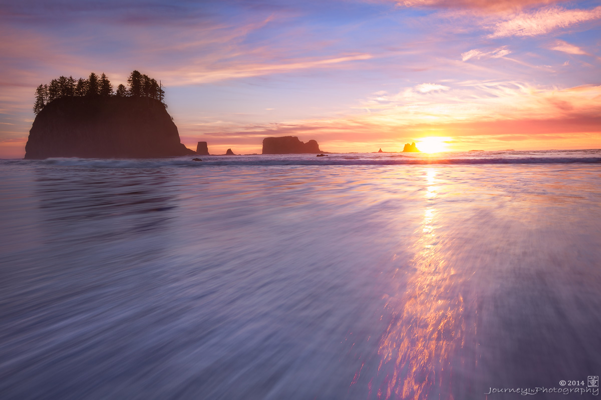
Took a couple days off work and drove to the coast, spend a day at second beach. I got lucky with some good light. More to come from this place!

2 images, 75% from 1 image with second masked in for the highlights in the upper right section. Image cropped in 10% from the upper left.
F11, ½ sec, ISO 100, 25mm, 5DII

I am very interested in your thoughts on the balance of this image.
Thanks for looking,
Zhoen

Comments

13 comments
Comment posted by Mark Seaver on January 21, 2014 at 4:55 PM
I find this nicely balanced, with the tree covered seastack balancing the sun and it's streak. I'm also enjoying the crossed flow from the sunstreak and the moving water.
Registered on January 23, 2011, 1103 Posts, 17270 Comments
Comment posted by Chet Dowell on January 21, 2014 at 5:00 PM
Beautiful colors and light. Love the sun track and the tree topped sea stack. Nice work!! Chet
Registered on December 3, 2012, 237 Posts, 1171 Comments
Comment posted by Allen Brooks on January 21, 2014 at 5:03 PM
I like the sense of motion you captured in the receding(?) water. The sun's reflection looks like fire; very nice. As far as the balance goes, part of me would like a little less foreground, but then you would lose some of the great reflection, so, all in all a great composition. :toast:
Registered on July 27, 2011, 262 Posts, 2597 Comments
Comment posted by gary phillips on January 21, 2014 at 9:31 PM
I'm literally getting sucked into this one. Great job handling the highlights. The sea stacks and sun streak form a wonderful triangle. Really sweet.
Registered on October 24, 2013, 185 Posts, 4136 Comments
Comment posted by Dan Kearl on January 21, 2014 at 11:21 PM
I might try to reduce the sun brightness a tad and maybe a bit more contrast?
Cool sense of movement….
Registered on September 2, 2013, 209 Posts, 1514 Comments
Comment posted by Kah Kit Yoong on January 22, 2014 at 8:16 AM
This is quite a nice seascape. The blown area around the sun is a little larger than I would have liked. Agree that some more contrast might be nice. I would let the stacks go to almost black since there is little detail I can see in the shadows right now.
Registered on September 27, 2006, 636 Posts, 10682 Comments
Comment posted by Nancy Lea Sandy on January 22, 2014 at 10:19 AM
IMO the balance is spot on even with all the hardscape on one side. The powerful motion in the fg and the graceful light and color of the sky more than compensates. Beautifully captured.
Registered on January 24, 2011, 576 Posts, 6942 Comments
Comment posted by Navin Sarma on January 22, 2014 at 11:56 AM
Nice comp here... that shimmering refection is really great. I think the processing is pretty sweet too, nothing really that I would change. Nice work
Registered on July 17, 2011, 233 Posts, 1373 Comments
Comment posted by Zhoen on January 22, 2014 at 3:25 PM
Thank you all for feed backs on the balance of the comp, I was really on the fence about the dark sea stacks over powering the scene. I will probably continue to tweak it, play with contrast and brightness as suggested. The lack of contrast may be from my de-saturation layers I added to my work flow lately.

Thanks again!
Registered on May 16, 2013, 25 Posts, 188 Comments
Comment posted by Nick Bristol on January 22, 2014 at 6:24 PM
Beautiful and inviting colors in this scene and I love the motion in the foreground water. Your comp works fine for me, if anything just a bit more room on the left if it was possible without adding something else in to the scene. Nice as is!

Nick Bristol
Lone Rock, WI
Registered on February 1, 2004, 752 Posts, 14140 Comments
Comment posted by Scott Fricke on January 22, 2014 at 8:17 PM
Gorgeous pastel colors, great color and a really nice perspective, whats not to like? :toast:
Registered on January 19, 2007, 133 Posts, 1448 Comments
Comment posted by Ed Lowe on January 22, 2014 at 9:31 PM
The balance looks fine to me, Zohen. I also like the diagonal flow of the water along with the warmth of the image. This is just a personal preference, but I find myself wishing the seastacks had a little more contrast and went a little darker. Either way this is a beauty.

Ed
Registered on February 7, 2004, 414 Posts, 7115 Comments
Comment posted by Bill Reid on January 23, 2014 at 10:06 AM
Very nice colors and flow to the water Zhoen and it feels well balanced to me. Maybe a bit more contrast but beautiful as is. Well done.
Registered on January 27, 2013, 65 Posts, 2460 Comments