Nature Photographers Network
This is the preserved archive of the original Nature Photographers Network. The community continues at naturephotographers.network.
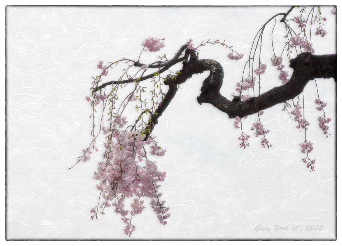
Sakura III + repost
‹ PreviousFlora GalleryNext ›

Sakura III + repost

by Gary Yeoh

Gallery: FloraPosted December 11, 201332,767 views11 comments
Some of you will remember a similar photo I posted early this year. I have taken comments from that photo into consideration in processing this similar image. I have excluded the main trunk in this image and lightened up the branch to show some texture. Also added a rice paper bg and applied a modified Orton process. The 'ínk bleed'effect is toned down. I have not sharpened this image as I want the image to look soft.

Would be interested to hear your view on this and quite possibly will do another iteration of this image. There is something here that keeps pulling me back to this image and I don't think I am done with it or got the effect I want from it yet.

Comments

11 comments
Comment posted by Giuseppe Guadagno on December 11, 2013 at 1:42 PM
Gary, first of all: it is a splendid image as it is.
For you question I can only say what I could do if it was mine: I would enhance the most appealing element, the trunk, reducing the negative space on the left and on the top; I love the soft images but here the flowers are so small and crowded that I am not sure that works: the design seems confused. This is the theory, may be in practice does not improve the photo. An attempt.
Take care.
Registered on February 3, 2007, 827 Posts, 5052 Comments
Comment posted by Allen Brooks on December 11, 2013 at 2:48 PM
Very nice composition. I suppose it depends on what you are going for, but for me the flowers blend in too much with the background and I'd like to see a bit more pop to the flowers.
Registered on July 27, 2011, 262 Posts, 2597 Comments
Comment posted by Ramamohan Pai on December 11, 2013 at 4:39 PM
Gary - I like the idea behind this. Gigi summarized pretty well - as it is I would love to see the flowers very crisp with the shadows on the branch opened up and sharpened slightly.
Registered on November 1, 2003, 550 Posts, 9037 Comments
Comment posted by scott lanz on December 11, 2013 at 9:33 PM
I much prefer this version, Gary. I like the crop of the trunk and the rice paper bg. I also like the look of blossoms. My first thought was that you could crop a bit off the left, but I don't feel strongly about this, and I like this one a lot as is. Very artistic. :toast:
Registered on November 14, 2003, 840 Posts, 12902 Comments
Comment posted by Miro Susta on December 12, 2013 at 1:31 AM
Hi Garry, the previous comments are appropriate, actually this a beautiful flower photo artwork, I like the nice pink flowers on bright BG, but the dark branch is pulling eye to much, what I will say that the first view is going to the branch and only after to the beautiful flowers. I hope that you do understand what I will say :confused:
Registered on August 18, 2006, 719 Posts, 3736 Comments
Comment posted by Gary Yeoh on December 12, 2013 at 6:05 AM
Thanks everyone for your comments.

I intend to make this into a greeting card and I left the space on the left for Haiku by Basho:
"The leafless cherry,
Old as a toothless woman,
Blooms in flowers,
Mindful of its youth."

Gigi: I did have a version with your suggestions which I did not post but since you have brought these points up, here it is.
Registered on September 1, 2009, 588 Posts, 8184 Comments
Comment posted by Ian Wolfenden on December 12, 2013 at 6:53 AM
Wonderfully creative image, Gary !! I think I do prefer the visual quality of the repost with its greater emphasis on the flowers, though reading the haiku suggests that the pallor of the flowers in the original might be worth sticking by when you set the words in place. So, I'm in two minds - sorry !!!
Registered on May 18, 2007, 1108 Posts, 7647 Comments
Comment posted by Morris McClung on December 12, 2013 at 3:29 PM
A work of art, Gary. I liked the haiku, too. Excellent comp and use of line.
Registered on May 7, 2007, 670 Posts, 19650 Comments
Comment posted by Sanjay Sundaram on December 12, 2013 at 10:44 PM
Very artistic, Gary. I like the sparseness of leaves and abundance of blooms. Wonderful composition too. I second Allen's suggestion to enhance the presence of the flowers, since they are light against a light background. But, it is a beautiful image as it is. Nicely done!

Sanjay
Registered on April 9, 2013, 107 Posts, 725 Comments
Comment posted by Bill Fach on December 14, 2013 at 2:02 PM
Gary: I do like the repost but my favorite view is the larger image that shows some of the intricate detail in the flowers and the texture of the BG. Well composed, captured and presented.>=))>
Registered on November 1, 2003, 1805 Posts, 26981 Comments
Comment posted by Albert Darmo on December 15, 2013 at 7:07 PM
Hi Gary :wavey: With my weak eyesight. i have to echo Bills thoughts, i like the large version with the intricate detail of the flowers :toast:
Albert Darmo
Canada
Registered on November 25, 2008, 1386 Posts, 11978 Comments