Nature Photographers Network
This is the preserved archive of the original Nature Photographers Network. The community continues at naturephotographers.network.
Havasu Falls Lower
‹ PreviousLandscape GalleryNext ›

Havasu Falls Lower

by Evan Olson

Gallery: LandscapePosted November 26, 2013449 views11 comments
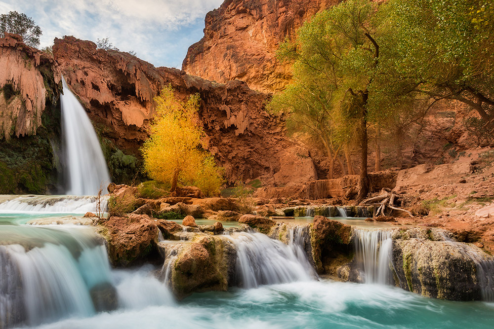
I recently went on a trip to Havasupai Falls in Northern Arizona. I have wanted to go on this trip for several years and things kept coming up. I finally was able to secure a reservation during what I was hoping to be peak fall colors. It turns out I was about 1-2 weeks too early but I had an incredible time anyways. I have a couple images I would like to share and get feedback on. This is the first of those images. I found it rather challenging to get a composition that didnt have multiple distracting elements in it. This image is from the bottom of Havasu Falls. C&C welcome.
Canon 6D
Canon 17-40L w/ Polarizer

Comments

11 comments
Comment posted by Mark Seaver on November 26, 2013 at 7:21 PM
I like all of the steps in the turquoise water. The trees add a fine change of pace. I do think that burning the sky would help as its current brightness pulls attention away from the more interesting parts of this view.
Registered on January 23, 2011, 1103 Posts, 17270 Comments
Comment posted by Ed Lowe on November 26, 2013 at 8:27 PM
I like your POV here along with the light which lends a nice glow to the scene. Your SS choice also works for me. My only suggestion would be to tone down the sky just a bit to keep the focus on all the great stuff happening in the rest of the image. Nicely done, Evan.

Ed
Registered on February 7, 2004, 414 Posts, 7115 Comments
Comment posted by Peter Coskun on November 26, 2013 at 11:02 PM
Very nice Evan. I like the overall colors you captured here. For me though the comp seems a little tight. The falls feel too close to the left side and the foreground feels somewhat cut off. I think if you cropped off a bit from the right side it would help even out the falls from the left edge. Thanks again for letting me tag along!
Registered on October 31, 2011, 170 Posts, 1240 Comments
Comment posted by James Doyle on November 27, 2013 at 3:20 AM
I like this image quite a bit (waterfalls and cascades are one of my favourite things to photograph). For me personally I find the trees cluttering the scene. But that's only my view, I guess maybe there could have been two images to be made, perhaps a tighter shot of the cascades and one with the fall coloured tree? It's a nice image as it is Evan. Having looked at the scene a bit longer I think its having the "golden" tree in the centre of the frame is drawing my eye to it rather than the water. Cheers James
Registered on November 16, 2013, 6 Posts, 7 Comments
Comment posted by Randy Runtsch on November 27, 2013 at 7:25 AM
Hi Even,

The colors and the motion of the falls are gorgeous. The golden tree near the center adds appeal, but in my opinion might benefit from a little burn in. Like Peter, I would like to see more of the left side as well. Overall, this is an admirable capture. :smile:
Registered on October 30, 2013, 50 Posts, 445 Comments
Comment posted by Bill Reid on November 27, 2013 at 10:10 AM
Wonderful colors and details in this Evan. I agree about darkening the sky and maybe the rt. side rocks area to bring focus into the centre. But a very nice image as is. Great job. :toast:
Registered on January 27, 2013, 65 Posts, 2460 Comments
Comment posted by Evan Olson on November 27, 2013 at 10:37 AM
Thanks for all the replies. I did crop this image down a bit so I can play with that some more. I have another image which is a tighter crop of the falls and the tree that I think will turn out nicely. Thanks for the suggestions!
Registered on November 17, 2012, 31 Posts, 70 Comments
Comment posted by Dan Kearl on November 27, 2013 at 10:40 AM
I like it, but I too would like a bit more water.
Registered on September 2, 2013, 209 Posts, 1514 Comments
Comment posted by Preston Birdwell on November 27, 2013 at 11:31 AM
The color is nice in this, Evan. I agree regarding burning down the sky a bit, as well as cropping from the right side somewhat in order to swing the balance more to the left. The water looks very nice; the whites a re nice and clean.

--P
Registered on November 1, 2003, 471 Posts, 5188 Comments
Comment posted by Ken Henke on November 30, 2013 at 8:55 PM
Beautifully composed image and agree the sky could be darken a tad. I also notice a yellow-ish color cast that could be reduced?
Registered on February 20, 2012, 117 Posts, 285 Comments
Comment posted by Tim Mulholland on December 19, 2013 at 10:30 AM
Very nice - I love the contrast that you've created in this image to bring out so much detail...

Tim!
Registered on April 24, 2006, 14 Posts, 139 Comments