Nature Photographers Network
This is the preserved archive of the original Nature Photographers Network. The community continues at naturephotographers.network.
Oneonta Two
‹ PreviousLandscape GalleryNext ›

Oneonta Two

by Ted Gore

Gallery: LandscapePosted November 9, 2013391 views11 comments
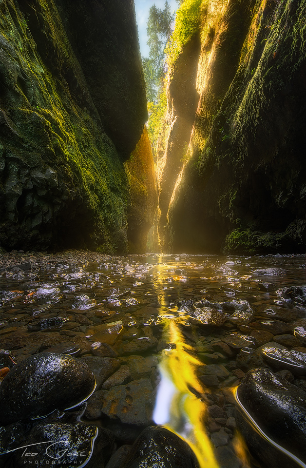
Oneonta Gorge during an august morning. Got down low for this vantage point with my camera only inches from the ground, and as close as I could get to this fist sized rocks while getting them in focus. Multiple focus points and blended along with 3 exposures for dynamic range. I've tinkered with this image for days, and while some I've shown it to just really aren't into it, I'm curious to know what you all think. I'm happy with it either way, but I think the bright V wedge is just too much of a draw.

Appreciate your thoughts and criticisms!

Comments

11 comments
Comment posted by Dan Kearl on November 9, 2013 at 3:19 PM
I thought the last photo you posted of Oneonta was one of the best I have ever seen of the Gorge and this is nice as well.
I like the water reflection and the water in general, maybe just bring down the light a tad in the V.
Registered on September 2, 2013, 209 Posts, 1514 Comments
Comment posted by Nuno Eira on November 9, 2013 at 3:24 PM
Like the colors, especially the backlight makes me dream ...
Registered on October 8, 2012, 37 Posts, 99 Comments
Comment posted by Jeremy Kessler on November 9, 2013 at 3:50 PM
Beautiful Image Ted. If it were mine I think I'd crop just above the white spot in the reflection. I know its so hard to crop parts of image sometimes. But I think it might help my eyes explore the background a little easier, right now they are pulled to both the top and bottom of the image at the same time. Do what you like though. Your opinion is what matters most.

Great work! :toast:
Registered on September 13, 2007, 36 Posts, 1283 Comments
Comment posted by Nancy Lea Sandy on November 9, 2013 at 3:56 PM
the bright wedge is a powerful draw but since it draws me past all the gorgeous green on the walls and the flow of the creek, I don't mind it at all. The highlights on the rocks are a little distracting for me but minor. I think this is very beautiful.
Registered on January 24, 2011, 576 Posts, 6942 Comments
Comment posted by Bill Reid on November 10, 2013 at 10:20 AM
Another great shot from here Ted. I like the comp and the light in the back and the greens in the walls. I find the bright
spot in the foreground a bit distracting but very nice other than that. Great job on this.
Registered on January 27, 2013, 65 Posts, 2460 Comments
Comment posted by Zack Clothier on November 10, 2013 at 2:31 PM
I like the first version better, the trees up top feel unnatural in the repost. As far as the sky I don't think it looks to bright, if anything it's a little dark. I think toning down the blue patch in the reflection would help also.
Registered on January 28, 2010, 343 Posts, 2257 Comments
Comment posted by Ted Gore on November 10, 2013 at 3:08 PM
thanks for the comments! Made a few changes I think for the better. Did some warping to make it so that tree is filling in the sky. I think the sky was a bit distracting, and too bright. Also dodged the tree a bit to more match the brightness of the other foliage in the canyon. Also got rid of the bright spot in the reflection in the foreground.
Registered on April 25, 2013, 36 Posts, 149 Comments
Comment posted by Ted Gore on November 10, 2013 at 6:35 PM
Hey Zack, I'm a little confused by your comment since it's before my repost. You mention the trees looking unnatural, but also comment on the blue spot in the reflection, which I took out of the repost. Clarify? Thanks
Registered on April 25, 2013, 36 Posts, 149 Comments
Comment posted by Randy Runtsch on November 10, 2013 at 9:08 PM
Ted, your tenacity paid in post-processing paid off to produce a pleasing image. I prefer the first version. The golden reflection and glow contrast well with the green moss. The only tiny thought I have is that my eyes want to see all of the rounded rock in the bottom-left corner. :toast:
Registered on October 30, 2013, 50 Posts, 445 Comments
Comment posted by Morris McClung on November 11, 2013 at 3:07 PM
I like the repost as it feels like it has a little better tonal balance to me. It definitely gives the impression of being in a steep and dark gorge. Nice depth in your comp, too, as it drives the eye to the other side of the gorge. Very well done.
Registered on May 7, 2007, 670 Posts, 19650 Comments
Comment posted by Mark Metternich on November 13, 2013 at 2:29 PM
I'm not going to be over analytical here. Looks kick ass! Great job on it Ted.
Registered on June 19, 2009, 276 Posts, 6240 Comments