Nature Photographers Network
This is the preserved archive of the original Nature Photographers Network. The community continues at naturephotographers.network.
Too Much Round Pond?
‹ PreviousLandscape GalleryNext ›

Too Much Round Pond?

by Wayne Jones

Gallery: LandscapePosted November 4, 2013293 views19 comments
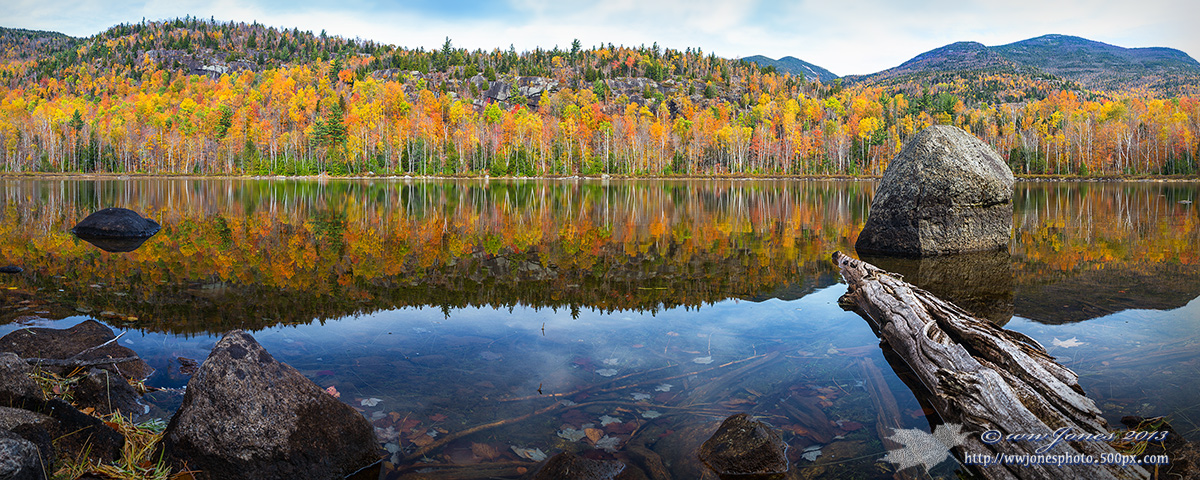
The title does not come from the fact that I posted two images from this place last week, and you may be getting tired of it. It's refers to my perpetual cropping question: "How much is too much?"

The images I posted last week zoomed in on the shoreline trees. I found that some people like wider views that show more than the shoreline. I included a lot of real estate in this one because I do not find the large "hay stack" rock on the right particularly attractive, but I like the log and the rest of the foreground. Another cropping choice is in my comment below, but I don't like the idea of cropping more (even though this is 102 megapixels), because shorter crops seem to turn into a picture of a big rock. What do you think?

Please see the larger version!

THANKS


Canon 5D3
Canon 24-105mm.; Circ. Pol.
1/8 sec. @ f/16; ISO 160
Seven vertical frames stitched in CS6

Comments

19 comments
Comment posted by Wayne Jones on November 4, 2013 at 9:54 PM
Here's another crop. Is this one better? Still too long? Or maybe still just including too much altogether?
Registered on April 18, 2007, 953 Posts, 6435 Comments
Comment posted by Mark Seaver on November 4, 2013 at 10:24 PM
Interesting dilemma, Wayne. The colors in the trees and their reflections are stunning, especially in the larger version. I also find myself very attracted to that log poking in from the right. I prefer the original post, because there's a sense of balance between the two rocks in the mid-ground anchoring the edges of the frame. I wonder about moving a few steps to the right to move that neat log away from the big rock.
Registered on January 23, 2011, 1103 Posts, 17270 Comments
Comment posted by Peter Cross on November 4, 2013 at 10:34 PM
Well, I admit that I like the 1st one the best. Mostly because of the color saturation in it. It's a grand view. You're on a roll, Wayne. Gorgeous sunsets now beautiful reflections. The pond surface is like a mirror, deathly still without a breath of air on it. A rare sight. Keep 'em coming.
Registered on April 3, 2010, 271 Posts, 1342 Comments
Comment posted by Eva McDermott on November 4, 2013 at 10:36 PM
I agree with Mark, that your 1st post seems more balance. The large maple leaf near the log is a really nice inclusion. Gorgeous color too Wayne.
Registered on January 4, 2009, 1015 Posts, 13229 Comments
Comment posted by Larry Herscovitch on November 5, 2013 at 1:09 AM
Very nice image. I like the second image more. My eye gets drawn to the black rock on the left of the first image and stays there too long. The second might seen weighted to the right but the long angled log on the right pointing back to the left helps solve that issue. The sky could be darkened a tad.
Registered on October 15, 2013, 14 Posts, 18 Comments
Comment posted by Bill Reid on November 5, 2013 at 7:41 AM
I like the first one the best Wayne. Beautiful colors and really nice fore ground details and beautiful reflection also. The first one seems to be more balanced to me. Beautiful scene and well processed. :toast:
Registered on January 27, 2013, 65 Posts, 2460 Comments
Comment posted by John&Patty Benway on November 5, 2013 at 9:32 AM
Wayne, I have to be very honest with you, the large view is now my favorite of your recent posts, really love it, so much to see and explore, definitely a beautiful autumn scene, and you also captured a very peaceful warm mood. What's not to love about it. Gorgeous work. Take care.
John & Patty
Registered on May 12, 2006, 626 Posts, 8700 Comments
Comment posted by Nancy Lea Sandy on November 5, 2013 at 9:36 AM
My vote is for the first image. I like the balance better and enjoy having a wider view of the lake. Beautiful color.
Registered on January 24, 2011, 576 Posts, 6942 Comments
Comment posted by Daniel Rappaport on November 5, 2013 at 12:24 PM
Both are beautiful. I like the second better because the log is more prominent and works better as a lead in.
Registered on September 9, 2009, 294 Posts, 2006 Comments
Comment posted by Jim Greenwood on November 5, 2013 at 12:48 PM
I prefer the first version, especially when viewing the larger photo. The additional boulders on the left provide better balance to the composition. And I like the stronger pano format.

"The large maple leaf near the log is a really nice inclusion."

I'm sorry ... I just had to laugh at Eva's comment. :wink: :biggrin:
Registered on November 9, 2003, 229 Posts, 1523 Comments
Comment posted by David Chauvin on November 5, 2013 at 6:48 PM
You can't go wrong with any of these but I am digging the full pano. :cool:
Registered on August 5, 2004, 1007 Posts, 5595 Comments
Comment posted by Randy Runtsch on November 5, 2013 at 8:31 PM
Wayne, I like the first image, but as soon as I saw it I wondered what it would look like with the left-hand rock cropped out. Then, I scrolled down and saw that you had already tried that. Both pictures look good, but I prefer #2, as the left-hand rock is not there to distract from the log and big rock. These are pretty pictures on both counts.
Registered on October 30, 2013, 50 Posts, 445 Comments
Comment posted by Mark Pelton on November 5, 2013 at 10:54 PM
I like the original Wayne. no need for crop. beautiful work.
Registered on November 25, 2003, 380 Posts, 4647 Comments
Comment posted by Mark Metternich on November 5, 2013 at 11:09 PM
Nice job on this one! :toast:
Registered on June 19, 2009, 276 Posts, 6240 Comments
Comment posted by Joseph Campisi on November 6, 2013 at 1:23 AM
Not too much for me Wayne! Love this. I wish you had left just a little more room on top, but that's really minor. Excellent pano!
Registered on November 24, 2008, 304 Posts, 3211 Comments
Comment posted by Ed Lowe on November 6, 2013 at 10:26 AM
Both are beautiful, but I prefer the first version, Wayne. IMO the rock on the left compliments the one on the right. The pano format is excellent as are the fall colors and reflection.

Ed
Registered on February 7, 2004, 414 Posts, 7115 Comments
Comment posted by Nick Bristol on November 6, 2013 at 6:06 PM
Wayne, Just sitting here and enjoying this wide view of a beautiful fall scene. I like the first one as it is. :toast:

Nick Bristol
Lone Rock, WI
Registered on February 1, 2004, 752 Posts, 14140 Comments
Comment posted by Bill Chambers on November 7, 2013 at 1:42 PM
Beautiful Wayne. I think I would actually lift the crop a little at the top to give the trees on the left side a little more breathing room. No other nits from me. I love the fallen leaves in the clear water. I like the original version (on top) best - nicely balanced.
Registered on April 10, 2005, 753 Posts, 21216 Comments
Comment posted by Stan Rose on November 7, 2013 at 3:18 PM
im assuming the top wasnt cropped but yeah, it needs more space up top. Other than that, i think the comment is the winner--it balances the left and right sides while the original was rhs heavy. Very pretty, Wayne!
Registered on September 15, 2005, 836 Posts, 17099 Comments