Nature Photographers Network
This is the preserved archive of the original Nature Photographers Network. The community continues at naturephotographers.network.
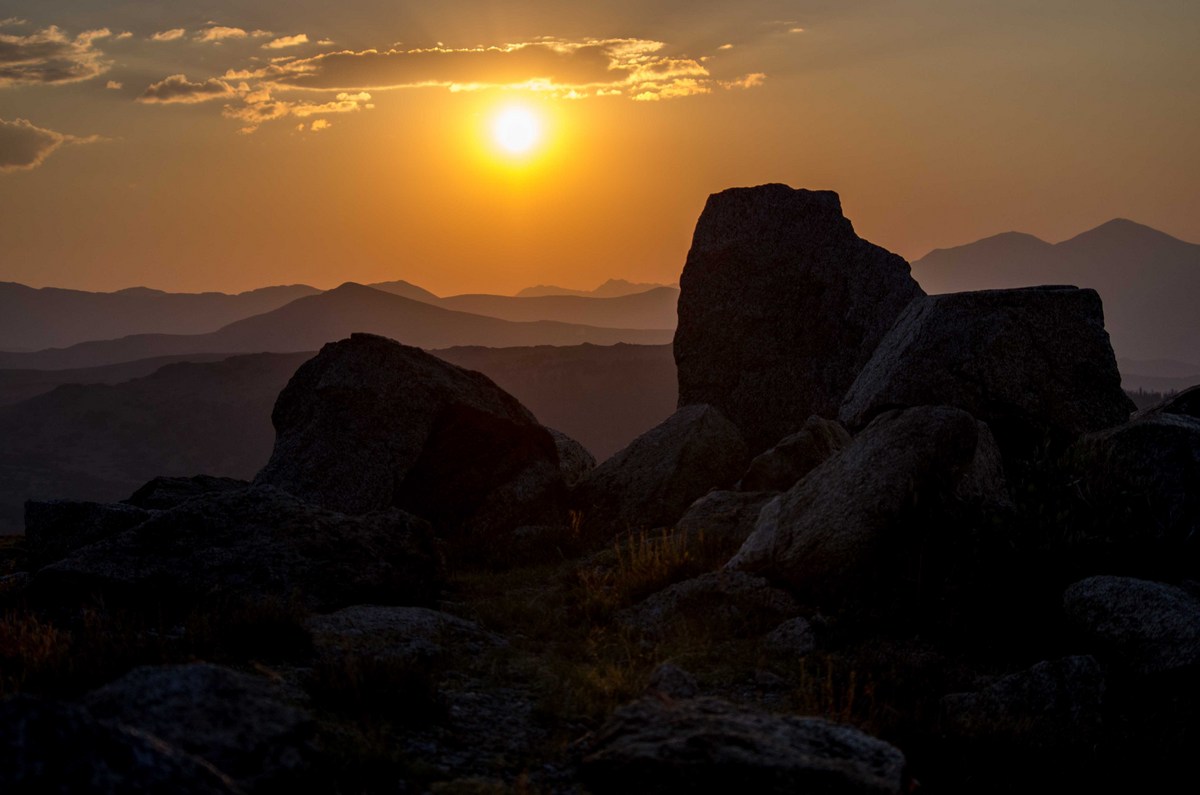
Mt. Evans Sunset
‹ PreviousLandscape GalleryNext ›

Mt. Evans Sunset

by Randy Runtsch

Gallery: LandscapePosted November 4, 201375 views8 comments
This is a view from Mt. Evans, in Colorado, just before sunset. Originally, the photo was processed to have a black foreground, but this view may be more like it really was.

How might you improve the picture through cropping, darkening/lightening the foreground, changing contrast, changing white balance, etc?

Pentax K-5 DA 55-300 at 55mm, 1/2000sec, f/5.6, iso 200

Comments

8 comments
Comment posted by Stan Rose on November 4, 2013 at 7:15 PM
Real pretty, Randy! I think the exposure looks pretty good--the only problem im seeing is the immediate fg looks a bit blurry (OOF?) Id probably just crop it out cause the rest looks great. :wavey:
Registered on September 15, 2005, 836 Posts, 17099 Comments
Comment posted by Randy Runtsch on November 4, 2013 at 9:57 PM
Thank you, Stan, for the good suggestion! I'll experiment with the cropping, and agree that it might improve the image.
Registered on October 30, 2013, 50 Posts, 445 Comments
Comment posted by Mark Seaver on November 4, 2013 at 10:07 PM
The layers here are great and the capture on the sky looks good as well. I wouldn't touch the white balance, but dodge the foreground for a bit more detail. Because of how dark the foreground is, I can't be sure but the very bottom does look soft.
Registered on January 23, 2011, 1103 Posts, 17270 Comments
Comment posted by Randy Runtsch on November 5, 2013 at 6:38 AM
Thank you or the suggestion about the foreground, Mark. I'll give it a try.
Registered on October 30, 2013, 50 Posts, 445 Comments
Comment posted by Randy Runtsch on November 5, 2013 at 6:54 AM
In this new version of the image the overall exposure was first decreased. Then, the foreground was dodged in. It showed that the immediate FG was OOF so the aspect ratio was changed to 16 x 9 to crop it out.

Thanks again for the tip, Mark. The new version looks better in my opinion.
Registered on October 30, 2013, 50 Posts, 445 Comments
Comment posted by Bill Reid on November 5, 2013 at 7:20 AM
The repost looks great Randy with very nice colors and the rocks seem better positioned in the scene now. Like the back round layers also.Very nice image. :toast:
Registered on January 27, 2013, 65 Posts, 2460 Comments
Comment posted by Mark Metternich on November 5, 2013 at 11:05 PM
Awesome use of silhouette! Dang!!!!! :toast:
Registered on June 19, 2009, 276 Posts, 6240 Comments
Comment posted by Randy Runtsch on November 6, 2013 at 7:10 AM
Thanks, everybody, for the suggestions and kind comments. :smile:
Registered on October 30, 2013, 50 Posts, 445 Comments