Nature Photographers Network
This is the preserved archive of the original Nature Photographers Network. The community continues at naturephotographers.network.
Japanese Garden Bridge/Repost
‹ PreviousFlora GalleryNext ›

Japanese Garden Bridge/Repost

by Randy Runtsch

Gallery: FloraPosted October 31, 201388 views10 comments
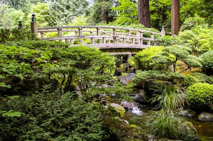
This photo was taken at the Portland (Oregon) Japanese Garden. I just noticed the man near the right end of the bridge. Perhaps I will edit him out.

Can anyone suggest improvements for this photo? It seems crowded and busy to me with the plentiful foliage, so may some of the foreground could be cropped.

Pentax K110D

DA 18-55 AL at 21mm, f/5.6, 1/125 sec, iso 1600 (it must have been dark in the garden)

Comments

10 comments
Comment posted by Ian Wolfenden on November 1, 2013 at 12:21 PM
I don't think personally i would change the composition at all, Randy - yes, there's a lot going on, but the bridge especially, and the stream hold it all together very well in my view. What I would suggest is bringing the light levels down a bit in the upper areas of the image ( the bridge in particular looks a touch washed out ). Overall a good take on a lovely scene.
Registered on May 18, 2007, 1108 Posts, 7647 Comments
Comment posted by Richard Teller on November 1, 2013 at 1:56 PM
I also think this is a nice scene. I do agree with Ian's comments on the brightness of the scene.
Registered on August 23, 2010, 1162 Posts, 6692 Comments
Comment posted by Randy Runtsch on November 1, 2013 at 8:03 PM
Ian and Richard - Thank you for the lighting suggestion. This was an opportunity to learn more about Lightroom, and how to use its gradient and burning/dodging abilities. Here is the new image. Perhaps I got carried away with the burning, but it's a big improvement in my opinion.
Registered on October 30, 2013, 50 Posts, 445 Comments
Comment posted by Nancy Lea Sandy on November 1, 2013 at 9:25 PM
The re-post is an improvement, IMO (though I agree with your assessment of over burning it just a bit). I like the composition very much with the rich variety of texture and green tones and the angular "hardscape" of the bridge. Good work
Registered on January 24, 2011, 576 Posts, 6942 Comments
Comment posted by Randy Runtsch on November 1, 2013 at 11:23 PM
Thanks, Nancy. I'll experiment more with the image as time permits.
Registered on October 30, 2013, 50 Posts, 445 Comments
Comment posted by Bill Fach on November 2, 2013 at 12:29 AM
Randy: Welcome to NPN in general and to the finest Flora gallery on the planet in particular. Thanks for a fine first post here. My initial reaction was that it was too bright/slightly overexposed. I did scroll down and see your repost which IMO is much better. I like your comp and the overall scene. A shot like this really deserves a larger version. You may post an additional image 1200 pixels on the long side and up to 500kb. I also edited your title to reflect the repost. You can do that yourself by clicking on the edit link on your photo on the thumbnail page. It's wise to acknowledge the repost so that others will know to revisit. Great to ahve you aboard and looking forward to more. >=))>

PS: Another trick to getting a better capture is to use a polarizer. It knocks down reflected glare off the foliage and generally saturates the colors.
Registered on November 1, 2003, 1805 Posts, 26981 Comments
Comment posted by Randy Runtsch on November 2, 2013 at 7:12 AM
Hi Bill: Thank you for the warm welcome and for the tip about how to mark the subject on a repost. The polarizer suggestion is a good one as well.

It's good to be here, and it's clear that being a member will aid the learning process. I will enjoy viewing and commenting on the work of others as well.
Registered on October 30, 2013, 50 Posts, 445 Comments
Comment posted by Ken Smith on November 2, 2013 at 11:18 AM
I like the second repost for all the reasons given. You've done a great job with the busy composition. Each item seems to separate from it surrounding plants to give some sense of depth which is a goal when dealing with that busy of comp. I might even try for more separation by selecting foliage and add a touch of saturation or desat...or brighten / darken. Not overly... a very deft touch. In the future, I would bring a polarizer (circ) to get the white reflection off leaves ...and bring out colors. The white mushes everything together and can dominate to make the scene flat looking. A polarizer really helps.
Registered on September 5, 2008, 449 Posts, 2444 Comments
Comment posted by Randy Runtsch on November 3, 2013 at 9:31 AM
Thanks for the additional suggestions, Ken. I will edit and try to further improve the image.
Registered on October 30, 2013, 50 Posts, 445 Comments
Comment posted by Albert Darmo on November 3, 2013 at 6:50 PM
Hi Randy :wavey: I enjoy this enchanting composition, and There is not much left for me to say. except the second version is much better.
Albert Darmo
Registered on November 25, 2008, 1386 Posts, 11978 Comments