Nature Photographers Network
This is the preserved archive of the original Nature Photographers Network. The community continues at naturephotographers.network.
Bleak and Cold
‹ PreviousLandscape GalleryNext ›

Bleak and Cold

by Ken Watkins

Gallery: LandscapePosted October 30, 2013143 views6 comments
Firstly I would like to apologize for hardly commenting on any posts in this forum, I find so many absolutely incredible. But I really have no idea about Landscape photography and rarely take any I know I should.
In the Arctic there is often nothing else to do and to me it looks "strange", so I take images :biggrin:
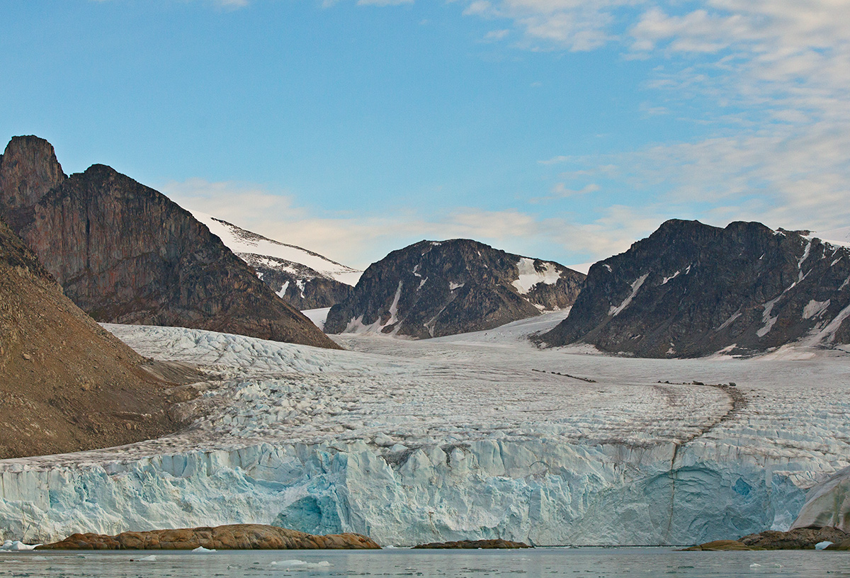
Here is one from somewhere in Svalbard, taken from a Zodiac, in relatively calm seas.
EOS 1D MkIV
70-200 mm F2.8 Mk II at 88mm
F4.5
ISO 800
1/5000

Comments

6 comments
Comment posted by Bill Reid on October 30, 2013 at 9:26 AM
Very nice view here Ken with very natural colors and a great view of the colors in the glacier. Sometimes a comment is just saying we like an image. Great job on this.
Registered on January 27, 2013, 65 Posts, 2460 Comments
Comment posted by Ed Lowe on October 30, 2013 at 9:34 AM
A very pretty scene, Ken. I hope you have more images from the Arctic as it looks like a fantastic place. Don't be afraid to make mistakes; we all do. My suggestion would be some additional saturation and contrast to give this scene a little more pop.

Ed
Registered on February 7, 2004, 414 Posts, 7115 Comments
Comment posted by Russell Colletta on October 30, 2013 at 9:58 AM
I for one would like to see images from this isolated and beautiful place, regardless of technical questions. This is nicely composed IMO. Probably could use some clarity and saturation, but the way it is presented here works too.
Registered on October 31, 2009, 114 Posts, 1008 Comments
Comment posted by Ken Watkins on October 31, 2013 at 1:51 AM
Thanks everybody, your comments are much appreciated. I will try a few more :toast: :toast:
Registered on December 15, 2010, 1537 Posts, 4877 Comments
Comment posted by Genny K. on November 2, 2013 at 1:26 PM
I like it. If this is how it looked, then leave it as is. Many, many images on here are way over-saturated, over-contrasted for mr, compared to what my eyes see, anyway. :rolleyes:
I like your comment about "relative calm seas...". :biggrin: Yeah, a Zodiac is like an anti-stabilizer...
This is very natural, and that's why I like it. It would be nice to have some sense of size here, as I'm sure that is one big glacier.
Registered on June 5, 2006, 132 Posts, 2001 Comments
Comment posted by Ken Watkins on November 3, 2013 at 1:18 AM
Genny.
"Anti-stabilizer", I love that :biggrin:

I also agree regarding saturation and contrast, it was a very dull day.
Registered on December 15, 2010, 1537 Posts, 4877 Comments