Nature Photographers Network
This is the preserved archive of the original Nature Photographers Network. The community continues at naturephotographers.network.
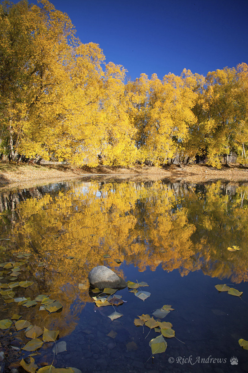
Fall Reflections
‹ PreviousLandscape GalleryNext ›

Fall Reflections

by Rick Andrews

Gallery: LandscapePosted October 24, 2013182 views8 comments
Here’s a recent shot I took in one of our regional parks. Thought I’d better get out there before the fall winds destroy the seasonal foliage.
:frown:

All comments, critique and suggestions welcome.

Tech stuff: Canon 5D2, 24-105 lens @ 24mm, f/18, 1/10 sec. Tripod, CP & ND filters.

Comments

8 comments
Comment posted by Bob Miller on October 24, 2013 at 9:32 PM
I would suggest removing the vignette and selectively doge/burn and saturate areas in the image. As it is, the eye is pulled to the center where the flatness of the trees at the waterline lacks sufficient interest to hold the viewer long enough. A different approach might be to dodge and saturate the floating leaves and some of the reflection to lead the viewer through to the horizon. I think you have something here but need to play with it a bit. :smile:
Registered on January 24, 2005, 152 Posts, 405 Comments
Comment posted by Daniel Rappaport on October 24, 2013 at 9:39 PM
Strong simple shapes and colors. I like it.
Registered on September 9, 2009, 294 Posts, 2006 Comments
Comment posted by Ed Lowe on October 25, 2013 at 9:02 AM
I really like the combination of blue and gold color in this autumn scene, Rick. The middle reflection of the treeline looks good to me. My only suggestions would be to lighten the FG leaves just a touch and tone down those on the middle of the shoreline. I think with those couple of small fixes this would really sing.

Ed
Registered on February 7, 2004, 414 Posts, 7115 Comments
Comment posted by Chris Stenger on October 25, 2013 at 4:01 PM
Nice scene. I like the yellow of the leaves, but the blue of the sky is too intense and oversaturated for me. I agree with Bob about the vignette.
Registered on May 9, 2013, 27 Posts, 163 Comments
Comment posted by Rick Andrews on October 26, 2013 at 10:08 AM
Hi everyone and thanks for the suggestions and feedback, here is a re-post after your recommended adjustments.

cheers
Rick
Registered on December 31, 2011, 45 Posts, 222 Comments
Comment posted by Bob Miller on October 27, 2013 at 9:21 AM
I like what you have done in your edit. Seems that it might be bit over-sharpened though.
Registered on January 24, 2005, 152 Posts, 405 Comments
Comment posted by Rick Andrews on October 27, 2013 at 11:08 AM
Thanks Bob, not sure how the over-sharpening occurred as I used my normal workflow process but agree it may look a little overdone.
Registered on December 31, 2011, 45 Posts, 222 Comments
Comment posted by Mark Metternich on October 27, 2013 at 12:56 PM
The edit looks good. Really nice scene!
Registered on June 19, 2009, 276 Posts, 6240 Comments