Nature Photographers Network
This is the preserved archive of the original Nature Photographers Network. The community continues at naturephotographers.network.
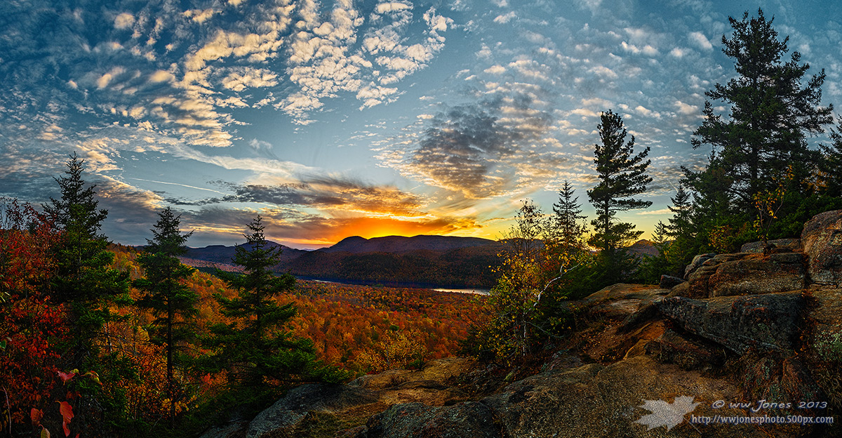
Bullhead Mt Sunset_re-do
‹ PreviousLandscape GalleryNext ›

Bullhead Mt Sunset_re-do

by Wayne Jones

Gallery: LandscapePosted October 23, 2013278 views14 comments
This is a re-do of the image I posted yesterday HERE.

Thanks for all your suggestions (especially Stan) to help me get rid of the HDR feel (even though it's a manual blend). This one has a brighter sky and darker land. IS IT BETTER?

THANKS for your honest comments.

Canon 5D3
Canon 24-105mm.; Circ. Pol.
1/6 sec. @ f/16 for the sky and 1 sec. @ f/16 for the land, at ISO 160
Ten exposures hand-blended into 5 vertical frames, and then stitched in CS6

Comments

14 comments
Comment posted by John Williams on October 23, 2013 at 11:07 PM
Much better Wayne! :wavey:
Registered on September 6, 2007, 221 Posts, 5985 Comments
Comment posted by Philip Hodgkins on October 23, 2013 at 11:13 PM
Absolutely lovely, Wayne. I am reluctant to choose between the two, but I think I prefer this one. As a practical matter, though, I suspect the other would be more attractive to a non-photographer. :toast:
Registered on July 24, 2006, 2741 Posts, 12349 Comments
Comment posted by Wayne Jones on October 23, 2013 at 11:25 PM
Thanks John.
PHIL: You hit on my dilemma exactly. The guy who wants a print of this seems to like the photos that "look like paintings." I'll see what his reaction is tomorrow.
Registered on April 18, 2007, 953 Posts, 6435 Comments
Comment posted by Morris McClung on October 23, 2013 at 11:37 PM
Definitely let the client choose. :biggrin:

I think this might show great on a black background. The other is certainly more painterly.
Registered on May 7, 2007, 670 Posts, 19650 Comments
Comment posted by Eva McDermott on October 24, 2013 at 1:32 AM
Love this one best Wayne but both are gorgeous.
Registered on January 4, 2009, 1015 Posts, 13229 Comments
Comment posted by John&Patty Benway on October 24, 2013 at 5:13 AM
I don't know Wayne, I like this one to, tough choice, luckily I don't have to make that call, it's up to you and your client, this one does have a little more of a natural look, either way, beautiful work. Take care.
John
Registered on May 12, 2006, 626 Posts, 8700 Comments
Comment posted by Bill Chambers on October 24, 2013 at 9:17 AM
Definitely a tough choice Wayne. Just to be difficult, I kinda like a mix of the two. I prefer the land/tress of the previous shot and the sky in this one. That's a big help, huh? LOL.
Registered on April 10, 2005, 753 Posts, 21216 Comments
Comment posted by Paul Breitkreuz on October 25, 2013 at 2:13 PM
Wayne, both work just fine IMO. However, as posted previously let the client choose. We as photogs get wrapped up in the technical and "realistic look" almost to a fault. But, in our defense that's what we are asking others to do for us, analyze & point out thoughts on the image technical items overall. So, that's what we do. :cool:
Registered on February 25, 2006, 525 Posts, 8448 Comments
Comment posted by Scott Smorra on October 25, 2013 at 9:28 PM
I like this one much better Wayne. I wasn't a fan of the HDR feel of the previous version, but I really like this one. Nice colors and sky.
Registered on November 2, 2009, 161 Posts, 2143 Comments
Comment posted by Stan Rose on October 25, 2013 at 11:03 PM
personally i think it's a huge improvement, Wayne--but i understand he appeal of the former. You oversharpened this one a bit :wink:
Registered on September 15, 2005, 836 Posts, 17099 Comments
Comment posted by Zack Clothier on October 26, 2013 at 1:00 PM
I'm with Bill, I like the land better in the first post, and the sky better here.. :biggrin: Looks like Garnet Lake from the Balm of Gilead?
Registered on January 28, 2010, 343 Posts, 2257 Comments
Comment posted by Albert Darmo on October 26, 2013 at 9:41 PM
Hi wayne :wavey: Love them both, but this one wins by a hair :smile:
Albert Darmo
Registered on November 25, 2008, 1386 Posts, 11978 Comments
Comment posted by Mark Metternich on October 27, 2013 at 12:51 PM
A better revision of the first. Killer scene for sure.

Still some haloing on that ridge line and what seems like some sharpening halos. I'm not sure what is causing it, but my first thought is maybe too much mid tone contrast (clarity) and maybe a little too much sharpening in certain areas for web. I'd sharpen various amounts in layers and erase out the indications of artifacting - or over sharpening.
Registered on June 19, 2009, 276 Posts, 6240 Comments
Comment posted by Wayne Jones on October 27, 2013 at 9:56 PM
Thanks again, everyone. This is another great example of how valuable NPN critiques are. You really helped me produce a better image.

Bill and Zack: Even before your comments, I recognized there was too great a contrast between the land and sky to print well, so I brightened the land somewhat, showed it to the client, and he actually chose the modified "realistic" version.

Zack: This was shot from the top of Balm of Gilead Mt, but that's 13th lake barely visible in the valley. This is one of the few places with a nice open view to the west and good hardwoods that I can get to quickly from home.

Stan and Mark, thanks for the technical eye here. I should really spend more time on Web conversions; I use an action I recorded to produce 1200 pixel reductions, but clearly, one size does not fit all. This image is so contrasty I even had to deal with the issues you mentioned in the full-size version to make an 11x21 print last Friday.
Registered on April 18, 2007, 953 Posts, 6435 Comments