Nature Photographers Network
This is the preserved archive of the original Nature Photographers Network. The community continues at naturephotographers.network.
Moon Rising [+edit]
‹ PreviousLandscape GalleryNext ›

Moon Rising [+edit]

by John Williams

Gallery: LandscapePosted October 21, 2013334 views22 comments
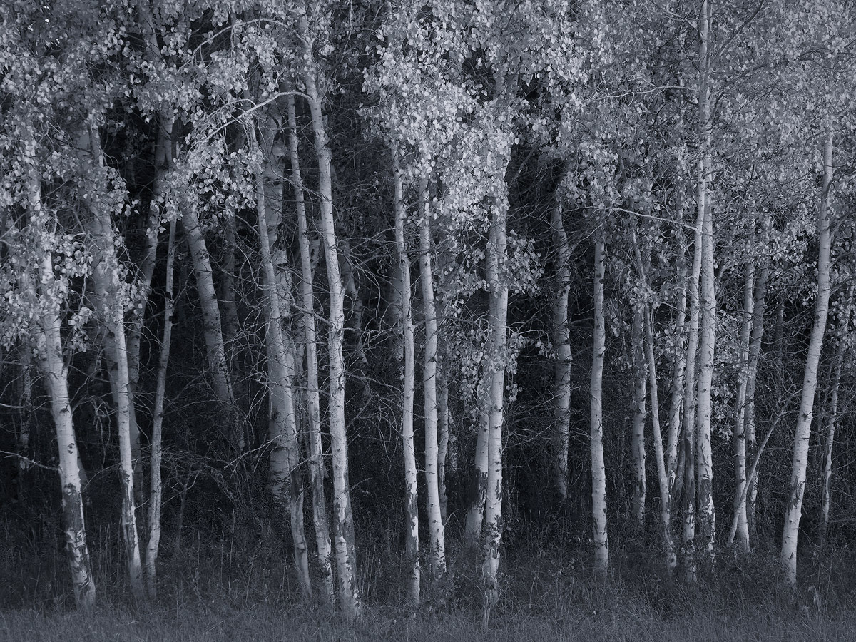
The title is deceptive. When I took this image, the light was bathed in late-light (not moon-light). The moon was rising above the aspen I was playing with though (see the following camera jpg, taken after this image), and I preferred the “moonlit” appearance of a BW version over the color.

I don't dabble with BW very often, and would love your thoughts; criticism welcome.

Nikon D80
Nikon 18.0-70.0 mm f/3.5-4.5 55.0 mm
1/8 sec at f/16 and ISO 100

Comments

22 comments
Comment posted by John Williams on October 21, 2013 at 10:40 PM
Registered on September 6, 2007, 221 Posts, 5985 Comments
Comment posted by Wayne Jones on October 21, 2013 at 11:06 PM
It's great that you envisioned this as a moonlit B&W. There is so much character in the structure of the aspen trunks and the texture of the bright leaves, it really does make an effective monochrome image. Maybe my taste in influenced by lots of B&W landscapes I have seen in recent years, but I think your conversion may be more realistic than I like to see. Since B&W is an unnatural artistic treatment of an image (because we normally see in color) it seems kind of logical to alter images for a more dramatic effect. Because of that, I think this might have more impact if it had more contrast; especially with more pure black tones. This is a great start, however, since it captures all the tones you need. Again, great vision to see this.
Registered on April 18, 2007, 953 Posts, 6435 Comments
Comment posted by John Williams on October 21, 2013 at 11:23 PM
Thanks Wayne; exactly the type of advice I was looking for. Something more like this?
Registered on September 6, 2007, 221 Posts, 5985 Comments
Comment posted by John Mumaw on October 21, 2013 at 11:30 PM
Yes! This is now a fine b&w image indeed.
Registered on September 9, 2005, 62 Posts, 2289 Comments
Comment posted by Peter Cross on October 21, 2013 at 11:42 PM
While I like both of these, the 2nd one definitely is the best. A really good eye for seeing this as it really is a very nice B&W image. Wayne's suggestion was a good one and it pushed it that much higher.
Registered on April 3, 2010, 271 Posts, 1342 Comments
Comment posted by Bruce King on October 22, 2013 at 12:04 AM
I really like this John. Waynes suggestion was spot on and you nailed it in the repost. :toast:
Registered on January 14, 2010, 276 Posts, 2212 Comments
Comment posted by Dan Kearl on October 22, 2013 at 12:11 AM
Repost is much better for me, in fact I would go even more contrast, the full Adam's treatment.
Nicely seen....
Registered on September 2, 2013, 209 Posts, 1514 Comments
Comment posted by Wayne Jones on October 22, 2013 at 12:12 AM
Oh yeah, that did it! PERFECT! ...and only wasted one sheet of paper :wink:
Registered on April 18, 2007, 953 Posts, 6435 Comments
Comment posted by Stuart Williams on October 22, 2013 at 2:23 AM
john, as a person who dabbles in b&w a lot (well, almost exclusively), I like this. The b&w works well with the aspens. Two things come to mind: first, i feel, perhaps mistakenly, that there's a slight tilt. Second, there appears to be a tone to the image. Personally, I prefer neutral b&w or slight warm tone (e.g., those used by LensWork). My guess is that you opted to use the blue tones for the moon effect? Anyway, all in all, nice work.
Registered on December 7, 2007, 247 Posts, 4792 Comments
Comment posted by Hamed Musharbak on October 22, 2013 at 9:13 AM
wonderful :toast:
Registered on June 1, 2009, 372 Posts, 2282 Comments
Comment posted by Ed Lowe on October 22, 2013 at 9:41 AM
No criticism from me, John. I think you nailed this beautifully with the added contrast in the repost.

Ed
Registered on February 7, 2004, 414 Posts, 7115 Comments
Comment posted by Bill Reid on October 22, 2013 at 9:46 AM
The repost nails it John. Really like the tones in this and the leaves just glow. Great job on this. :toast:
Registered on January 27, 2013, 65 Posts, 2460 Comments
Comment posted by John&Patty Benway on October 22, 2013 at 10:04 AM
Beautiful re post John. Well done.
John
Registered on May 12, 2006, 626 Posts, 8700 Comments
Comment posted by Harley Goldman on October 22, 2013 at 10:45 AM
Repost looks great. I might even bring in the black point a bit more, but looks real nice.
Registered on November 19, 2003, 586 Posts, 11271 Comments
Comment posted by Morris McClung on October 22, 2013 at 10:53 AM
The repost is dead on. A fine b&w aspen image, John.
Registered on May 7, 2007, 670 Posts, 19650 Comments
Comment posted by Joseph Campisi on October 22, 2013 at 12:11 PM
I agree with the others, the repost nails it John. Beautiful and delicate image, with a great subtle range of tones. Nice choice for B&W!
Registered on November 24, 2008, 304 Posts, 3211 Comments
Comment posted by Nick Bristol on October 22, 2013 at 1:01 PM
John, I just love the repost you did here. Fantastic b&w image imo. Totally enjoying the look and feel this has. :toast:

Nick Bristol
Lone Rock, WI
Registered on February 1, 2004, 752 Posts, 14140 Comments
Comment posted by Daniel Rappaport on October 22, 2013 at 1:01 PM
Well seen and composed. Love the glow. Think I prefer the more subtle version to the higher contrast.
Registered on September 9, 2009, 294 Posts, 2006 Comments
Comment posted by Stan Rose on October 22, 2013 at 9:02 PM
repost looks good! :smile:
Registered on September 15, 2005, 836 Posts, 17099 Comments
Comment posted by Phil Pogledich on October 23, 2013 at 8:42 AM
Definitely the repost, though some of the brighter leaves may be just a bit too bright from my perspective. I really like the image. I guess this sort of aspen shot is a bit familiar but as far as familiar themes go, it's way up there on my list.
Registered on August 24, 2009, 123 Posts, 3099 Comments
Comment posted by Eva McDermott on October 23, 2013 at 10:09 PM
Late to comment here, but I love your B&W repost. Excellent use of contrast.
Registered on January 4, 2009, 1015 Posts, 13229 Comments
Comment posted by Doug Koepsel on October 23, 2013 at 11:28 PM
The increased contrast and greater darkness of the background give the repost a better sense of depth to me.
Registered on April 1, 2010, 196 Posts, 1592 Comments