Nature Photographers Network
This is the preserved archive of the original Nature Photographers Network. The community continues at naturephotographers.network.
Back to Basics - Repost
‹ PreviousAvian GalleryNext ›

Back to Basics - Repost

by Barbara Graham

Gallery: AvianPosted October 4, 2013255 views11 comments
First, hi to everyone. I haven't been using my camera at all for a year or more except for a couple of unsuccessful attempts, and I suddenly had the desire to go out back and try to start over again.

Canon EOS 7D
EF400mm f/5.6L USM
10/4/2013 – 6:29:19 PM
1/1000 sec
Manual
f/5.6
ISO 400
Handheld
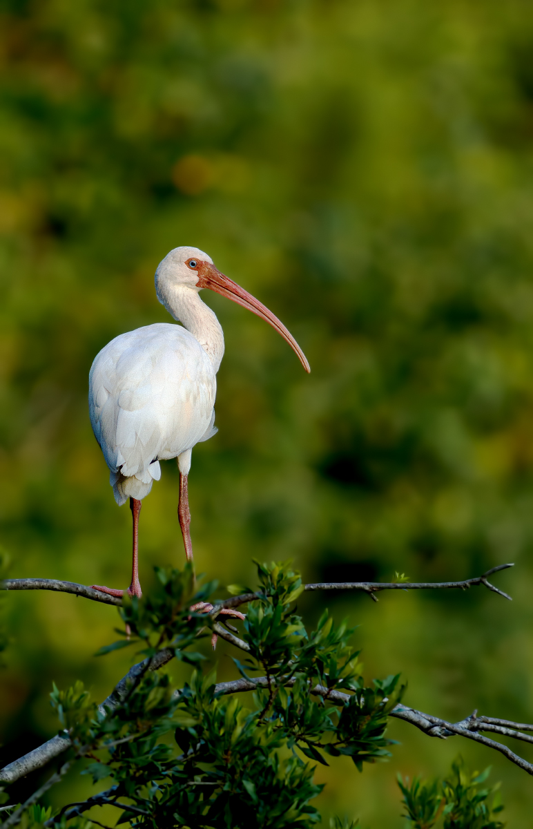
Processed in CS5 using Curves and Levels (too much?) and cropped to 59% of original. Original is also vertical.

What I like: Head turn, catch light, foreground and bird separated from background; the white against the green.

What I don't like: Easy, basic, common subject; ordinary surroundings; too much noise -- I used noise reduction on everything except the bird. That includes the leaves and branches, which I don't like doing and think probably shouldn't be done. There is a lot of noise in the bird as well. I think with the 7D there wasn't enough light to get a good image.

I would love it if whoever wouldn't mind would help me start over with honest comments and critiques. I can't promise how often I'll post, and what I post will probably be all common large birds, but at least by posting this I'm hopefully getting started again. Maybe I'll get inspired to go further than my backyard again. Thank you!

Comments

11 comments
Comment posted by Peter Cross on October 4, 2013 at 8:30 PM
Welcome back, Barbara. This is a nice image. I'm surprised you had lots of noise (but I'm not seeing much on my monitor) as you didn't have a high ISO and your shutter speed indicated light. Nevertheless it's a pleasing image. The BG is nice and soft and shows off the bird well. Whites on the bird look good and it gave you a nice pose from pretty good perch. I think you did very well here; even with the time off. This is way better than a few years ago when you truly were just beginning. I hope to see more of your photos in the future.
Registered on April 3, 2010, 271 Posts, 1342 Comments
Comment posted by Richard Ditch on October 4, 2013 at 11:25 PM
Welcome back Barbara - I know I've missed your posts and your intriguing questions.

Image quality isn't bad here. Nice sharpness. Whites under control.

The histogram for the image shows all three color channels jammed against the left side, making the dark areas of the background darker than they need to be. Try a Levels Layer with the black marker moved 20 points to the right.

I'd also have tried to get closer. Even with your crop I'd like to see more taken off the top and left to tighten this up a bit.
Registered on November 1, 2003, 1031 Posts, 12705 Comments
Comment posted by John Tobias on October 5, 2013 at 12:10 AM
Barbara, not sure I would call this starting over as IMHO this is a very nice portrait of the ibis. You have nice detail in the whites and I like the way the greens set off the bird. I also do not see much in the way of noise on my monitor. I would be happy to have this image in my collection. thanks for sharing and welcome back.
Registered on September 12, 2009, 2120 Posts, 6455 Comments
Comment posted by Ken Archer on October 5, 2013 at 4:14 AM
It's great to see you back here Barbara. A sweet photo of this ibis. Excellent pose and details and complimentary background too, but what I really like about this photo is that beautiful blue eye. A bit tighter crop may make this one even more appealing, mostly off the right side and top in my opinion.

Looking forward to seeing more of your photos.
Registered on October 28, 2004, 222 Posts, 6683 Comments
Comment posted by Carol Nichols on October 5, 2013 at 12:10 PM
Hi Barbara. I hope you find your inspiration again. I like the position of the bird's head and body and the light shining on him. I think the image may look better with some cropped off the top and off the bottom. I think the left and right sides are just fine. Try it and see what you think.
Registered on November 7, 2007, 161 Posts, 1420 Comments
Comment posted by Barbara Graham on October 5, 2013 at 1:57 PM
Thank you so much for the comments. I followed Richard's directions for a Levels layer and also cropped a little bit from the bottom and right and a lot from the top. Better?
Registered on July 27, 2010, 1310 Posts, 5035 Comments
Comment posted by Richard Ditch on October 5, 2013 at 2:12 PM
That's it - nice improvement.
Registered on November 1, 2003, 1031 Posts, 12705 Comments
Comment posted by Carol Nichols on October 5, 2013 at 4:22 PM
Barbara, a composition guideline for bird photography that I learned somewhere along the way, is that there should be more space on top of the subject than on the bottom. In your repost you have less on top than on bottom and I believe the image would be stronger the other way around.
Registered on November 7, 2007, 161 Posts, 1420 Comments
Comment posted by Max Waugh on October 6, 2013 at 10:10 AM
Barbara, the repost is an improvement. The levels adjustment worked well. I think a tighter crop was a good choice too, though you could have gone either way, IMO, in regards to more room on the top or bottom.

Along those lines: Carol, you made an interesting comment. Perhaps this is not the place to continue the discussion, but I would wonder why the composition guideline you mention should be applied specifically to bird photography. Our composition decisions usually depend on numerous factors, but I really can't see why birds should dictate a specific composition/crop choice.

Max
Registered on September 26, 2008, 428 Posts, 2329 Comments
Comment posted by Carol Nichols on October 6, 2013 at 11:51 AM
Max, I believe I said it applied to bird photography because I read it either in a blog post or book written by Arthur Morris, a fairly famous bird photographer. It seems like it could be applied to wildlife photographs as well and perhaps other types of photography..
Registered on November 7, 2007, 161 Posts, 1420 Comments
Comment posted by Nate Chappell on October 6, 2013 at 12:11 PM
Very nice Barbara, I like both versions. The repost is nice but you were concerned about the noise and cropping it more does bring in a bit more noise.

Regarding Carol's comment, I agree with Max that comp is based on numerous factors, what other elements are in the frame as well as personal preference. In this particular image it looks like there may be more distracting vegetation n the bottom. On verticals in particular I like to place the bird's head fairly high in the frame, for this particular image I would have placed it in between what Barbara has done with these 2 posts, so the head would be about the "rule of thirds" mark.
Registered on February 1, 2006, 1158 Posts, 19528 Comments