Nature Photographers Network
This is the preserved archive of the original Nature Photographers Network. The community continues at naturephotographers.network.
Mountain Paradise +repost
‹ PreviousLandscape GalleryNext ›

Mountain Paradise +repost

by Chris Moore

Gallery: LandscapePosted September 29, 2013845 views23 comments
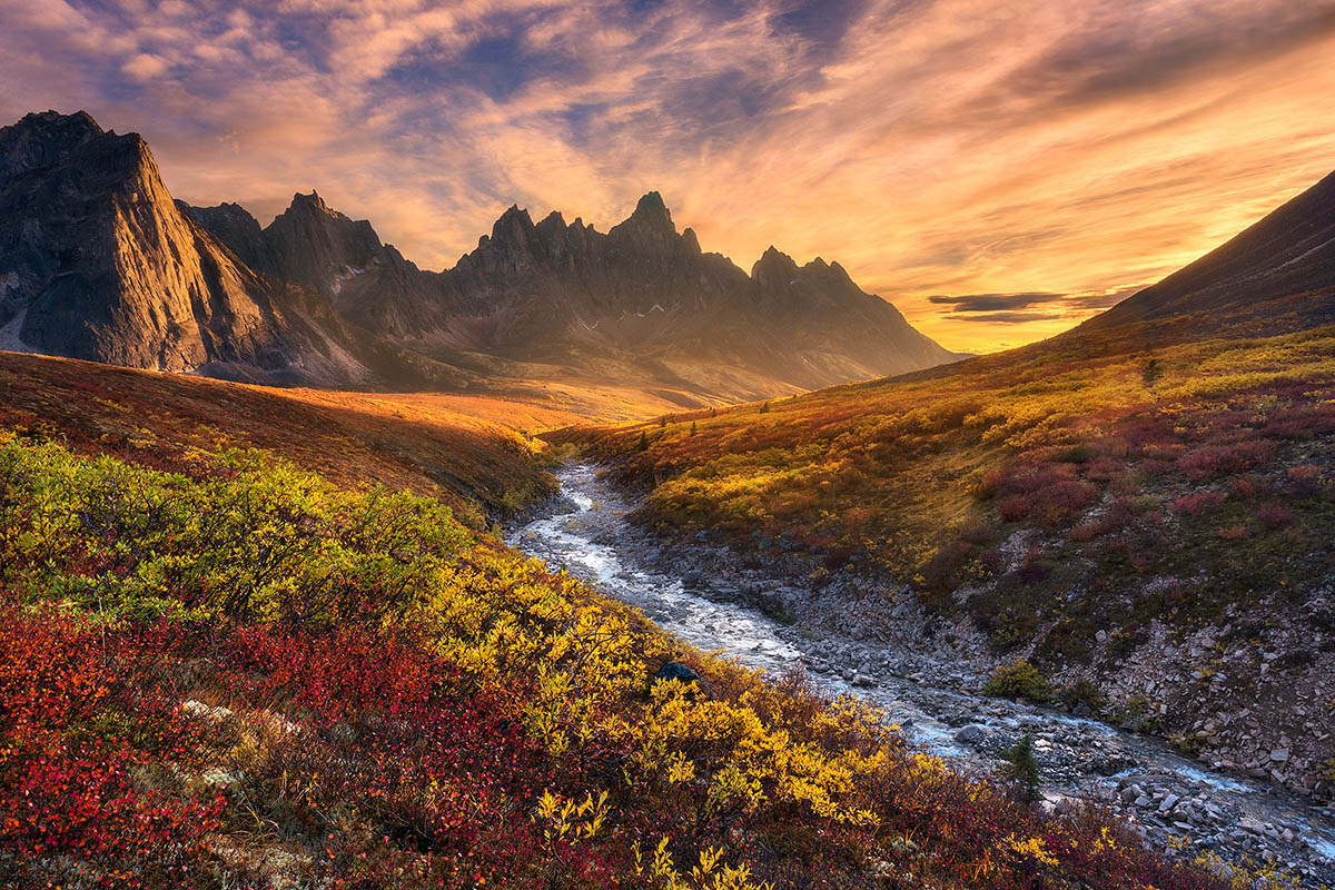
This is the last one I'll post from the Yukon trip, and its one of my favorites. I did get some aurora shots that I like, but we unfortunately we didn't get any good snow, and without the snow the images just don't hold ground to what you've seen posted here before. This is from an amazing area facing Tombstone Mountain that Marc A showed us and he has some great shots from around here. There are a number of great compositions spanning a half mile or so along this creek. This particular afternoon, the sunset seemed to last for well over an hour, but for a small window the sun peaked through the clouds as it set behind the mountain and gave some illumination to the midground which really added some depth. I intentionally processed this to give it a dreamy feel. I reprocessed from scratch a couple of times, and in the end liked this version, though some may take issue with the magentas being a little strong. It's from a single RAW, except the highlights on the right sky I had to take a separate shot to tame them. I hope you all are having a good weekend and thanks for looking. Critiques welcome.

Comments

23 comments
Comment posted by scott lanz on September 29, 2013 at 11:01 AM
Wow, Chris, spectacular. Awesome scenery expertly captured and processed. :toast:
Registered on November 14, 2003, 840 Posts, 12902 Comments
Comment posted by Bill Reid on September 29, 2013 at 11:32 AM
Beautifully done Chris and I agree the best of the Yukon images. Great color and light in this and top notch processing. Great job. :toast:
Registered on January 27, 2013, 65 Posts, 2460 Comments
Comment posted by Michael Anderson on September 29, 2013 at 12:12 PM
This is fantastic Chris! My favorite of your series. Beautiful composition, spectacular light and nice accents on the fall colors all combine to make this an outstanding image.
Registered on January 31, 2006, 228 Posts, 3072 Comments
Comment posted by Dan Kearl on September 29, 2013 at 12:29 PM
I just want to walk through this....
Excellent work.
Registered on September 2, 2013, 209 Posts, 1514 Comments
Comment posted by Floris van Breugel on September 29, 2013 at 12:43 PM
Incredible view! The fall colors and the jagged peaks must have been quite something to see together. I do find the sky over processed.
Registered on December 19, 2008, 306 Posts, 4840 Comments
Comment posted by Chet Dowell on September 29, 2013 at 12:56 PM
:toast: :toast: Chet
Registered on December 3, 2012, 237 Posts, 1171 Comments
Comment posted by Nathan Apodaca on September 29, 2013 at 1:30 PM
Perfect comp and nicely captured. I really like the dreamy feel, but also agree that it may be a bit more believable if the sky was just a bit less processed-looking. What a grand finale to wrap up the Yukon images!
Registered on November 16, 2011, 67 Posts, 1127 Comments
Comment posted by Gary Reed on September 29, 2013 at 1:55 PM
Chris, Very dreamy indeed. As you mentioned the magentas are a tad much for me, the rest is spot on though. A fantastic comp with magnificent light. :toast:
Registered on September 19, 2009, 198 Posts, 1074 Comments
Comment posted by Peter Coskun on September 29, 2013 at 2:23 PM
The comp here is great as are the range of colors. I find the magenta a tad too much in the sky, but it seems to fit with the rest of the scene. I feel like the clouds should be more orange rather than the yellow but that is a minor nit. A very fantastic image overall.
Registered on October 31, 2011, 170 Posts, 1240 Comments
Comment posted by Thomas Haney on September 29, 2013 at 4:17 PM
Beautiful shot Chris. The scenery is absolutely amazing and you captured it very well. My only suggestion would be to leave a little more brightness in the sky so it looks more natural, the darkness to me makes the post processing a little too obvious. Very well done.
Registered on April 7, 2013, 138 Posts, 537 Comments
Comment posted by Chris Moore on September 29, 2013 at 4:34 PM
Thanks for the comments. I'll tweak the sky and post another version soon.
Registered on January 12, 2010, 84 Posts, 388 Comments
Comment posted by Chris Moore on September 29, 2013 at 5:41 PM
I appreciate the comments on the sky, now that I look at it again I do agree with everything you said. I reworked the sky in the RAW file and painyed it on to the foreground because I am happy with that. I did have to stretch it a little to make it fit properly. I did all the adjustments in ACR this time. I tamed the magentas and kept it a bit lighter. The differences are much more apparent when clicking back and forth quickly between the tiffs than it may be with the smaller versions here. Maybe this works better?
Registered on January 12, 2010, 84 Posts, 388 Comments
Comment posted by Floris van Breugel on September 29, 2013 at 5:52 PM
Although a subtle improvement, I still find the sky in the repost to be over processed. The tone of the yellows and browns in particular, in the right half of the sky (and to some extent the magenta in the left), are the problems. If you reduce the saturation in those areas (substantially), then the beautiful foreground colors will stand out more (which, IMO, would be a good thing). That color of yellow kind of makes me think of a sunset in LA on a hot smoggy summer day...

That is of course my opinion, but I've found that outside of the internet people tend to appreciate more natural representations of color (I've been working hard myself to resist the temptation of pushing it!).
Registered on December 19, 2008, 306 Posts, 4840 Comments
Comment posted by Joe James on September 29, 2013 at 8:46 PM
Wonderful shot Chris! Great composition, wonderful colors, just really well done.
Registered on November 20, 2009, 89 Posts, 808 Comments
Comment posted by Mark Metternich on September 29, 2013 at 9:00 PM
I take no issues! Sweet shot Chris! :toast:
Registered on June 19, 2009, 276 Posts, 6240 Comments
Comment posted by Jeremy Kessler on September 30, 2013 at 1:09 AM
This is a beautiful image Chris. :toast:

I do I agree with Floris regarding the sky, I think if I were to hang on my wall (I bet it would looks awesome as a print!) I'd prefer a little bit more natural rendering of the sky.

But as always, do what you like, don't let your photos become a product of others :wink:
Registered on September 13, 2007, 36 Posts, 1283 Comments
Comment posted by Grant Collier on September 30, 2013 at 5:11 PM
Goregous scene and well processed! I prefer the original post. The 2nd one seems a bit too yellow on the right side and the sky doesn't appear as dramatic to me. Maybe something closer to the right side of the sky from for the first post and the left side from the 2nd?
Registered on July 29, 2005, 73 Posts, 430 Comments
Comment posted by Aaron Feinberg on October 1, 2013 at 12:02 PM
Gorgeous. And I'll say it again...to me this is an exact MA feel. Not sure what that means but it does work...Unreal light and location...very cool :)

aF
Registered on October 26, 2009, 399 Posts, 2789 Comments
Comment posted by Harry Lichtman on October 1, 2013 at 5:24 PM
Chris - A beauty indeed! The far right in the golden area of the scrub it looks like there may have been a drag of the erasure tool or some other artifact. I though the dark area wa a tree, but it doesn't look like the other trees closer to the river. Kind of a dark baer band going up to the ridge - skyline. Maybe have a look, just seemed out of place.
Registered on September 17, 2010, 304 Posts, 3507 Comments
Comment posted by Chris Moore on October 1, 2013 at 6:56 PM
Thanks, Harry. I didn't really notice that until you pointed it out. I went back to the RAW file and there was a darker band there, not sure from what and I think it just got brought out a little with the processing. Fortunately it doesn't stand out very much on the print.
Registered on January 12, 2010, 84 Posts, 388 Comments
Comment posted by Kory Lidstrom on October 2, 2013 at 2:33 PM
Nice work, Chris.
Registered on November 19, 2008, 49 Posts, 1035 Comments
Comment posted by Kah Kit Yoong on October 3, 2013 at 3:28 AM
I would agree that the colours are perhaps not looking true to life but very pleasing nonetheless. Beautiful image.
Registered on September 27, 2006, 636 Posts, 10682 Comments
Comment posted by Chris Moore on October 3, 2013 at 7:47 PM
Thanks for the help tweaking this. For now, I settled on a version somewhere between the original post and what floris suggested.
http://exploringlight.photoshelter.com/gallery-image/New-Work/G0000YKSuLVwVXHU/I0000rvd3LhRID0Y
Cheers!
Registered on January 12, 2010, 84 Posts, 388 Comments