Nature Photographers Network
This is the preserved archive of the original Nature Photographers Network. The community continues at naturephotographers.network.
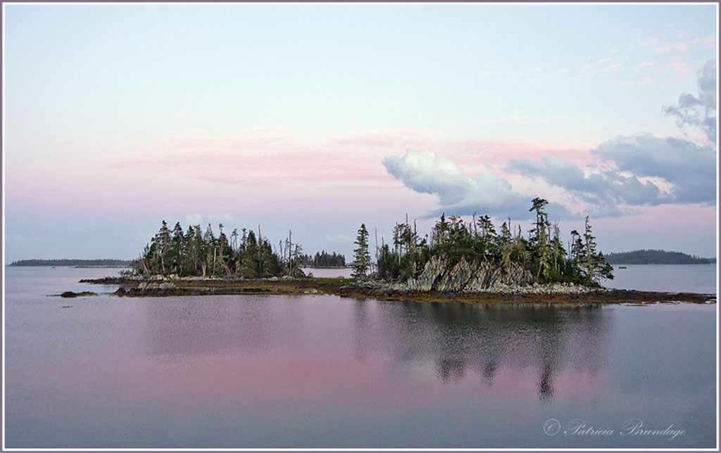
Chapel Islands
‹ PreviousLandscape GalleryNext ›

Chapel Islands

by Patricia Brundage

Gallery: LandscapePosted September 7, 2013279 views7 comments
This grouping of islands is a favorite spot of mine on the eastern shore in Nova Scotia. The sunset was brilliant, but this gentle pink sky was in the east. Taken with Canon 40D, using 10-22 lens, ISO 400, F5.6, 1/50 sec..

Comments welcomed.

Comments

7 comments
Comment posted by Todd Bloomquist on September 7, 2013 at 6:59 PM
Patricia, I love how this feels. The colors are subtle and it seems to have a story that goes along with it. I don't know what to tell you to improve it--well done.

Todd
Registered on January 21, 2012, 10 Posts, 51 Comments
Comment posted by Dan Kearl on September 7, 2013 at 8:50 PM
Very attractive pastel color and a nice comp.
For some reason the larger version is not as nice as this one, maybe compression?
The cloud is perfect.....
Registered on September 2, 2013, 209 Posts, 1514 Comments
Comment posted by Patricia Brundage on September 7, 2013 at 9:06 PM
Dan. Both look fine on my computer but when I uploaded I didn't view them to see if they were OK on the NPN site. Both processed exactly the same but somehow the sharpening is different. Oops. Thanks for pointing this out.
Registered on March 23, 2006, 1111 Posts, 6531 Comments
Comment posted by Hamed Musharbak on September 8, 2013 at 2:50 AM
I like the simplicity here

good work
Registered on June 1, 2009, 372 Posts, 2282 Comments
Comment posted by David Chauvin on September 8, 2013 at 1:54 PM
The pastel color gives this a very peaceful fee. :cool:
Registered on August 5, 2004, 1007 Posts, 5595 Comments
Comment posted by Bill Chambers on September 8, 2013 at 4:17 PM
Beautiful Patricia. The soft pastels really stand out. The only possible suggestion I can think of would be to crop the bottom a wee bit to make the image less centered, but that's very minor. Usually, the negative space at the top might be distracting, but in this image it just adds to the feeling of spaciousness. Excellent work.
Registered on April 10, 2005, 753 Posts, 21216 Comments
Comment posted by Preston Birdwell on September 8, 2013 at 7:32 PM
I like the nice pastels in this along with the looming clouds. It looks like the large version is a bot over-sharpened and there may be some compression artifacts, as well. I like the magenta in the water. Nice moody image, Patricia.

--P
Registered on November 1, 2003, 471 Posts, 5188 Comments