Nature Photographers Network
This is the preserved archive of the original Nature Photographers Network. The community continues at naturephotographers.network.
Chest Deep
‹ PreviousLandscape GalleryNext ›

Chest Deep

by James Fougère

Gallery: LandscapePosted September 6, 2013528 views16 comments
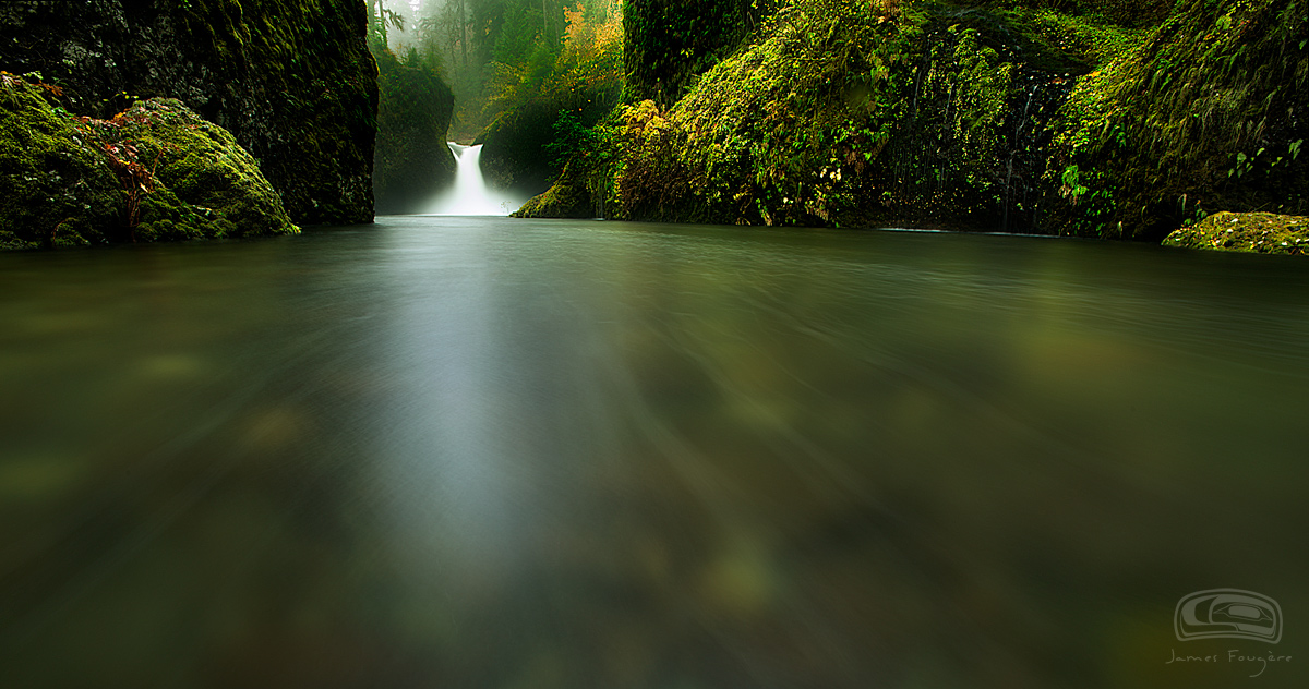
I was curious about your thoughts with the perspective I took of this well known waterfall in the Columbia Gorge?

This was a bit difficult to capture! I was in the river up to my chest! In the heavy rain, with a strong current made it difficult to capture several exposures without tripod movement!

I was trying to capture foam streaks for the foreground, but I did not get as much steaks as I hoped! I did blend several images for the foreground to compile as much "streaking" as I could for leading lines to the waterfall.

I was conservative with the saturation of color on this one :wink:

This was a tough shoot for the lower half of the body :eek:

Your comments are always appreciated.

D800E, 14-24mm

Comments

16 comments
Comment posted by Floris van Breugel on September 6, 2013 at 2:48 PM
Every time I see a picture of punchbowl I just end up staring at the bright patch of glare on the water... unfortunately this perspective just makes that glare patch even bigger and more distracting. I do like the streaks you did capture, though if they had been higher contrast that would have made a big improvement.
Registered on December 19, 2008, 306 Posts, 4840 Comments
Comment posted by Brad Strong on September 6, 2013 at 3:07 PM
James,

Sounds like a pretty interesting adventure. Other than the falls, this is all really dark. The color picker shows a lot of black clipping. It's your choice, but I'd like to see some shadow detail instead of so much black. You mention conservative saturation, but this is still really saturated IMO. Adding lots of blacks to an image is another means of saturation (while eliminating shadow detail).

For the perspective you shot from, I wouldn't know if you didn't explain that you were in the water. While kind of interesting, the perspective and composition is only ok for me. The waterfall is the main visual interest in this image, but it's very small and seems like too long of an exposure for it. I think this type of shot would work better without a waterfall. If you're interested in the lines in the water, the waterfall and its reflection detracts from them.

Brad
Registered on October 1, 2012, 43 Posts, 302 Comments
Comment posted by James Fougère on September 6, 2013 at 3:42 PM
Floris,

I see what you mean, the reflection is distracting even with the polarizer I used. I should tone it back. I did everything I could to accentuate those streaks. I would have liked to see more of them while I was in the water. Maybe there is a better way to accentuate them if I had better processing skills!

Brad,

I will look at the file again, I did some levels adjustments, and would not clip the blacks. I was wanting to the mood of this image to stay a bit dark and mystical being a rainforest location on a rainy day :smile: As for your other comments, I do not see the point of doing this image without the waterfall. If I had more streaks, then they would have led the eye towards the waterfall. I realize with this perspective, the waterfall is smaller. As for exposure of the waterfall, that is a personal choice :biggrin:

I will cut back the reflection..

Thanks guys!
Registered on October 25, 2010, 41 Posts, 831 Comments
Comment posted by Dan Kearl on September 6, 2013 at 8:35 PM
I would think your blinkies were off the chart in camera. Way too slow for me and the water is way too bright.
I like where you are standing in the river, but the FG water that blurred has no interest. Sharp river rocks look better for me.
I also would have raised the lens a bit for less FG.
Registered on September 2, 2013, 209 Posts, 1514 Comments
Comment posted by Tom Hilton on September 6, 2013 at 8:38 PM
This will make a great LARGE print...
Love the perspective and the density...
I like it a lot!
Registered on September 19, 2011, 68 Posts, 668 Comments
Comment posted by James Fougère on September 6, 2013 at 9:27 PM
Dan,

My blinkies were fine. When it comes to waterfalls, and coastal scenes everyone has different perspectives and opinions on exposure of moving water. I feel it comes down to personal taste. I am not sure how bright your monitor is, but the highlights are under control. I was trying to capture foam streaks with a long exposure, not do a fast shutter speed of the rocks. If I had more streaks present, then the camera angle would be exactly what I wanted. So maybe the existing streaks are not enough to hold the eye :smile:

Tom, I am liking it as well, but for what I was trying to achieve, more foam streaks would have been ideal :biggrin:
I have another version I will post to compare concepts...

Thank you for the comments.
Registered on October 25, 2010, 41 Posts, 831 Comments
Comment posted by Kah Kit Yoong on September 6, 2013 at 10:25 PM
Having seen a stack of outstanding images from this location honestly, this one doesn't seem convincing to me with not much happening in that foreground taking up 2/3s of the frame and the falls themselves diminished in scale. Some more prominent streaks are really needed to make this work.
Registered on September 27, 2006, 636 Posts, 10682 Comments
Comment posted by James Fougère on September 6, 2013 at 10:32 PM
This is another composition of the same waterfall taken the same day standing in the river :biggrin:

Maybe this appeals to some people, since the foam streaks are not strong enough with my other composition.

I was only up to my knees for this one.

Kah, I agree with you, that is why I posted it, just to see what people had to say. That is why this site can have value to help each other with image ideas critiques etc :biggrin:
Registered on October 25, 2010, 41 Posts, 831 Comments
Comment posted by Kah Kit Yoong on September 6, 2013 at 11:13 PM
I like the second composition a lot better.
Registered on September 27, 2006, 636 Posts, 10682 Comments
Comment posted by Marylynne Diggs on September 7, 2013 at 12:22 AM
I like both. Despite the blurred water and wide angle/small falls, the textures and fogginess in the first one are a unique take on an oft-shot falls. I do like the fg water better in the second, but the darker canyon walls are less pleasing than the colorful walls on number 1.

What I find most compelling inboth of these is the use of the bowl and canyon walls to create a gateway to the falls effect. I have generally tried to minimize the walls, and your use of them here is a nice change.
Registered on December 14, 2010, 122 Posts, 1034 Comments
Comment posted by Jeremy Kessler on September 7, 2013 at 12:50 AM
Nice Image, I'm sorta in agreement with the river taking up so much of the image. I'm sure you have lots more comps though to work with.

See any Kayakers when you were there? Just finished up a website for a photographer who's got some shot of them running the falls. http://morthphotography.com/p/image/i/7525/reid-morth_kayak-8346.htm :smile:
Registered on September 13, 2007, 36 Posts, 1283 Comments
Comment posted by Peter Cross on September 7, 2013 at 12:54 AM
Well, I certainly get a feel that the water is coming at me. Probably not as strong as you got from actually being in it. I'll bet it was a challenge. I don't have any problem with the color saturation as presented but I seen many more from the gorge with way more. So I guess it's up to you as to how much is needed to duplicate what you mind's eye remembers. I really like the falls in the BG but being a light subject the eye is drawn right to it. Only suggestion would be to clone out those couple areas of bright sky as they distract the eye. The misty brightness is fine, however. That's my take as a non-landscape person.
Registered on April 3, 2010, 271 Posts, 1342 Comments
Comment posted by James Fougère on September 7, 2013 at 1:17 AM
Jeremy,

I did not see any kayaks in there, but I am sure running this spot would be a blast!!
As I mentioned, without more predominate foam streaks the images loses its appeal. I aspects of both compositions.

Thanks again for the input here everyone :smile:
Registered on October 25, 2010, 41 Posts, 831 Comments
Comment posted by Brian Donovan on September 7, 2013 at 10:21 PM
I like the second image more than the first and I think it helps to bring in that rushing water in the foreground. I do feel as though the cliffs are a bit dark and could be brightened a bit, while still maintaining the high contrast image. The background is soft and misty...I like it!
Registered on August 29, 2013, 11 Posts, 40 Comments
Comment posted by Hamed Musharbak on September 8, 2013 at 2:53 AM
nice
Registered on June 1, 2009, 372 Posts, 2282 Comments
Comment posted by Mark Metternich on September 19, 2013 at 11:28 PM
The glare does not bug me in the slightest. Great perspective!!!!

Darks feel a little heavy and it feels tilted to the right sightly. Feels that is... :) :toast:
Registered on June 19, 2009, 276 Posts, 6240 Comments