Gallery: LandscapePosted August 16, 2013242 views10 comments
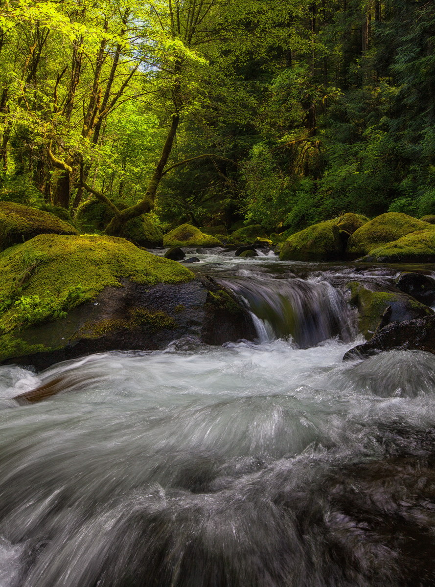
Herman Creek, Columbia Gorge, this spring. Canon 5DMk2, 16-35 at 28mm, polarizer. iso250, f16, 1/4sec.
Comments
10 comments
Comment posted by Peter Cross on August 16, 2013 at 10:26 PM
Like it, Daniel. For me, it's all about the water and the FG is just terrific. It's like being there. I really like how it turned out. Exposure was perfect. The top of the photo has all the supporting green veg, rocks, etc. They are fine except the bright green seems a tad too bright. I know this is the Gorge so I may be off on that comment.
Registered on April 3, 2010, 271 Posts, 1342 Comments
Comment posted by Joseph Campisi on August 17, 2013 at 10:26 AM
I really like the shutter speed in this one Daniel! Really shows the power of the flow, along with the in-your-face perspective.
Registered on November 24, 2008, 304 Posts, 3211 Comments
Comment posted by Luke Ormand on August 17, 2013 at 1:37 PM
Nice mood and I like the dappled light coming in on the left. I think the right side could be brightened up a bit, particularly the lower portion of the shot but overall it's a nice flow
Registered on February 4, 2009, 1093 Posts, 7035 Comments
Comment posted by Nick Bristol on August 17, 2013 at 2:52 PM
Daniel, I'm really enjoying this view! It's a very cool shot and well done. It really puts you right there in the scene and I just feel the water rushing past. Nice work!!
Nick Bristol
Lone Rock, WI
Registered on February 1, 2004, 752 Posts, 14140 Comments
Comment posted by Gary McGhee on August 18, 2013 at 2:06 PM
I like your low down view point Daniel, my eye wanders right up and through this. The vibrancy of the surrounding foliage is very nice too. A very inviting scene.
Gary.
Registered on April 15, 2010, 142 Posts, 2416 Comments
Comment posted by David Edwards on August 19, 2013 at 6:27 AM
Love the detail and clarity of the fg water. I like your comp and processing too. My only suggestion would be to slightly lighten the two rocks on the middle right to help draw the eye around. A beautiful forest stream shot Daniel.
Registered on December 6, 2008, 142 Posts, 2623 Comments
Comment posted by Paul Breitkreuz on August 20, 2013 at 9:36 AM
Daniel, sadly this is one of those really nice images that the thumbnail does not work too well on. But, the LARGER version is a real treat. An excellent deep forest capture. I do like the SS on this water action too, and of course the very fine greenery surrounding the Gorge here.
Registered on February 25, 2006, 525 Posts, 8448 Comments
Comment posted by Peter Richter on August 20, 2013 at 5:23 PM
Stunning dynamic balance to me, Daniel! Your choice of shutter speed is spot on to my eye.
Peter
Registered on November 10, 2010, 218 Posts, 2723 Comments
Comment posted by Mark Metternich on August 25, 2013 at 12:50 PM
Very nice shot Daniel! Maybe I'll see you in there this coming fall of next spring.
I'm not sure, but I wonder if the image might benefit from a right to left graduated luminance adjustment to less light falloff on the right a little? I say I don't know because I don't. But tonal balance is one of the main fundamentals I look for in any image. Yet having said that, sometime too much tonal balance makes images look too HDR ish... Just some thoughts.
Registered on June 19, 2009, 276 Posts, 6240 Comments
Comment posted by Daniel Rappaport on August 25, 2013 at 1:32 PM
Hi Mark,
No question that this image is unbalanced, but the contrast between the 2 areas of green was what the image said to me, so I kept it rather than trying to balance it.
Registered on September 9, 2009, 294 Posts, 2006 Comments

Comments
10 commentsNick Bristol
Lone Rock, WI
Gary.
Peter
I'm not sure, but I wonder if the image might benefit from a right to left graduated luminance adjustment to less light falloff on the right a little? I say I don't know because I don't. But tonal balance is one of the main fundamentals I look for in any image. Yet having said that, sometime too much tonal balance makes images look too HDR ish... Just some thoughts.
No question that this image is unbalanced, but the contrast between the 2 areas of green was what the image said to me, so I kept it rather than trying to balance it.