Nature Photographers Network
This is the preserved archive of the original Nature Photographers Network. The community continues at naturephotographers.network.
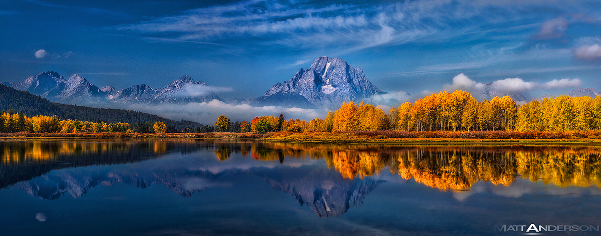
Ox Box #2 in Color
‹ PreviousLandscape GalleryNext ›

Ox Box #2 in Color

by Matt Anderson

Gallery: LandscapePosted August 11, 2013776 views12 comments
small version doesn't do it justice, use the larger link or the purchase print link which as a downloadable 1800px version.

A color version of the last post. People seem to like this better, though I prefer the black and white. If you click the "Purchase Print" link you can see a long write up on the photo and the thoughts that went into the processing and conversion.

I've looked at this photo in Chrome, Firefox, and Safari. Even though sRGB is embedded, I've noticed the colors aren't consistent across the browsers. Safari has the closet rendition to calibrated monitor.

This is composed of two horizontal shots on a D800E, 70-200mm 2.8VRII ISO100 f/13 1/15 second at 70mm, initially processed in LR5, polished in Photoshop CC.

Comments

12 comments
Comment posted by Navin Sarma on August 11, 2013 at 1:49 PM
Sweet stuff, Matt. Orange and blues work very well together. Can't decide if the lil cloud on the left is distracting or not. If possible, I'd look at healing the reflection a little right of center
Registered on July 17, 2011, 233 Posts, 1373 Comments
Comment posted by Harry Lichtman on August 11, 2013 at 1:54 PM
Matt - he lighting and foliage look just spectacular for this iconic spot. Regarding the processing, definitely appears to be a cyanotic shift in the sky, water. Not so much in the mnts. Also maybe a polarizer used :confused: though I didn't see that in your description above. The left looks darker than the right. The upper clouds should be more white IMO and they look cyan. Lower clouds look fine. I'm looking forward to the fall already! You've lit my fire with this one! To be super picky, while the clouds are nice, some almost look like the remnants of plane contrails which we always try to avoid. Not much you can do about that except wait, but with this kind of lighting that is really no option. :toast:
Registered on September 17, 2010, 304 Posts, 3507 Comments
Comment posted by Nick Bristol on August 11, 2013 at 3:09 PM
Matt, Wow, this looks fantastic! I do like the b&w version alot but this color version is just outstanding too. I would love love to see your print of this...I'm sure you have one and it is probably quite large. :smile: I want to go see this place one of these days! Beautiful work! :toast:

Nick Bristol
Lone Rock, WI
Registered on February 1, 2004, 752 Posts, 14140 Comments
Comment posted by Sairam Sundaresan on August 11, 2013 at 3:10 PM
Fantastic Pano Matt! This would look fantastic in print! The clean reflections and the vibrant yellows really make this sing! :toast:
Registered on March 14, 2013, 100 Posts, 643 Comments
Comment posted by Philip Hodgkins on August 11, 2013 at 4:16 PM
Hard to critique an image that is better than I know how to take. I will content myself with saying the B/W image is head and shoulders above the color.
Registered on July 24, 2006, 2741 Posts, 12349 Comments
Comment posted by Shantikara Valuska on August 11, 2013 at 5:42 PM
I love both versions, this for its amazing colors, and the BW for its strong contrasts.
:toast:
Registered on July 25, 2011, 38 Posts, 451 Comments
Comment posted by Richard Teller on August 11, 2013 at 6:36 PM
Beautiful pano of one of my favorite spots. The light is great, the clouds, fog and reflection work together to make a great image. I can see this really large.
Registered on August 23, 2010, 1162 Posts, 6692 Comments
Comment posted by Tom Hilton on August 11, 2013 at 7:56 PM
One of my favorite places on earth,
and this is the best image of it, that I have ever seen...
Both B&W and color are spectacular...
I would vote color...
Excellent.
Registered on September 19, 2011, 68 Posts, 668 Comments
Comment posted by Nancy Lea Sandy on August 11, 2013 at 9:32 PM
Nice. Balance between the warm/cool tones is durn near perfect. Excellent comp as well. Good work
Registered on January 24, 2011, 576 Posts, 6942 Comments
Comment posted by Marc Adamus on August 13, 2013 at 5:27 PM
There is one reason this is arguably the most photographed landscape spot on the globe, and this is it!
Registered on September 17, 2005, 780 Posts, 8091 Comments
Comment posted by David Edwards on August 14, 2013 at 4:52 AM
Magnificent color and contrast Matt. What a majestic scene! Excellent in every way.
:toast:
Registered on December 6, 2008, 142 Posts, 2623 Comments
Comment posted by Bill Chambers on August 14, 2013 at 11:34 AM
Beautiful color here and I love the pano format but, honestly, I prefer the B&W version on your Whytake blog. Still, this is beautiful.
Registered on April 10, 2005, 753 Posts, 21216 Comments