Nature Photographers Network
This is the preserved archive of the original Nature Photographers Network. The community continues at naturephotographers.network.
"FIRE & ICE"
‹ PreviousLandscape GalleryNext ›

"FIRE & ICE"

by James Fougère

Gallery: LandscapePosted August 9, 2013558 views12 comments
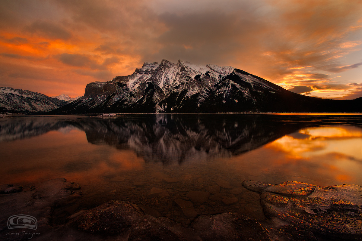
Here is another image from last Dec 2012 in the Canadian Rockies. This one is for you Marc. I thought you would like this one, since the scene is a little warmer :biggrin:

Sunrise shot from a local Banff, AB Lake. The public seems to like this photo, I posted it 2 days ago on 500px. I am curious as to whether this crowd finds this image print worthy :biggrin:

The exposure of the foreground is just right on my setup, but it may be a bit dark on other monitors.

I added a larger file for viewing more detail.

Any comments are always appreciated :smile:

Nikon D800E
Nikkor 14-24mm F2.8

Comments

12 comments
Comment posted by Stan Rose on August 9, 2013 at 4:56 PM
Well, of course it's 'print-worthy' the real question is whether it's portfolio worthy. :wink:
I'd say it's a close call, and you should make it not me :biggrin:
What i like: it's a classic scene, definitely evokes the majesty of the Canadian Rockies. I like the dark mood, it's well-presented.
Where I differ from the 'public' is that ive seen 5,000,000 photos of scenes like this whereas the public is probably only familiar with 5,000 or so :wink:
So, my take is that it's solid, but nothing that really stands out or makes me think "this is one of Fougere's shots..." As sunrises go , it's actually fairly tame--Adamus probably would snooze through this one (either that or go crazy with the PS--JUST KIDDING Marc :razz: ) Id probably showcase it for the reasons you mentioned--it's gonna appeal to the public. But it's not a top tier image for you IMO.
Registered on September 15, 2005, 836 Posts, 17099 Comments
Comment posted by Peter Coskun on August 9, 2013 at 5:08 PM
I like this quite a bit. As Stan mentioned, it has that dark mood that evokes the majesty of those mountains. The foreground looks fine to me, however I would like to see a little more detail in the blacks. They just seem, well too black. I think just slightly pulling some detail out of those blacks will give it some more depth. Gotta love when the light just pops!
Registered on October 31, 2011, 170 Posts, 1240 Comments
Comment posted by James Fougère on August 9, 2013 at 5:12 PM
Stan,

I completely agree with what you are saying. When I processed this image, I liked it, but it does not have the WOW!! factor I like and strive to capture. But when I walk around the galleries here in Whistler, all the images are the same "Blue Skies", very simple compositions and not very dramatic scenes. That is what the public wants. This image is in the middle, maybe that is why the public likes it. I am not a big fan of 500px, but it is interesting that when I post there and with images I really like, they get little views. Then with an image like this, it gets several thousand views, and is voted 99.8% "liked", one of the top images of the day.

I was contemplating a gallery location in Whistler, but I put the project on hold, because this situation concerns me. I decided to stay with an online gallery on my personal website. I have a tour business here in Whistler that is not photography specific, and guests can learn about my portfolio that way. If having a gallery location here in Whistler village at $10,000 per month rent, selling prints would have to be the priority, which means I would have to display a portfolio that would not be exactly what I want. Peter Lik style gallery and portfolio :wink:
Registered on October 25, 2010, 41 Posts, 831 Comments
Comment posted by Jared Warren on August 9, 2013 at 8:18 PM
Well, I really like it. A 7.5 on my "wow meter", as one who straddles the line between photographer and a member of the unwashed masses.
Registered on May 11, 2012, 84 Posts, 931 Comments
Comment posted by James Fougère on August 9, 2013 at 9:03 PM
Jared,

Delicate Rainbow is a sweet image :biggrin: unwashed masses ?? No way!!
Registered on October 25, 2010, 41 Posts, 831 Comments
Comment posted by Michael Cothran on August 9, 2013 at 9:05 PM
From a critique point of view, I think your image has lots of impact, but I'm having a slight issue with the warm colors above & below, coupled with a fairly neutral colored mountain. Minor nit.

I sell photographs at juried arts & craft shows, mostly in the Southeast. I print to impact the patrons of the shows, NOT other photographers. In fact, I really don't want to know what other (most) photographers think of my work, which is why I rarely post an image on this site, or any other site. I do come here everyday for inspiration, and I get plenty of that, and I do have my favorite photographers here. There is a small handful whose opinions I do respect, but most, I'd just as soon not know. And that said, you may feel the same about my opinion. But as an art show photographer, I see $$$ in this image, as I feel it would appeal to many shoppers, but not necessarily seasoned landscape photographers.
Registered on December 5, 2012, 31 Posts, 730 Comments
Comment posted by Philip Hodgkins on August 9, 2013 at 9:10 PM
Middle of the road drama, for sure, but it certainly appeals to me. Agree to seeking a bit more detail in the solid blacks.
Registered on July 24, 2006, 2741 Posts, 12349 Comments
Comment posted by James Fougère on August 9, 2013 at 9:11 PM
Michael,

Thanks for your comments, and I agree with your points. In regards to the neutral white mountains, I processed the mountains that way to keep the snow white, to create more attention there, and also to have a contrasting effect from the snow to the warm colors of the sunrise in the image.

As for the details in the blacks in the foreground, I can see the detail needed for the print, but the jpg is a bit darker. I can post another version to show more of what I see later.
Registered on October 25, 2010, 41 Posts, 831 Comments
Comment posted by Eva McDermott on August 9, 2013 at 9:17 PM
Love the visual impact here James. Beautiful light, full of emotion. Agree with Michael C's input to some extent since my best sellers in Maine are not favorites here for sure.
Registered on January 4, 2009, 1015 Posts, 13229 Comments
Comment posted by Lorna Taylor on August 9, 2013 at 11:08 PM
Simply stunning !
Registered on November 12, 2010, 254 Posts, 3083 Comments
Comment posted by Kathy Barnhart on August 11, 2013 at 5:42 PM
This is gorgeous. Love the warm, burnished colors and the darkness seems fitting for a winter dawn. Snow on the mountains adds a lot to the scene.
Registered on November 11, 2011, 404 Posts, 1639 Comments
Comment posted by David Edwards on August 12, 2013 at 6:21 AM
Fabulous color and boldness with a great sky & reflection is the main attractant for me. It's a fairly straight forward comp with a straight-on view of the mountain, but I like that simplicity and it does showcase the mountain very well. The warm tones and sat look excellent imho. I would probably lighten the fg a little, particularly in the middle and the left to bring out the rock structures there a little.
:toast:
Registered on December 6, 2008, 142 Posts, 2623 Comments