Nature Photographers Network
This is the preserved archive of the original Nature Photographers Network. The community continues at naturephotographers.network.
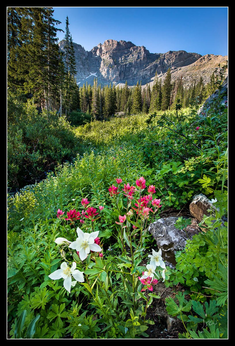
Albion Columbine
‹ PreviousLandscape GalleryNext ›

Albion Columbine

by Jared Warren

Gallery: LandscapePosted July 31, 2013414 views13 comments
I hope others aren't tiring of the wildflower images; I'm having a lot of fun with these. About 15 images went into this one, blended for dynamic range and depth of field. No interesting sky, the light could have been better, and I missed focus on part of the foreground columbines (more noticeable when viewed larger), but let me know if you have other feedback for improvement. Also, is the saturation ok for your taste? I had to play around with contrast and WB in shaded areas and I didn't want to overdo it. Thanks for looking.

5Diii, Nikon 14-24 @ 14mm, multiple images @ f/8, base images 1/25 sec.

Comments

13 comments
Comment posted by Harry Lichtman on July 31, 2013 at 2:21 PM
Jared - Spectacular display - the color balance in the shade vs. the sun looks fine.The sky/mnt/tree transition looks a bit off probably do to the blending. A light haze or halo is apparent, pretty wide in this case. Makes the transition in the sky appear off. After you work that out, it should be a great shot.
Registered on September 17, 2010, 304 Posts, 3507 Comments
Comment posted by Morris McClung on July 31, 2013 at 6:00 PM
Excellent comp, and the color is nice for the brighter light. In fact, the only thing that could improve this would be better light. I wonder if the issue at the mountain/sky transition is from compression?
Registered on May 7, 2007, 670 Posts, 19650 Comments
Comment posted by Mark Pelton on July 31, 2013 at 6:49 PM
Color and saturation looks good to me. Overall, the exposure looks good. Nice blend.
Registered on November 25, 2003, 380 Posts, 4647 Comments
Comment posted by Brian Schrayer on July 31, 2013 at 7:27 PM
This is definitely a lovely scene and overall very nicely composed. If I'm being really picky I wish that the trees weren't covering the peak on the left but this might have been the best framing option for the wildflowers so I can certainly understand your choice here. Overall, the color and saturation look pretty good, but it might be worth trying to neutralize the slight blue color cast in the shadow area beneath the peaks (and maybe darken that area slightly - maybe just to add some shadow contrast using Tony Kuyper's luminosity masks - create a luminosity painting layer and darken with a darks mask).

Oh, yeah and definitely not tired of the wildflower images or of great new locations from Utah. :wavey:
Registered on May 28, 2004, 114 Posts, 2890 Comments
Comment posted by Bill Reid on August 1, 2013 at 9:06 AM
Color and saturation look great Jared and nice job on the blend. Really nice composition and the only thing to improve this would be better light. Very well done.
Registered on January 27, 2013, 65 Posts, 2460 Comments
Comment posted by Richard Teller on August 1, 2013 at 10:24 AM
Beautiful place and great composition. I agree that the one thing that would improve this even more would be better light.
Registered on August 23, 2010, 1162 Posts, 6692 Comments
Comment posted by Scott Smorra on August 1, 2013 at 1:43 PM
I think you did pretty well here with the available light Jared. The WB looks OK to me. The OOF flowers are a bummer, since I think they are the most important element in the image. Sometimes I will shoot the foreground flowers at f/16 to maximize DOF and minimize the amount of blending that is necessary during post processing. If there is a lot of wind this becomes problematic due to the slower shutter speeds or higher ISOs.
Registered on November 2, 2009, 161 Posts, 2143 Comments
Comment posted by Matt Anderson on August 1, 2013 at 10:05 PM
A classic wildflower scene, and you've nailed it!
Registered on September 6, 2007, 346 Posts, 2696 Comments
Comment posted by Jared Warren on August 1, 2013 at 10:41 PM
Thanks all for the helpful feedback- I particularly like Scott's thought of shooting the foreground at a smaller aperture. There was a slight breeze to deal with but I'll keep that in mind next time out.
Registered on May 11, 2012, 84 Posts, 931 Comments
Comment posted by Kane Engelbert on August 1, 2013 at 10:51 PM
I think Morris is on to something here; the compression usually brings out our opportunities. Overall compression should help all of us get better at blending but for whatever reason many blame compression on our image not appearing the way we intended.

The comp here is excellent, which is always the tough part. I say that referring to the fact that in 10 years from now you will go back and te work this image with a mastery of blending skills. Your gonna go back because the comp is good. Bad comp, and the image will fade away.

Even without clouds I think this image will sing with Marc Adamus blending skills. Lol.

The foreground light seems too bright when you compare it to your much darker midground. Thus your transition there should be less. I would keep the mids where it's at but darken the foreground. However bring out the luniosity in the foreground. The sky blend is a tough one. The mountain exposure isn't too important (your interest is the flowers), so keeping that a bit darker than it is won't be noticeable to most. I would lighten the sky a notch and blend it with the mid foreground. Then sharpen well. The slightly darker foreground should transition well with the mids and distant(slightly lighter) sky. These kinds if blends feel better to the eyes. Histograms help.

Just my opinion. I Myself is still trying to get this kind of blending down. It's not easy.
Registered on June 14, 2009, 63 Posts, 291 Comments
Comment posted by Pavel Cakl on August 2, 2013 at 1:04 PM
It's good enough to me :toast:
Registered on April 8, 2010, 7 Posts, 178 Comments
Comment posted by Nick Bristol on August 3, 2013 at 12:19 PM
Jared, What a beautiful scene this! I like your comp and just enjoy looking at this. I do agree with many of the other comments that might make this even better but I am enjoying it as is. :smile:

Nick Bristol
Lone Rock, WI
Registered on February 1, 2004, 752 Posts, 14140 Comments
Comment posted by Kory Lidstrom on August 4, 2013 at 2:21 PM
The comp is decent. But, I will say that the foreground appears much too bright for a shadow area.
Registered on November 19, 2008, 49 Posts, 1035 Comments