Nature Photographers Network
This is the preserved archive of the original Nature Photographers Network. The community continues at naturephotographers.network.
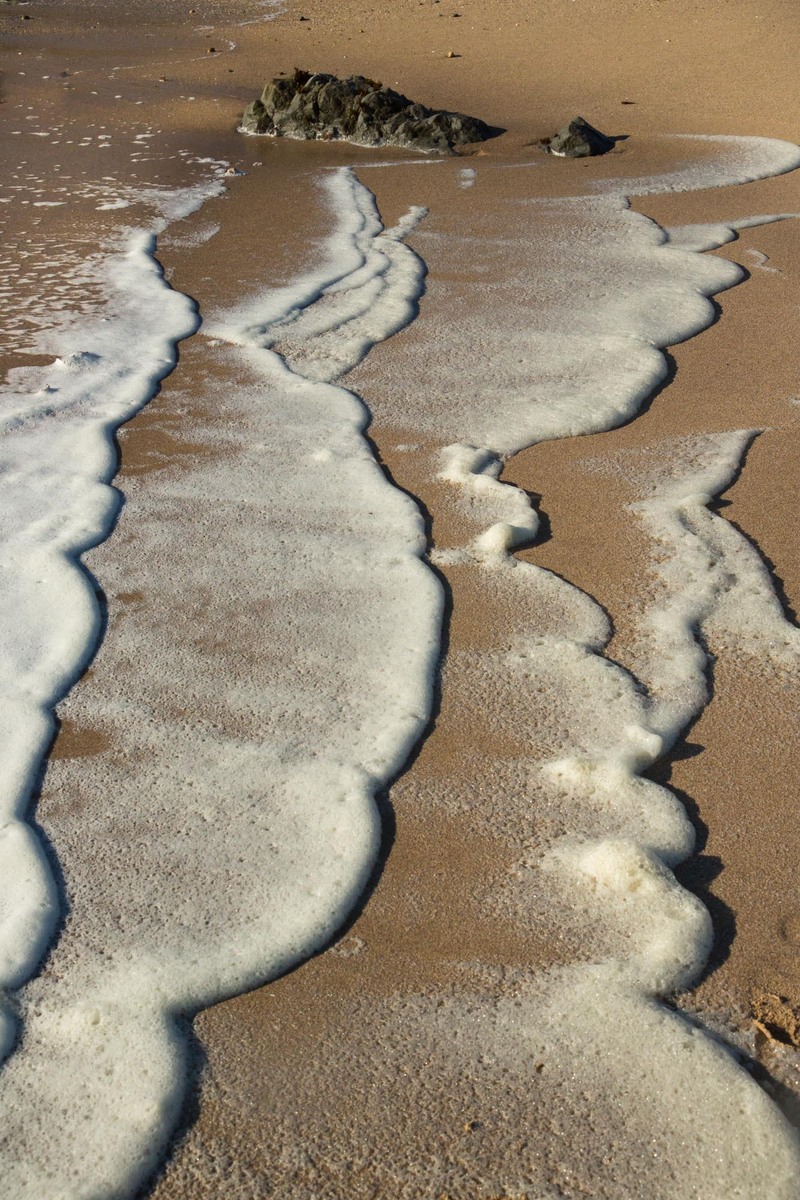
Beach Latte
‹ PreviousLandscape GalleryNext ›

Beach Latte

by Kathy Barnhart

Gallery: LandscapePosted June 30, 2013200 views10 comments
When the wind whips up the Pacific, as it did this week, we get foamy surf that my biologist brother-in-law assures me is organic matter that makes cool patterns on the beach. Taken in the evening south of Half Moon Bay, California.

Canon 5d, M3, ISO 400, 50mm, f/11, 1/400 sec.

Thanks in advance for any comments and critiques.

Comments

10 comments
Comment posted by Johan Eickmeyer on June 30, 2013 at 4:20 PM
I like the comp and shapes. I think it may work a bit better as a B&W conversion though.
Registered on March 25, 2013, 36 Posts, 164 Comments
Comment posted by Harley Goldman on June 30, 2013 at 4:59 PM
Great color and patterns. I like it cropped down to eliminate the rocks, making it much more abstract. Very cool image.
Registered on November 19, 2003, 586 Posts, 11271 Comments
Comment posted by Nick Palmieri on June 30, 2013 at 6:48 PM
Really cool. If it were mine I think I would try a version without the rocks. Great textures in that water.
Registered on September 1, 2011, 35 Posts, 748 Comments
Comment posted by Kathy Barnhart on June 30, 2013 at 8:14 PM
I like the idea of trying the photo without the rocks. Here's the result:
Registered on November 11, 2011, 404 Posts, 1639 Comments
Comment posted by Catherine Reilly on June 30, 2013 at 8:30 PM
Hmmm, "organic matter"... I like it better in my imagination as the foam on a latte...

I like the wave pattern created by the foam and think it is improved by fully abstracting it to just foam and sand. Nice eye for this.

P.S. And now I see that you had the same advice almost in unanimity. Looks good! Can I nitpick, now? Try the crop to just below the arch at the top, so there's no break in the wave lines. Ooooo, then they go on forever, and forever. :smile:
Registered on August 16, 2006, 603 Posts, 9192 Comments
Comment posted by Chet Dowell on June 30, 2013 at 9:05 PM
Nice abstract Kathy. I do like the crop better. Well done. Chet
Registered on December 3, 2012, 237 Posts, 1171 Comments
Comment posted by Hamed Musharbak on July 1, 2013 at 4:34 AM
wonderful shapes, i like the second version
Registered on June 1, 2009, 372 Posts, 2282 Comments
Comment posted by Morris McClung on July 1, 2013 at 11:42 AM
Nice title. I like the strong neutral colors in this and the side-lighting adds texture. I think this works well as an intimate study with the rock included, but see potential for abstracts, too. Nicely done.
Registered on May 7, 2007, 670 Posts, 19650 Comments
Comment posted by Harley Goldman on July 1, 2013 at 1:37 PM
I much prefer the repost. The abstract works for me.
Registered on November 19, 2003, 586 Posts, 11271 Comments
Comment posted by Bill Reid on July 3, 2013 at 1:44 PM
Great shapes and tones in this Kathy. A wonderful abstract. I think I prefer the second one the best. Very nice.
Registered on January 27, 2013, 65 Posts, 2460 Comments