Gallery: Photo ArtPosted June 12, 2013105 views4 comments
*
Comments
4 comments
Comment posted by Howard Cheek on June 13, 2013 at 7:43 AM
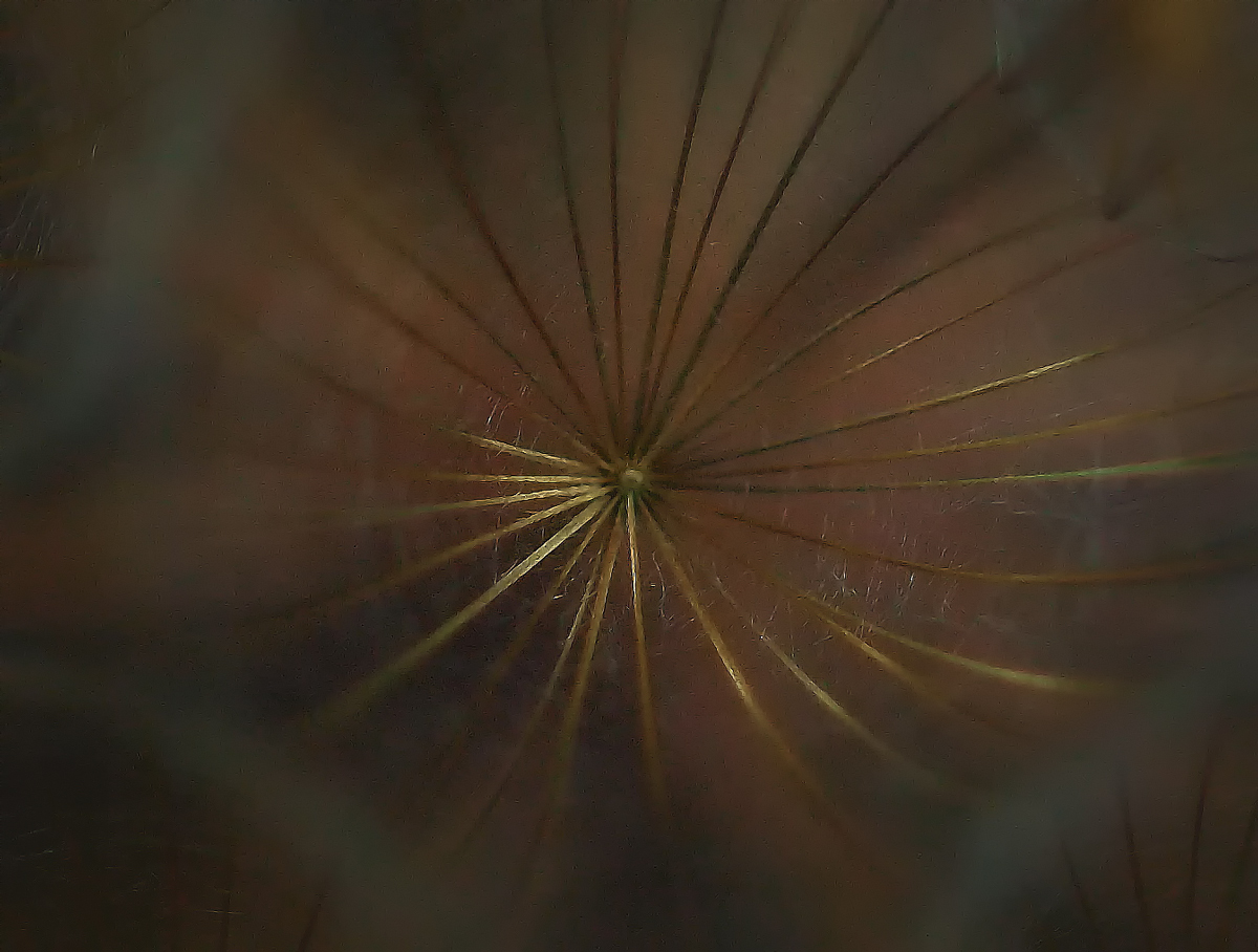
I like the overall abstract/symmetrical look, and the bit of light coming through leads the eye.
That light seems to emanate from center outward, with a sense of 'rotation' for me..
Not the usual fare, nice job of thinking 'out of the box' Charlie
Registered on July 24, 2008, 1201 Posts, 10758 Comments
Comment posted by John Clulow on June 13, 2013 at 7:04 PM
In the larger view this image is viable, I think, in terms of color, form, and delicate detail in the webs. I'm glad I took the time to view that before commenting, because I wouldn't say as much for the standard version.
Huge difference, I think, between the standard and larger view images in terms of impact.
Registered on November 1, 2012, 155 Posts, 1079 Comments
Comment posted by Charlie Baugh on June 13, 2013 at 8:29 PM
Definitely not "usual fare", Howard. And if only we could have everybody's full screen. I know exactly what you mean and agree, John.
Registered on April 18, 2011, 329 Posts, 1985 Comments
Comment posted by Albert Darmo on June 13, 2013 at 10:35 PM
Hi Charlie The larger version is a killer the lines and light give us an aura of mystery
Albert Darmo
Registered on November 25, 2008, 1386 Posts, 11978 Comments

Comments
4 commentsThat light seems to emanate from center outward, with a sense of 'rotation' for me..
Not the usual fare, nice job of thinking 'out of the box' Charlie
Huge difference, I think, between the standard and larger view images in terms of impact.
Albert Darmo