Nature Photographers Network
This is the preserved archive of the original Nature Photographers Network. The community continues at naturephotographers.network.
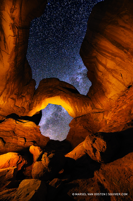
Portal To The Stars
‹ PreviousLandscape GalleryNext ›

Portal To The Stars

by Marsel van Oosten

Gallery: LandscapePosted June 12, 2013889 views17 comments
While leading this year's Namibia tours, Outdoor Photographer published my blog on night photography in Arches NP. I'm in Johannesburg now with decent internet access, so I thought I'd share it with you. Here's the text from the blog:

"Of all the National Parks that I have ever visited in the US, Arches National Park is without a doubt the most iconic. Many millions of photographs have been shot here, and to come up with something different is not easy. That does not mean one shouldn’t try though, and I personally greatly enjoy the creative process of coming up with new possibilities to photograph iconic subjects.

Double Arch is one of them. One of the reasons it has been photographed so much is probably because it’s so close to the car park, but also because it’s a stunning piece of architecture by mother nature. When you’re standing below this imposing marvel of nature, it’s hard to not be impressed by the size and the beauty of this amazing structure. From my research for my visit to Arches, I learned that 99.9% of all the images of this arch are more or less taken from the same viewpoint. I’m sure one of the reasons for this is that you need some distance to get the whole thing to fit inside your frame – standing inside the arch is not going to work. However, if you don’t try to fit the whole scene into the frame, new possibilities arise.

I decided to move into the scene and resist the temptation of showing everything. Instead of moving as far back as possible to see the entire structure, I tried to find an interesting foreground and move in with my 14-24mm wide angle lens. The opening inside the smallest arch was my main point of interest, so I opted for a vertical composition with some room at the bottom for the rocks in the foreground and quite a bit of space at the top to show the height of this place. Another good reason to go for a vertical was that the vast majority of images taken of this arch are all horizontals.

My second decision was to photograph the arch at night and to bring out the details and colors by using a flashlight. The light painting would give me a lot of creative control over the look and feel of the image, so that was an important part of the shot. I wanted to include part of the Milky Way, which meant that I had only a very short window of time to take the shot – the position of the Milky Way in the night sky changes constantly and I wanted it to be in a diagonal direction.

I knew that this was going to be an exposure blend; one for the sky and one for the rocks. In order to get a many stars as possible, you need at least an ISO of 1600, but more often around 3200 or even 6400. Your shutter speed can not be longer than approximately 30 seconds, otherwise the stars will start to streak. For the rocks exposure I could shoot at a fairly low ISO to prevent noise, with a considerably longer shutter speed. And I needed some extra time to light paint such an enormous subject.

For the light painting I used my trusty assistant, my wife Daniella. She was positioned outside of the frame to the left, armed with a Surefire Invictus flashlight and colored gels. I first decided on the color temperature of the light, and then we started experimenting with the light painting. Light painting is all about seeing the unseen, so you have to previsualize everything. After a few test shots, I decided to focus most of the light on the foreground and the main arch so that those areas will grab your attention first. However, the inside of the main arch didn’t catch enough light at the angle that I preferred for the whole scene, so I decided to shoot a second exposure just for the main arch with the light positioned directly below it. I would then later merge these two exposures.

Meanwhile I constantly checked the night sky for the position of the Milky Way, and when it looked good, I shot my third exposure for just the sky, without any light painting. The three exposures were later merged in Photoshop. – Marsel van Oosten"

Equipment and settings: Nikon D3, AF-S Nikkor 14-24mm f/2.8G lens – Rock exposure: 1 minute @ f/5.6 and ISO 800; Sky exposure: 25 seconds @ f/5.6 and ISO 3200

Comments

17 comments
Comment posted by Aaron Feinberg on June 12, 2013 at 7:26 AM
Being a huge fan of your work this is good and get some wow factor but compositionally it's missing something for me. Which I can never say I've thought of with any of your photographs. Great job on the technicals as I know getting everything right is tricky :) Look forward to seeing what else you pull out of your sleeve!

aF
Registered on October 26, 2009, 399 Posts, 2789 Comments
Comment posted by Matt Anderson on June 12, 2013 at 8:13 AM
Marsel, always a treat to view your engaging imagery.
This is no slouch ! Spectacular.
Registered on September 6, 2007, 346 Posts, 2696 Comments
Comment posted by Marsel van Oosten on June 12, 2013 at 8:31 AM
Aaron - compositionally, this is very different from what I would usually do. My main reason for this was the fact that all the obvious compositions had all been done before, including one that I did myself before this one: At The Gates

Even though I prefer the latter, Portal To The Stars is one of my most popular night images ever, both in terms of feedback and sales. It's interesting, and I've been trying to figure out what causes that. My guess is that it's the warm, saturated light that contrasts with the blue. Other than that, your guess is as good as mine. :smile:

Thanks for your honest feedback.
Registered on March 9, 2004, 285 Posts, 2277 Comments
Comment posted by Rick Turner on June 12, 2013 at 9:37 AM
Just returned from Arches and this is a brilliant out of the box capture. Very well done to both you and your wife (I suggest you call her director rather than assistant.LOL).
Rick :wavey:
Registered on February 18, 2012, 534 Posts, 2755 Comments
Comment posted by Kory Lidstrom on June 12, 2013 at 11:50 AM
Love the planning and pre-visualization here. The comp is ok, not the most compelling one but I realize that this was somewhat experimental for you.
Registered on November 19, 2008, 49 Posts, 1035 Comments
Comment posted by Nancy Lea Sandy on June 12, 2013 at 1:09 PM
Interesting "double frame" for the sky. The color tones are nicely balanced, as well
Registered on January 24, 2011, 576 Posts, 6942 Comments
Comment posted by Eva McDermott on June 12, 2013 at 7:13 PM
Amazing image Marsel! The center "O" and light in the sky is especially stunning.
Registered on January 4, 2009, 1015 Posts, 13229 Comments
Comment posted by Wayne Jones on June 12, 2013 at 7:49 PM
It must be difficult when an amazing image like this is compared to an image like "At The Gates." But since the only work that people think about in comparison to this one is also yours, that's not such a bad place to be in! I confess that I too immediately thought of "At The Gates" when I saw this image; that's how memorable "At The Gates" is. However, this one is also impressive, in the composition, light painting, and star exposure. I can understand its popularity, even though there is one other image of this place that I prefer. (I don't need to mention which one that is, do I. :wink: )

Excellent work as always, and it is wonderful that you so freely share your expertise. Thanks especially for demonstrating that it is both commendable and possible to produce unique images, even of such frequently-photographed places.
Registered on April 18, 2007, 953 Posts, 6435 Comments
Comment posted by Nathan Apodaca on June 12, 2013 at 8:09 PM
Wow... Very nice take on that incredible location. The light painting looks spot on, to me!
Registered on November 16, 2011, 67 Posts, 1127 Comments
Comment posted by Mike Dawson on June 12, 2013 at 9:35 PM
Fantastic work, I think your composition is fantastic and your lighting equally well done, if there were anything here to improve upon it might the dark area's on top of the cliff on each side, probably where the flashlight would not reach, not sure how you solve that
Registered on February 4, 2006, 364 Posts, 8872 Comments
Comment posted by Aaron Feinberg on June 12, 2013 at 9:58 PM
Yea...if I could figure out which images sold better than others and why it would definitely make the job much easier. haha. Good to know though and agree about the comp....prefer the former. Also why I dont look at many photographs of places b/c when I go there if I happen to shoot something someone else has it will be coincidence not copying :)

Rock and roll!
aF
Registered on October 26, 2009, 399 Posts, 2789 Comments
Comment posted by Chris Chamberlain on June 12, 2013 at 11:45 PM
I don't know if it's fair to compare the two. I think they make different statements. I think they are both stellar images expertely crafted. I'm very impressed at how well thought out and executed your work is. Now having said that, this might be the second best night/lightpainted image I have seen. "At The Gates" just hits me in a little more profound way.

Chris
Registered on March 13, 2007, 500 Posts, 8365 Comments
Comment posted by Stuart Williams on June 13, 2013 at 7:35 AM
i like a crop of the bottom half and the title 'dragon's eye'
Registered on December 7, 2007, 247 Posts, 4792 Comments
Comment posted by Rick Lundh on June 14, 2013 at 4:23 PM
WOW...a great photographer such as yourself, and such a great image, and only 13 comments. What's the world coming to? I love it. You demonstrate effort, creativity, and dedication to the craft with this photo. Congrats Marsel! :toast:
Registered on April 28, 2004, 774 Posts, 4351 Comments
Comment posted by Joe James on June 14, 2013 at 10:28 PM
Marsel - Stunning, beautiful and amazing. Thanks for the detailed "how two" as always.
Registered on November 20, 2009, 89 Posts, 808 Comments
Comment posted by Marsel van Oosten on June 15, 2013 at 2:10 AM
if there were anything here to improve upon it might the dark area's on top of the cliff on each side, probably where the flashlight would not reach, not sure how you solve that


That was deliberate - I thought it added more depth to the rock areas and I preferred the rocks to be darker where they touched the sky. My first light painting exposures had the entire rock lit.

Thanks for all your comments/critique/feedback - much appreciated! :smile:
Registered on March 9, 2004, 285 Posts, 2277 Comments
Comment posted by Paul DeCesare on June 16, 2013 at 2:11 AM
Know what I think??

:toast: :toast: :toast:
Registered on August 31, 2007, 29 Posts, 202 Comments