Nature Photographers Network
This is the preserved archive of the original Nature Photographers Network. The community continues at naturephotographers.network.
The Fountain & the Fish
‹ PreviousPOP Photos GalleryNext ›

The Fountain & the Fish

by Ester van Dam

Gallery: POP PhotosPosted June 10, 2013131 views5 comments
taken with a sony a550
at 50mm
1/40 sec
f/6.3
ISO400
handheld
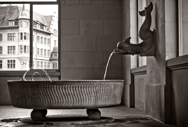
i thought the kind of romantic old feel of this warm tint suited the image i shoot mostly in color so this was a bit of an experiment. All comments and suggestions are welcome : )

Comments

5 comments
Comment posted by Buck Ward on June 10, 2013 at 8:59 PM
While I usually care to see more tonal range in a black and white photograph, the thing that grabs me about this one is the building through the window. It is as much a part if the scene as the fountain. It's almost as if it's enjoying peeking in to watch the water flow.
Registered on December 8, 2003, 96 Posts, 1917 Comments
Comment posted by Lon Overacker on June 11, 2013 at 5:35 PM
Ester,

I think this is fantastic! Looks like something that would be included in some famous photographer's gallery in Paris or NYC.... I like Buck's comments and I too find the juxtaposition between the building through the window and the tub/spout to be very engaging. If anything, and very minor, I would wish for more room on the left (a bit) and a smidge less from the right. but as presented, this is quite excellent!

Lon
Registered on November 24, 2006, 521 Posts, 19147 Comments
Comment posted by Harley Goldman on June 12, 2013 at 9:51 AM
I like this a lot. It is an intriguing composition, with great tension with the dark tones indoors and the brighter building outside, inviting exploration of both. Beautifully done.
Registered on November 19, 2003, 586 Posts, 11271 Comments
Comment posted by Ester van Dam on June 12, 2013 at 1:54 PM
Thank you all for your wonderful comments and the remarks it is very much appreciated! :wavey:

And Lon i can see how it would improve if a bit from the left was removed and some extra space was added to the right, you are right on that one. Thank you i learn a lot this way. Have a great evening!
Registered on August 30, 2011, 50 Posts, 103 Comments
Comment posted by SandyRichardsBrown on June 20, 2013 at 12:41 PM
Striking image - the B&W is perfect here to accentuate the different elements of the image.
Congrats on the WP!
Sandy
Registered on November 24, 2003, 3937 Posts, 12909 Comments