Gallery: LandscapePosted June 1, 201397 views7 comments
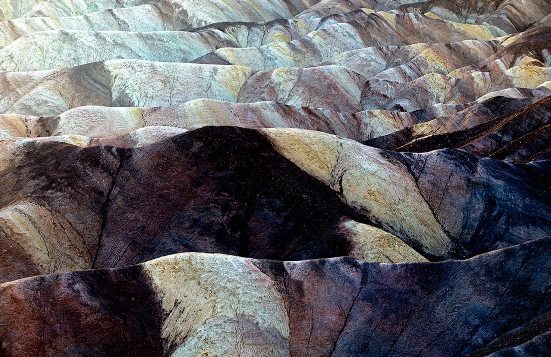
This is another image from Death Valley. The mountains (hills) there are really amazing. Your comments and suggestions are welcome. Chet
Comments
7 comments
Comment posted by Nancy Lea Sandy on June 1, 2013 at 10:18 PM
I like the progression of hills and frame filling color but the fg seems a little dark compared to the bg. The light ulc and the dark lrc are at war for my attention. A slight crop from the top might help this. These hills really are incredible
Registered on January 24, 2011, 576 Posts, 6942 Comments
Comment posted by Gary McGhee on June 2, 2013 at 8:29 AM
I like your frame filling composition Chet, excellent depth.
Gary.
Registered on April 15, 2010, 142 Posts, 2416 Comments
Comment posted by Bill Reid on June 2, 2013 at 9:24 AM
Very nice image Chet. I agree with Nancy's comments. Some very nice blue shades in this and nice depth to the image. Very nice.
Registered on January 27, 2013, 65 Posts, 2460 Comments
Comment posted by Peter Richter on June 2, 2013 at 9:31 AM
The repetitive pattern and color transitions work wonderfully for me, Chet.
Maybe a bit less contrast? Only a minor suggestion.
Peter
Registered on November 10, 2010, 218 Posts, 2723 Comments
Comment posted by scott lanz on June 2, 2013 at 10:57 AM
The repeating pattern you captured here, Chet, is excellent. Like a couple others, I find the foreground a bit dark and heavy, but I like the abstract design overall a lot.
Registered on November 14, 2003, 840 Posts, 12902 Comments
Comment posted by Lon Overacker on June 2, 2013 at 2:58 PM
Chet,
Another wonderfully isolated view from this location. Kudos to you for seeing these last couple of image. The layers here are of course excellent. My only nit really is that the contrast and detail-less dark areas I think are taking away from overall presentation. Unlike your previous image where I think the contrast/sat worked, I think it's too heavy here, primarily in the lower ridges. The ridges in the upper part of the frame are fantastic - the lower is just too strong for my taste. this one has great potential.
Lon
Registered on November 24, 2006, 521 Posts, 19147 Comments
Comment posted by Morris McClung on June 2, 2013 at 4:46 PM
Great layers of bands of colors. Fascinating landscape.
Registered on May 7, 2007, 670 Posts, 19650 Comments

Comments
7 commentsGary.
Maybe a bit less contrast? Only a minor suggestion.
Peter
Another wonderfully isolated view from this location. Kudos to you for seeing these last couple of image. The layers here are of course excellent. My only nit really is that the contrast and detail-less dark areas I think are taking away from overall presentation. Unlike your previous image where I think the contrast/sat worked, I think it's too heavy here, primarily in the lower ridges. The ridges in the upper part of the frame are fantastic - the lower is just too strong for my taste. this one has great potential.
Lon